The best prototyping tools for responsive web design
The rise of responsive design has made prototyping essential for designers. Gavin Wye explores three prototyping apps for RWD.

With most sites now responsive by default, prototyping is a necessity. We’re designing and building sites that respond to the
device used to view them. Working in, or as close as possible to, the medium via which our designs will be consumed can only be a benefit for us. It’s getting easier and easier to do this as the tools we have at our disposal become more sophisticated.
By far the hardest part of a designer’s job is to adequately explain ideas and intentions to others. Enabling people to experience these ideas is a much better way to help them understand — I find the phrase ‘show, don’t tell’ particularly fitting. It doesn’t stop there, though. Prototyping your design also gives you the opportunity to see where it works and doesn’t by testing, tweaking and adjusting as you go.
The pros of prototyping
How often have you seen something built, just as you designed it, to discover it’s not what you really expected or wanted? At that point, it’s too late.
I have long-believed that designers should code. A deeper understanding of the design is gained if you know what’s going on beneath. It makes you a better designer and makes for a more rigorous design. How a document is structured is a design decision.
But I’ve recently had to question this belief. I’ve begun seeing apps that offer some of the benefits of HTML prototypes via a drag-and-drop interface, enabling you to get from an idea to interacting with that idea and moving it forward relatively quickly. By far the biggest benefit, and the thing that has made me question my opinion, is the fact that these apps make it so easy to prototype in a responsive manner.
If you’re going mobile-first, you can change the screen size to desktop and watch the content reflow and reposition where necessary. That’s vastly oversimplifying both the process and the considerations we should be taking into account when designing a responsive site. But it’s a start, and a better start than a number of different-sized wireframes and visuals.
Prototyping apps
Over the years, I’ve tried many apps in the hope they would help me get closer to the live version of what I was designing at the time, without taking as long as it would to hand-code a prototype. The answer was always: there are no shortcuts. But now that apps are emerging to assist with designing and prototyping a responsive site, how can they help you — and which should you be looking more closely at?
Get the Creative Bloq Newsletter
Daily design news, reviews, how-tos and more, as picked by the editors.
Let’s look at three apps to consider introducing to your workflow: Divshot, Easel and UXPin. Broadly, all three of them do the same thing: help you create a page by dragging and dropping a number of standard elements.
Drag-and-drop interface builder Divshot and in-browser web design tool Easel use Bootstrap as a base framework: sensible, given its meteoric adoption. Divshot has also recently included ZURB’s Foundation. UX/wireframing tool UXPin isn’t just about prototyping; you can upload personas and other artefacts to help tell the story of the project.
01. Divshot
Dragging and dropping can be tricky with Divshot: it only lets you put elements in a position, which it then fits in the DOM. This can be restrictive, but you’re getting Bootstrap’s production-level code underpinning the design. You need to utilise Bootstrap, and fit your design to this, which permits you to add custom CSS to tweak the visual design.
When trialling Divshot, I found myself spending time in the built-in code editor once I’d established the initial structure of the page. But it didn’t take long to establish that initial structure and I was able to sketch rapidly within the interface. One shortcoming is the lack of an option to link pages to create a clickable prototype — so you’ll need to download your prototype, then manually create links between files. (Divshot is planning to add the ability to link pages within the app in a future release.)
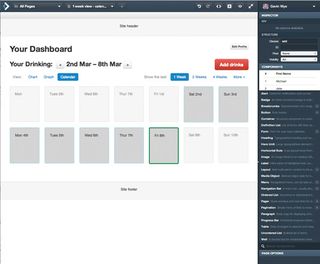
There are two other notable features. Divshot’s visibility controls in the inspector apply a class to the elements, enabling you to show or hide them easily on one of four devices that are set up for you (phone, tablet, desktop and HD).
Then there are the themes. Divshot has hooked in to Bootswatch, via which you can quickly switch the theme you’re using — and even use your own custom themes. This themes feature is simple at the moment, but consider the power it could give you if you plugged in your custom theme for your client. Divshot costs between $30 and $300 a month.
02. Easel
Easel also uses Bootstrap. Unlike Divshot, you can ‘sketch’ in the interface quickly without using the layout elements. You can also swiftly and easily link pages into a clickable prototype. Once you’re ready to share something with your team or client, you can do so, and get feedback, using the comments mode.
I’d also consider using this to run lo-fi usability tests: the opportunity for feedback in this way is one of the biggest advantages of prototyping. Easel also has support for teams. Not having your design tied to a particular individual can only be a good thing.
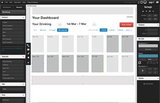
One drawback with Easel is the fixed canvas size for the desktop view, especially if you wanted to set the design to be completely fluid. I found the width of elements was fixed to the canvas size rather than in the available space in the browser. Easel costs between $15 and $99 a month.
03. UXPin
UXPin’s interface has more features than Divshot or Easel, making it feel a fuller, more complete app. You’re not tied to a CSS framework, so have freedom to design completely without the constraints they put on you. You can set up your own grid and switch between a few different screen sizes, adding others as you need to give you lot of flexibility.
Once you’ve created your prototype and shared it with team members, they can comment, reply and resolve individual queries. Unlike the other apps, you can create iterations that can be reviewed and commented on. I like how this exposes the working out behind the design – documenting elements that don’t work is just as useful as documenting the things that do. Too often we only pay attention to the things that work, forgetting to explain the journey.
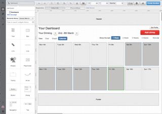
UXPin feels really focused on telling the story of the project, providing the ability to upload extra assets not created in the app, such as personas, a project kickoff, or a project framework template. UXPin costs between $12 and $89 a month.
Workflow considerations
All three apps have a place in my workflow. They cover a lot of ground and I can see them gaining traction. UXPin and Easel are quick to get to grips with: if you need something to help you test ideas quickly, then they would be good places to start.
If you work in a more integrated way, maybe side-by-side with a dev team, and are considering how components fit together reusably, then you may favour Divshot (particularly if you’re using Bootstrap or Foundation). I can see integrated teams getting mileage out of the ability to link to a custom theme.
There’ll be devs saying you should be building your own framework. But if you can take something you’ve prototyped, tested and handed to the dev team, who are happy to use it, why wouldn’t you?
Easier than it was
These three apps show that prototyping is much easier than it was. The level you take it to is a matter of choice. It will depend on the project, team and how much time you have. I can still see occasions when I’ll still want to get into the code, so treat these apps as a shortcut at the beginning of the process.
As the tools we use mature, barriers to entry will lower. Dare I say it, but it’s becoming easier to prototype things by pulling together different elements from sites such as jsFiddle and GitHub.
The future of prototyping
Each app has pros and cons. One thing that puzzles me about these apps is that they all start with the desktop as default rather than starting out with mobile first.
When designing in this way, content is one of the crucial things - and none of these apps make it easy to get content in right at the start of the design process. If our designs are to embody the principles that we are starting to live by, the tools we use need to be built with them at their heart. Maybe a default page state would be a welcome addition.
Nevertheless, prototyping is becoming simpler, meaning you can test and explain your ideas more effectively – giving you time to focus on design.
Gavin Wye is senior user experience designer, currently working for Virgin Money.
This article originally appeared in net magazine issue 245.
Liked this? Read these!
- Discover what's next for Augmented Reality
- CSS mistakes every web designer must avoid
- Great examples of website navigation

Thank you for reading 5 articles this month* Join now for unlimited access
Enjoy your first month for just £1 / $1 / €1
*Read 5 free articles per month without a subscription

Join now for unlimited access
Try first month for just £1 / $1 / €1
The Creative Bloq team is made up of a group of design fans, and has changed and evolved since Creative Bloq began back in 2012. The current website team consists of eight full-time members of staff: Editor Georgia Coggan, Deputy Editor Rosie Hilder, Ecommerce Editor Beren Neale, Senior News Editor Daniel Piper, Editor, Digital Art and 3D Ian Dean, Tech Reviews Editor Erlingur Einarsson and Ecommerce Writer Beth Nicholls and Staff Writer Natalie Fear, as well as a roster of freelancers from around the world. The 3D World and ImagineFX magazine teams also pitch in, ensuring that content from 3D World and ImagineFX is represented on Creative Bloq.
