Motion design is a necessary skill for the modern web. With web animation thriving, everyone from UX designers to front-end developers needs an appreciation for what motion can add to their work.
The character and energy that motion brings to an app or system interface works wonderfully on the web, too. Motion is a valuable interaction design tool. These are exciting times!
So how can we develop an eye for motion and put traditional animation principles into practice for web design?
Great interface animation is useful, conveys information and does it with restraint and style. That's a tall order, but it's not out of reach. Restraint and style is where motion design skills come in. Well designed motion keeps our audience focused on the quality experience instead of distracting them with awkward bells and whistles.
Classic animation principles
The bible of animation, if there were one, would be The Illusion of Life by Disney animators Ollie Johnston and Frank Thomas. This book features the 12 principles of animation by which Disney imitated life in its animated films.
These principles are time-tested, and even though they're written for an entirely different medium, we can apply them to animated interactions with great results. Learning to identify each of these principles will help you develop an eye for animation and give you a basis for evaluating and designing interactions.
The 12 classic principles are: squash and stretch, anticipation, staging, straight ahead and pose to pose, follow through, slow in and slow out, arcs, secondary action, timing, exaggeration, solid drawing and appeal.
Get the Creative Bloq Newsletter
Daily design news, reviews, how-tos and more, as picked by the editors.
They don't all apply equally to our efforts in interface animation, but it's still helpful to know what each entails. We'll take a closer look at the three principles that are particularly key to interface animations: timing, secondary action and follow through.
Web animation timing and spacing

My improv teacher always tells us that timing is the key to comedy. As it happens, timing is also the key to animation. In animation, timing is all about how long an action takes.
In the classic text, it's said that correct timing makes an object appear to obey the laws of physics. It gives cues as to the weight of an object and which forces have acted upon it. When it comes to interface animation, our goal isn't always to replicate the physical world, though. We tend to focus on the aspect of timing that establishes an object's 'personality'. So much can be communicated through timing!

For web animation, spacing comes down to the easing (the timing function) that we apply to an animating property. Easing determines how speed changes occur across the duration of an animation. That's how we indicate mood and personality. The duration of an animation also plays a role here, but the easing does most of the talking.
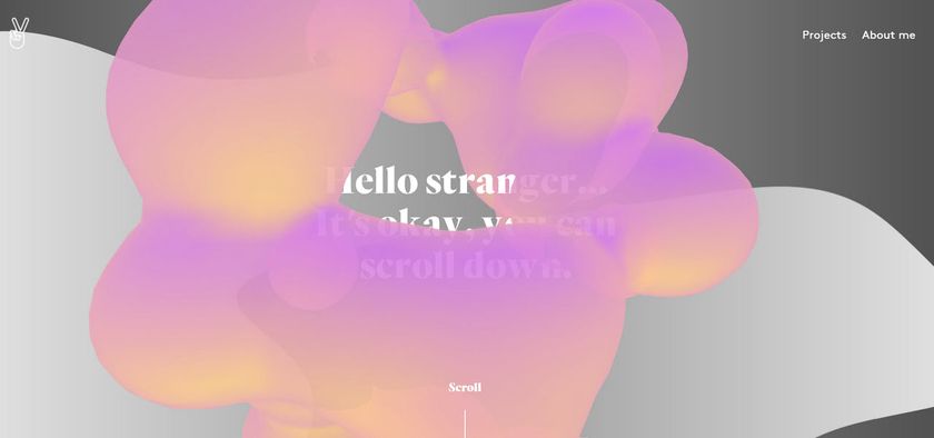
Strong bouncy timing, like the motion of the dots in the Dots game, conveys an energetic, playful feeling. It can often feel even a bit childish at times. Scroll down on the game's website for a short animation and look closely at the way the dots move – when they fall into place they bounce back up a little. The bounce is short, which informs us the dots have some weight to them.

At the other extreme, linear easing appears mechanical and lacks life. Linear motion holds a constant speed across the entire duration of the motion so there's no slowing down or speeding up at all. That's impossible in the real world, thanks to things like gravity! Linear easing communicates nothing useful about the mass or nature of the moving object.
The funny thing about timing is that despite its potential to communicate, and all the effort we might devote to choosing it, all animations have to happen quickly. One of the biggest motion design crimes out there is to make your UI animations too slow. It takes practice to get timing right, but the more you do it, the better you'll get. Prototyping animations is very effective for getting your timing down.
Secondary action in web animation

Secondary action is additional animation that complements, or occurs as a reaction to, the primary animation. In traditional animation, this might be something like a character whistling or moving her arms around while she walks. In interfaces, it's how nearby elements move in reaction to the main motion.
Websites and apps can't whistle or move their arms, so the opportunities for secondary action aren't always as obvious. However, they do have related elements and some elements that move together. Those are prime candidates for secondary action.
Twitter's heart animation is a good example of secondary action. The main action is the heart scaling up. The circles and little particles that fly out around it are secondary actions that enhance the heart's effect.
Follow through and overlapping action online
Follow through and overlapping action are two closely related concepts that deal with how an object comes to a stop. Follow through is the motion of overshooting the final destination by a small amount and then coming back to settle into place.
In the Slides changelog timeline, each item in the list shoots out a little further than its destination before settling back to a stop. That's follow through in action.
Similarly, overlapping action is the concept that not all parts of an object come to a stop at the same time. For example, a dog's floppy ears keep moving forward even after their body has come to a stop.
Unless you're working with some sort of physics engine, you'll be faking or approximating these concepts with easing choices or keyframe placement. There's nothing wrong with that. Hinting at these familiar concepts with any type of animation goes a long way to creating a more realistic feeling.
Next page: Putting animation principles into web design

Thank you for reading 5 articles this month* Join now for unlimited access
Enjoy your first month for just £1 / $1 / €1
*Read 5 free articles per month without a subscription

Join now for unlimited access
Try first month for just £1 / $1 / €1
- 1
- 2
Current page: Animation principles for web design
Next Page Using animation principles in web design