Back up your design decisions with hard data
Do you need to reassure nervous stakeholders about a site design? Add statistical weight to your decisions with Design Quips.
You might well know exactly what you're doing when it comes to web design, but at some point in a build you're likely to run up against a stakeholder who isn't prepared to trust your expertise and instead wants hard data that proves you're on the right path. What do you do? Bluff it out and hope they won't realise?
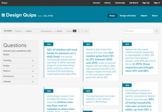
Before you try that tack, take a look at Design Quips, a smart project by ZURB that collects useful data about habits and trends into one big reference resource.
Consisting of over 600 factoids - with around 200 new ones being added every month - it works on two excellent levels. You can use it as a repository of empirical evidence that you can use to defend your design decisions, but you can also factor it into your design process to help you make those decisions in the first place.

"We use Quips in our design meetings and work sessions whenever there is uncertainty about a specific piece in the design we are considering implementing," says ZURB's Chris Brownlee.
"For example, recently one of our top designers, Brandon used Quips to validate a design decision on whether or not to use social logins. Quips gave Brandon the ability to quickly pull up this cool fact- 'Visitors are 200 per cent more likely to log in to your website using Facebook Connect than any on site login.' Needless to say they added social plugins and the client was stoked."
Fact frenzy
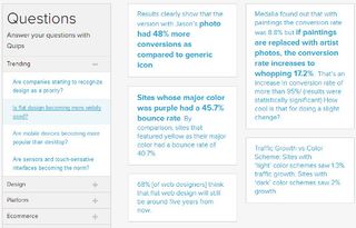
Finding useful facts on Quips is a breeze; you can browse the entire library, search for particular terms, filter it by platforms, demographics or devices, and it also features a set of questions that you might ask at some point in your design process.
For example: 'Should I design for mobile first?' currently returns 26 relevant quips to help you decide. What beancounter could resist the fact that after a responsive redesign, "e-commerce site Skinny Ties saw 71.9 per cent conversion rate increase on iPhone"? Exactly.
Get the Creative Bloq Newsletter
Daily design news, reviews, how-tos and more, as picked by the editors.

Built using Rails and a custom CMS, Quips has been a bit of a learning experience for ZURB. "We built a framework to organise the data we were collecting, knowing that it would likely change as it grew," says Chris Brownlee. "By 200 quips we had to organize them in order to make the aggregation easier. Facts seemed to disappear, so we had to organise it daily rather then just dump the data into the CMS and hope for the best.
"This was surprisingly more complicated than we thought - one-off tags meant little, but tags assigned to 50 per cent of quips didn't help. Surprises came when we cross-referenced topics, like "mobile" and "adult", or "ecommerce" and "decline". A few tags were more than topics: "growth," "decline" describe trends. "Infographic" and "PDF" describes the source's type."
Fact-checking
The other issue lay in ensuring the quality of the facts on offer. "We discovered that reliable, accessible sources were vital. One time we re-checked some facts in an article, and discovered the article had dead links. We decided that was unacceptable - we axed the quips from our system. It set a bar for quality."

So if you're dreading your next client meeting, take a look beforehand and make sure you're armed with some quips; you might also find some facts in there that'll help you make some informed improvements along the way.
Words: Jim McCauley
Liked this? Read these!
- How to build an app: try these great tutorials
- Pro tips for mobile website design
- Our favourite web fonts - and they don't cost a penny
Has data helped your design process? Tell us in the comments!

Thank you for reading 5 articles this month* Join now for unlimited access
Enjoy your first month for just £1 / $1 / €1
*Read 5 free articles per month without a subscription

Join now for unlimited access
Try first month for just £1 / $1 / €1
The Creative Bloq team is made up of a group of design fans, and has changed and evolved since Creative Bloq began back in 2012. The current website team consists of eight full-time members of staff: Editor Georgia Coggan, Deputy Editor Rosie Hilder, Ecommerce Editor Beren Neale, Senior News Editor Daniel Piper, Editor, Digital Art and 3D Ian Dean, Tech Reviews Editor Erlingur Einarsson and Ecommerce Writer Beth Nicholls and Staff Writer Natalie Fear, as well as a roster of freelancers from around the world. The 3D World and ImagineFX magazine teams also pitch in, ensuring that content from 3D World and ImagineFX is represented on Creative Bloq.
