20 bright and colourful website homepage designs
Bold, vibrant and creative - these website pages demand attention! Check out this inspiring collection of homepages that make a big first impression.
When you’re designing a homepage, there’s a range of different approaches you can take. Whichever angle you choose, you need to make sure you're doing it for the right reasons.
Whether it’s an elegant, professional and clean design to help show off a certain brand personality, or a bright, colourful and creative homepage to help grab the visitor’s attention, there should always be a reason for choosing a particular style.
When designers go for a bold, vibrant and colourful look the reason is usually simple – they want the site to be remarkable, memorable and to stick in the visitor’s mind. This can be common with startups in particular, who often only get one chance at making a first impression, and so need to be sure they make a good one.
We’ve brought together a showcase of brilliantly creative, often vibrant and always memorable homepage designs to help give you some inspiration for your next design project.
01. Flutter
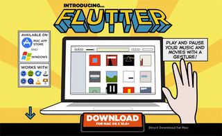
Flutter is a desktop tool that runs in the background of your computer and lets you control your music playback with a wave of your hand, using your webcam. Its homepage is bright, bold, vibrant and has a quirky style all of its own. The app itself is very fun, and the cartoon style of the homepage helps to show off that fun, irreverent theme.
02. Flipboard
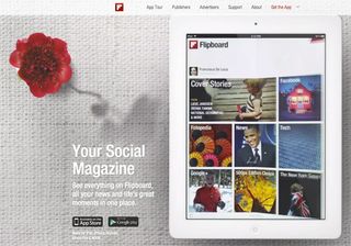
Flipboard was one of the first iPad apps that was truly remarkable – it takes RSS feeds, Tweeted links and Facebook mentions and turns them into a beautifully designed digital magazine. The beauty of the app is in seeing it in use, and so the Flipboard homepage has focused exclusively on that – a huge animation of someone scrolling, swiping and using the app is used as the background for the page.
03. Square
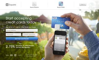
Square allows small businesses and retailers to accept credit card payments using their iPhones and iPads. The product itself is fairly innovative and is, in many cases, an entirely new proposition for businesses, which means that Square needs to show the product in use. They’ve opted for a huge background image that aligns beautifully with the sign-up form, and the image even loads in with a subtle animation as soon as you open the page.
Get the Creative Bloq Newsletter
Daily design news, reviews, how-tos and more, as picked by the editors.
04. Kaleidoscope
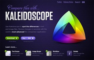
Kaleidoscope is an app that helps you find the differences between text and image files after they’ve been changed. The homepage beautifully divides up the individual features, so the section that shows off the image comparison looks completely different to the text comparison, yet they fit together perfectly. The Kaleidoscope logo also looks stunningly designed, and they’ve done a great job of showing that off right at the top of the page.
05. Flock
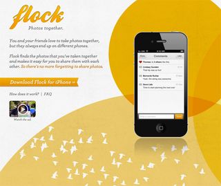
Flock is an iPhone app that helps friends share photos with each other. Flock has chosen, as you may expect, to show off the product with the aid of a large iPhone display – but the background also looks beautiful, and is bright and vibrant in a way that helps to draw attention to the image of the app in use.
06. MailChimp
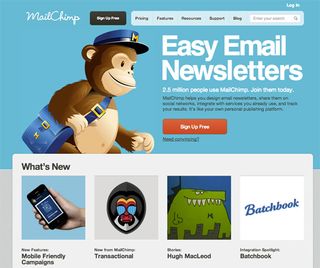
MailChimp, the email marketing company that helps you send newsletters to your subscribers, is no stranger to big, bold designs. Its homepage headline stands out a mile away, with a focus on huge typography set against a colourful background. The huge image of its monkey mascot, Freddy, also helps to show off the personality of the company, and helps to set it apart from more formal competitors.
07. Piictu
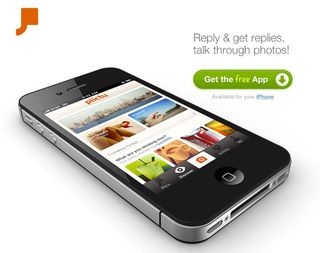
Piictu, the photo sharing iPhone app, uses a bold design choice for its homepage by making it as minimalist, clean and simple as possible. The design strips away everything that's unnecessary, leaving just an iPhone with the product in use, the logo, a short tagline explaining what the app does and a button to install it, for free. It’s a brave design choice, but it serves a purpose and does it well.
08. Highrise
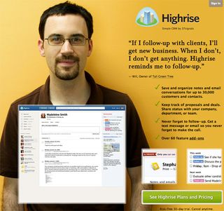
37signals, who make productivity software for small businesses, have taken a bold and unusual approach on their homepage for CRM tool Highrise, by using a huge image of one of their customers, and making a big feature out of the testimonial. It’s a creative approach that's rarely seen in product sites - but 37signals found that testing large images of their customers significantly improved their conversion rates.
09. Airbnb
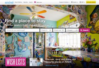
Airbnb allows people to rent out their homes and apartments to others, instead of using a hotel. The places that are rented out on Airbnb are often quirky, interesting and fun – and to help show this off, they’ve made use of photography in the background, to focus on some of their more quirky and stylish homes.
10. Paravel
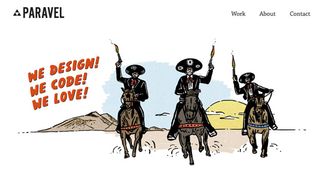
Paravel are a team of three designers who have joined together to create a web design and branding agency. The homepage shows off their creative, quirky side by using a colourful image of the team as if they were the three musketeers. It’s an unusual take on how to brand yourself, but it’s definitely creative and memorable, and shows off their fun personality.
11. Paper
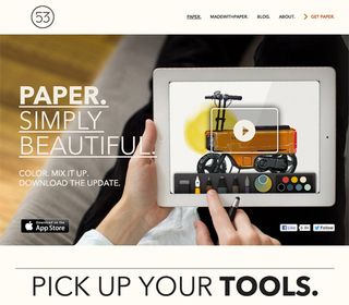
Paper is an iPad drawing and painting application with a focus on beautiful design. The app itself is superbly designed, and that focus on visual aesthetics also translates to its homepage. The huge background image shows the app in action, which draws the visitor into watching the video, while scrolling down reveals details on how the app works.
12. Treehouse
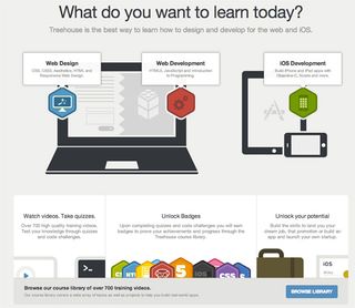
Treehouse runs interactive courses that aim to teach you web design, web and iOS development. The whole site has a clear, simple and almost-but-not-quite minimalist feel that comes together elegantly, and the homepage shows this off beautifully. The simple laptop, iPad and iPhone images instantly show off what Treehouse does and the visual design is simple, consistent and thoughtfully crafted.
13. Turning Art
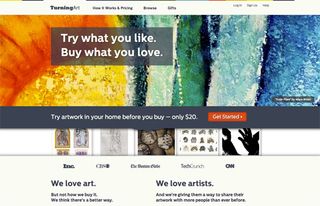
Turning Art is a creative take on buying art – you get to try paintings in your home before you buy. Obviously, with an art selling site, the design is a huge focus, and Turning Art aim to show off the artwork they sell by devoting the top half of the homepage to a gradually changing slideshow of beautiful, high resolution paintings. The result is a constantly changing and visually stunning homepage.
14. Vimeo

Vimeo allows people to upload high quality videos, and is well known amongst the creative crowd. The homepage’s header is devoted to a sign up form, but with a beautifully designed, ultra-quirky and colourfully illustrated background that helps to show off the creative nature of the site.
15. Virb
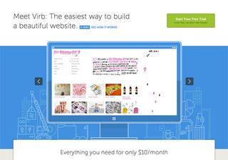
Virb bills itself as the easiest way to build a beautiful website, and the visual design and style of the homepage helps to evoke the idea that you’re working on a blueprint. While they’ve used a slider on the homepage to show off the product in use, they’ve also used the background (and other elements on the page) to appear as if they’re blueprint templates, which all form a thoughtful, cohesive and clever theme for the site.
16. OnSwipe
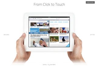
OnSwipe helps publishers to make their websites easier to read and scroll through while using a tablet. The homepage devotes its background to huge visual examples of the product in action, and breaks up different features into separate sections to help demonstrate each of them. There’s a very strong use of white space, and everything is given room to breathe – so even though there’s a lot of information on the page, it never feels overly complicated or crowded.
17. Disqus
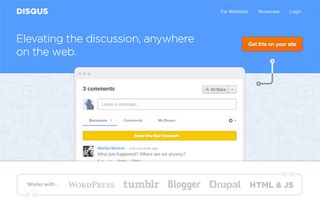
Disqus makes it easy for publishers to add comment boxes to their sites, and helps to keep the entire conversation stored all in the same place. Brilliantly, you can try out the Disqus interface right on the homepage (try typing into their comment box). The whole visual design comes together nicely because of the little things, too – the nice animated pattern in the background, the curved, spacious typography of the headline and even the simple, clean and impossible-to-miss “Get this on your site” button.
18. Superfly
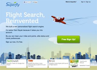
Superfly is a flight search engine that aims to personalise your results by taking into account your air miles and travel preferences. While the homepage is relatively simple, it’s also impossible to miss the huge cartoon background which adds some personality to the page. There's a huge “Free Sign Up!” call to action on an impossible-to-miss button (which contrasts well with the background), plus testimonials and press coverage the site has picked up.
19. Cue
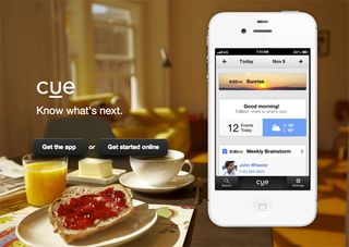
Cue is an iPhone app that automatically syncs with your calendar and mail to help build a schedule of your day. The homepage makes a very creative use of the background – while the huge image of the app shows off the product in action, the background updates automatically using detailed, high resolution photos that sync up with the schedule on the phone. It’s beautifully designed, creative and works fantastically.
20. Code School
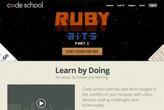
Code School is a series of courses that help to teach you how to program, by allowing you to test out code in the browser and follow along with video lessons. The design of the homepage is remarkable: design is a huge focus in Code School lessons, and that focus on aesthetics carries right through to the homepage. The top half of the homepage above the fold is dedicated to the latest course, which is always bold, attention grabbing and creatively designed.
Words: Rob Wilson
Rob Wilson writes for printer cartridge specialists Click Inks. In his spare time he develops iOS apps and studies graphic design.
Liked this? Read these!
- Pro tips for creating a mobile website
- Amazing examples of HTML5
- Web design secrets to boost your skills!
- CSS and JavaScript tutorials to power up your skills
Have you found any examples of creative homepages that you think should be included? We’d love to hear about them in the comments!

Thank you for reading 5 articles this month* Join now for unlimited access
Enjoy your first month for just £1 / $1 / €1
*Read 5 free articles per month without a subscription

Join now for unlimited access
Try first month for just £1 / $1 / €1
The Creative Bloq team is made up of a group of design fans, and has changed and evolved since Creative Bloq began back in 2012. The current website team consists of eight full-time members of staff: Editor Georgia Coggan, Deputy Editor Rosie Hilder, Ecommerce Editor Beren Neale, Senior News Editor Daniel Piper, Editor, Digital Art and 3D Ian Dean, Tech Reviews Editor Erlingur Einarsson and Ecommerce Writer Beth Nicholls and Staff Writer Natalie Fear, as well as a roster of freelancers from around the world. The 3D World and ImagineFX magazine teams also pitch in, ensuring that content from 3D World and ImagineFX is represented on Creative Bloq.
