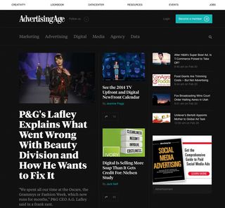
Advertising news site is packed with personality
Brian Hoff explains why Advertising Age's redesigned website is the business.

Three things in particular get me really excited about web design: great typography, a strong structure and beautiful balance. The new AdAge nails all three.
Ad news website Advertising Age, which is highly regarded in the marketing and media community, carries most of its weight on the shoulders of beautiful and readable Tiempos Text (and Tiempos Headline for, well, headlines).
What I love about this typeface choice is that while it has an editorial nod, its curves also pack some personality.
The experience and layout remains equally enjoyable as you scroll down the page, and each section feels well thought-out and unique, with comfortable breathing space around the various elements.
Far too often I come across news websites that cram text and headlines into every little 'fold', nook and cranny. This is a welcome breath of fresh air.
AdAge's website is not trying to be too clever, and this is a good thing. They understand their audience and display articles in a feed-like style
"The redesign attempted to address AdAge's business needs while enhancing the overall user experience," says Miguel Buckenmeyer of Area 17.
"The visual design – the typography, the use of white space, the extra templates and so on – are clear nods to print editorial, and we believe help differentiate the overall product."
Get the Creative Bloq Newsletter
Daily design news, reviews, how-tos and more, as picked by the editors.
Words: Brian Hoff
Brian is the founder and creative director of Brian Hoff Design, a Philadelphia-based boutique digital agency creating web and mobile platforms and products. Follow him on Twitter at @behoff.
Like this? Read these!
- 50 great parallax scrolling websites
- Why your website needs a landing page
- Free graffiti font selection
Have you seen any amazing new sites or portfolios? Let us know in the Comments!

Thank you for reading 5 articles this month* Join now for unlimited access
Enjoy your first month for just £1 / $1 / €1
*Read 5 free articles per month without a subscription

Join now for unlimited access
Try first month for just £1 / $1 / €1
The Creative Bloq team is made up of a group of design fans, and has changed and evolved since Creative Bloq began back in 2012. The current website team consists of eight full-time members of staff: Editor Georgia Coggan, Deputy Editor Rosie Hilder, Ecommerce Editor Beren Neale, Senior News Editor Daniel Piper, Editor, Digital Art and 3D Ian Dean, Tech Reviews Editor Erlingur Einarsson, Ecommerce Writer Beth Nicholls and Staff Writer Natalie Fear, as well as a roster of freelancers from around the world. The ImagineFX magazine team also pitch in, ensuring that content from leading digital art publication ImagineFX is represented on Creative Bloq.
