8 ways to conquer creative block
Stuck in a creative rut? The answer lies in mockups, explains Jerry Cao of UXPin.

Designer's block is a downward spiral. It's a lot like quicksand – the more your struggle, the deeper you go. But what are you supposed to do, just sit there and sink?
We know what it's like, so we want to throw you a rope. Here are 8 strategies that we've found useful in unblocking ourselves, all of which can be executed specifically with mockups.
01. Redraw existing sites
If this sounds like mindless busy work, it's because it is – but that's exactly what you need. Shifting your focus out of the problem at hand and onto something still design-related will reveal new options, whether on the screen or in your head.
Why redraw existing sites, though? As you (re)build multiple sites, you'll start to notice repetitions in structure and recognize similars skeletons behind the design. You'll see UI patterns implemented in various ways, but learn which elements are always the same, or should be. It's a practice that's always helpful in general for sharpening your skill as a designer, but when you're blocked, it could be a life-saver.
As recommended in Web UI Best Practices, first begin with skeletal wireframes, then move into detail. Each new phase reveals different elements you hadn't thought of before, and challenge your creative thinking in how to recreate them.

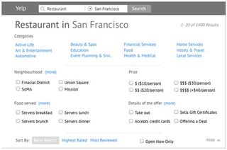
This is actually what our CEO Marcin Treder did with Yelp. Working in collaboration with UserTesting and Optimal Workshop, we conducted this hypothetical redesign project to validate our design theories and forge new ones. Working off of our partners' data from their usability testing, we rebuilt Yelp from scratch in UXPin, improving the features as we saw fit based on the research.
The result was a better understanding not just of the site, but of design best practices in general.
Get the Creative Bloq Newsletter
Daily design news, reviews, how-tos and more, as picked by the editors.
02. Zoom out
… both literally and figuratively. Perhaps the reason you're stuck is that you can't see the forest for the trees. Try shifting your viewpoint away from the details and onto the big picture – and the best way to do that is to physically change your viewpoint.

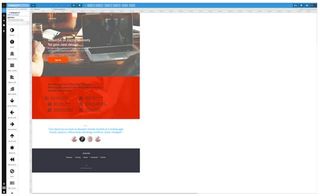
Working in a zoomed out view of a mockup creates the proper context you need to reevaluate the problem. You'll see how each element relates to the whole, and notice layout choices you hadn't seen before.
New methods of rearranging paragraphs, columns, sidebars, menus, navigation bars – anything, really – will come to light just by changing your perspective.
03. The Blur Test
The blur test is a personal method of Lee Munroe, which he describes on his blog. It's used to test visual hierarchy, but can also help in designer's block by giving you a fresh outlook on a mockup.
The idea is that you view a blurry version of a screen so that, with the details obscured, you won't be distracted when analyzing how the overall format fits together. Yes, visual details are the most important part of a mockup, however, these details won't matter unless your visual hierarchy is on point.

Munroe recommends taking a screenshot at blurring it with a Gaussian Blur filter in Photoshop by 5-10 pixels. Your screenshot will be reduced to colorful blobs, text will be unreadable, and you'll be able to see which blobs stand out (and which ones don't, but should).
As we showed in the free e-book Web Design for the Human Eye, this technique helps reveal a new direction to go in, and a way out of the block.
04. Try new software
It's a poor craftsman who blames his tools… but a clever one who experiments. Trying out new design tools gives you an immediate change, or at the very least a distraction.
The excitement of a new “toy” might be enough on its own to inspire some new ideas. If not, exploring the new features and relearning your old techniques might spark something inside you previously forgotten. Equally possible, you might realize how much you miss your old software's features, and the reason why might be the inspiration you were needing.

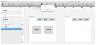
For example, some of our designers recently switched to using SketchApp, which is built specifically for web design (instead of Photoshop, which is more of a graphic/image design tool reconfigured for a web design role).
The ability to easily resize complex shapes, blur the background, and scroll to a multi-screen view makes it much easier (and fun, actually) to experiment with different UI configurations.
Next page: four more ways to conquer creative block with mockups

Thank you for reading 5 articles this month* Join now for unlimited access
Enjoy your first month for just £1 / $1 / €1
*Read 5 free articles per month without a subscription

Join now for unlimited access
Try first month for just £1 / $1 / €1
The Creative Bloq team is made up of a group of design fans, and has changed and evolved since Creative Bloq began back in 2012. The current website team consists of eight full-time members of staff: Editor Georgia Coggan, Deputy Editor Rosie Hilder, Ecommerce Editor Beren Neale, Senior News Editor Daniel Piper, Editor, Digital Art and 3D Ian Dean, Tech Reviews Editor Erlingur Einarsson and Ecommerce Writer Beth Nicholls and Staff Writer Natalie Fear, as well as a roster of freelancers from around the world. The 3D World and ImagineFX magazine teams also pitch in, ensuring that content from 3D World and ImagineFX is represented on Creative Bloq.
