8 optical illlusions to improve your mockups
Harness the power of Gestalt to make your mockups instantly understandable, by following these 8 tips.
Mockups, themselves, are a lot like illusions. Ideally, in appearance they should be identical to real, working sites, even though the illusion is quickly dashed if a user tries to interact.
Optical illusions are, more often than not, a product of a few quirks and phenomena of human sight. Luckily, this knowledge has been well documented by science — the science of Gestalt.
The Gestalt principles are the theories that analyze the gray areas of how our sight works. These principles explain how people perceive visual objects on the web, and how variations in arrangement, perspective, size, etc. can alter this perception.
This piece will explain a little about the Gestalt movement, and why this century-old science is still impacting modern web design. Let's explore how to apply the most useful ones for mockups.
The science of shape
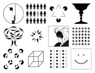
"Gestalt" is not a person, but the German word for shape or form that lent its name to an early 20th century psychology movement.
It started in 1910, when psychologist Max Wertheimer fixated on the way the lights of a railroad crossing flickered on and off (like lights "encircling" a movie theater marquee). It created the illusion that the lights were moving in a circle, even though they were merely alternating with good timing. This division between how we perceive visual stimuli versus what's actually there fueled the Gestalt movement for the next couple decades.
Along with his colleagues, Wertheimer developed several theories on sight perception that tend to revolve around a handful of similar concepts.
Get the Creative Bloq Newsletter
Daily design news, reviews, how-tos and more, as picked by the editors.
01. Emergence
For humans, the first step in identifying what we see is to create an outline around an object, and then match that outline against outlines we already know.
An outline of a flat surface with four legs is identified as a table, thanks to past experiences with tables. As explained in The Guide to Mockups by UXPin, only after this outlining process do we consider the details.
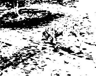
Take a look at the above picture, commonly used in explaining the principle of emergence. Objectively, it's a mess of black blobs against a white background. But guided by our own visual instincts, we can pull out the shape of a dalmatian.
Notice the revelation comes all at once. We don't see a leg first, and then a head, etc. We see the entire shape of the dog, and later identify its parts.
First, give general shapes, contours, and outlines precedence before diving into fine details. Create a clear visual hierarchy otherwise even the most polished icons and menus will make little sense amidst the clutter.
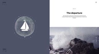
Once you dive into the details, the principle of emergence still applies.
For instance, users will identify buttons by their shape first — as explained in Interaction Design Best Practices, a button's shape (signifier) explains its function (affordance). This means users will more readily recognize a rectangle-shaped button than a star-shaped one.
Outline first, then details later.
02. Reification
Visual stimuli is inconsistent, and it's rare that we get a clear, front-and-center view of what we're looking at. That's why our brains are wired to "fill in the gaps" when information is missing. This allows us to comprehend visuals even when they're vague or obscured.
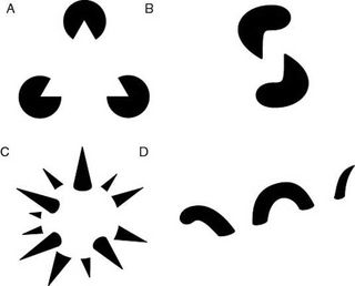
The above image shows the common examples of reification.
In reality, they are all ambiguous and incomplete shapes, but our brains still strive to make sense of them. For example, Figure A gives us the impression of a triangle, even though it's nothing more than three incomplete circles.
As long as you have enough information to communicate an object, the user can fill in the rest.
This means you're allowed to be creative with your use of white space, treating it as another design tool instead of an empty canvas. It also means you can partially obscure objects to either save space, or better communicate meaning.

In Linkedin's top navigation, even though portions of the Connection and Message icons are blocked by the notifications, users can still immediately recognize them.
03. Multistability
If an object has multiple interpretations, the human mind can only see one at a time, though they may alternate. The longer a viewer focuses on one interpretation over the other, the more dominant that interpretation becomes.
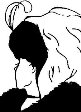
Images like the one above are popular because of this entertaining phenomenon. Viewers can only see either an old maid or a young beauty at one time; which is more dominant for you?
To put it simply, avoid multiple interpretations.
Double-check that your designs can only be seen the way you intend them, otherwise you open up your layout to misinterpretations. Because you may develop a dominant interpretation that overshadows others, usability testing can help identify these problems.
If you can't afford formal usability testing, even a quick guerilla usability test with a couple coworkers is better than risking bias.
04. Similarity
Objects that look similar are perceived as similar.
By communicating meaning and usage with visuals alone, the principle of similarity has a great effect on web design. Simply give a similar visual thread to elements that function the same, and the user will understand how they work in a way that feels intuitive.
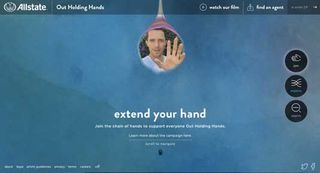
Take Allstate's LGBT support site, Out Holding Hands (above). The three primary navigation elements are given the same treatment: a white graphic icon with a text label encircled in a dark button, all the same size and with the same typography. These pages are all very different, but by using similar visuals the user knows they're all top-level navigation.
At the same time, secondary pages in the top-right, tertiary pages in the bottom-left, and social media CTAs are each, respectively, giving similar treatments. Location is also important — you can see similar links are grouped separately. This idea is represented under the principle of proximity, which I'll discuss under grouping.
05. The figure-ground relationship
Objects are perceived as either foreground (figure) or background (ground).
Humans naturally distinguish between elements of focus in the foreground, and distant elements in the background. Steven Bradley lists the three types of figure-grounds relationships:

- Stable — (left): The distinction between foreground and background is obvious.
- Reversible — (center): Separate elements have equal claim to either background or foreground. In the hands of the right designer, a site with a reversible figure-ground relationship can create a dynamic and invigorating tension. Keep in mind the rule of multistability, where the user perceives only one interpretation at a time.
- Ambiguous — (right): The distinction is unclear, and the user may interpret the figure-ground relationship as they want. These should be avoided, as the variability takes control away from the designer.

The figure-ground relationship is especially useful for modal windows, a popular trend today. There's no ambiguity in where the focus is when the Moddeals modal window appears with a deal offer (above).
Typically, sites box off a modal window to distinguish it from the rest of the site, but by darkening the original screen, Moddeals doesn't even need a window. The text alone clearly gets the focus.

On a much subtler note, the site for the German film Tannbach uses the figure-ground relationship to establish more meaningful distinctions.
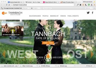
To emphasize the human relationship in the film, the designer makes the two people sharp against a blurred rustic background. It's a fairly clever implementation of a simple Gestalt principle and shows that you don't need to interpret the meaning as just "make a menu pop out against a blurry background."
06. Grouping
How objects are group suggests relationships between them.
Designers can use location and the grouping of elements to suggest relations, just like the principle of similarity. This concept is comprised of two different Gestalt principles that work together:
- Enclosure — Enclosing dissimilar objects together within a perceptible boundary — such as a box, outline, or card — will suggest similarity in the viewer's mind.
- Proximity — Objects grouped closely together will be perceived as similar, especially if separated from other groups by even more space. This also ties into the time and spatial elements of Hick's Law explained in The Guide to Mockups.
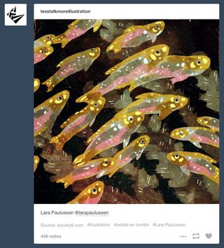
The above example from Less Talk More Illustration uses both.
Each post is enclosed in its own card, and each shows all the relevant options for each post. This use of enclosure is especially beneficial when users present multiple pictures within the same post — the options for liking, reposting, etc. apply to the entire post, and users known which controls apply to which pictures.
Within each post, similar elements are grouped together in close proximity (plus use visual similarity). Actions like favoriting and reposting are grouped in the corner close together, instead of spread out along the bottom.
By putting the controls next to the relevant item, the designer spares the user from the hassle of researching, memorizing, and diving into complex user paths. This also relates to the point about making clicks easy because you want to minimize the path between the user and the goal. The simplification of the system allows basic common sense to triumph over lengthy and involved explanations.
07. Closure
The human eye will complete partially incomplete images on its own.
The principle of closure states that user will provide their own closure to incomplete objects by filling in the gaps themselves, relying heavily on reification. This can be used to a designer's advantage, firstly by affording them some leeway with partial designs, and secondly by encouraging minimalist styles that communicate elegance.
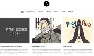
Notice how, in the grid layout from Abduzeedo above, there are no real borders, and yet the entire screen appears organized and sectioned. Viewers create their own grids in their minds based on the crisp, structured layouts — and they're just as potent as visible grids, perhaps more-so.
08. Continuation
Eye flows can create momentum that influences what is noticed.
As the user's eyesight follows a line, momentum is built up that propels it forward. The principle of continuation shows that such lines have more power over sight flows than other characteristics like color. In the example below, most people perceive one straight line and one curved line — not a bent red line and a bent black line.
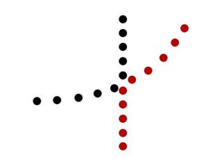
Web designers can take advantage of continuation by using lines to link elements together. We see this every day with navigation menus, both vertical and horizontal, including on this very site:

The Creative Bloq navigation uses two continuing lines on top of each other. The top line shows types of content, while the second line shows categories. The principle of continuation ensures that users won't confuse the two lines: they scan horizontally until the first line ends.
Takeaway
In a visual medium such as web design, the Gestalt principles provide an obvious advantage. Knowing how to apply them gives you more control over visual hierarchy, helps create more harmonious designs, and increases the likelihood that your message comes across.
Combining the general principles — emergence, reification, multistability, and invariance — as well as the finer principles — similarity, closure, the figure-ground relationship, etc. — will open up an entirely new level of visual design for your web mockups.
If you'd like more advice on creating UX mockups, check out the free 100+ page Guide to Mockups. You'll get tips on visual techniques, methods, processes, and best practices for Photoshop and Sketch.
Like this? Read these!

Thank you for reading 5 articles this month* Join now for unlimited access
Enjoy your first month for just £1 / $1 / €1
*Read 5 free articles per month without a subscription

Join now for unlimited access
Try first month for just £1 / $1 / €1
The Creative Bloq team is made up of a group of design fans, and has changed and evolved since Creative Bloq began back in 2012. The current website team consists of eight full-time members of staff: Editor Georgia Coggan, Deputy Editor Rosie Hilder, Ecommerce Editor Beren Neale, Senior News Editor Daniel Piper, Editor, Digital Art and 3D Ian Dean, Tech Reviews Editor Erlingur Einarsson, Ecommerce Writer Beth Nicholls and Staff Writer Natalie Fear, as well as a roster of freelancers from around the world. The ImagineFX magazine team also pitch in, ensuring that content from leading digital art publication ImagineFX is represented on Creative Bloq.
