6 clever persuasion techniques in web design
How do you get website visitors to do what you want? Jerry Cao outlines some clever techniques.
04. Framing
Framing is the language in which an option is presented. Framing can also complement anchoring and ordering — if you have a surcharge for using credit cards, you can "frame" the cash price as a discount. The credit card price becomes the anchor, and the cash price seems more attractive.
05. Reference

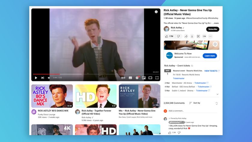
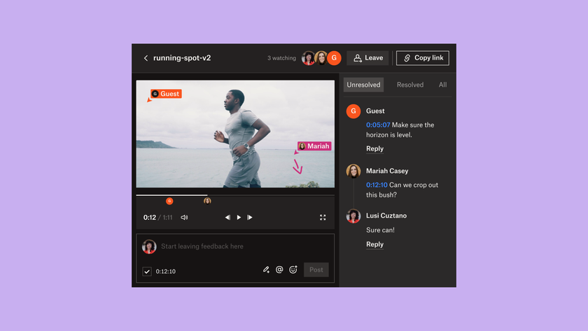
While this requires some more complex data capability, this tactic provides social reference as a means of incentivizing users to interact deeper. Not only do users see where they stand compared to other users, but they can envision themselves achieving meeting their goals.
06. Loss aversion
Studies show that people fear loss more than they value gains. "You can save $30 by signing up," is weaker than, "You're losing $30 if you don't sign up."
One of the best uses of the loss aversion for web design is in the Scarcity Principle — limiting the availability of time, products, inclusions (membership), or information to make each seem more valuable. The UI pattern of a clock counting down the end of a sale, for example, is a glaring reminder to the user of the loss they could experience if they wait, inciting them to avert that loss by buying quickly.
In the example below, Groupon makes use of both limiting time and product availability in a sale of headphones.

If you'd like to learn more about crafting effective copy for interaction design, check out the first volume of our books on the topic.
Conclusion
While big decisions like buying a expensive product might overshadow the smaller decisions of where to click next, it's the smaller decisions that affect the user's enjoyment. Big or small, potential decisions your users make should be identified readily, and designed to suit your needs based on the tips we listed above.
Get the Creative Bloq Newsletter
Daily design news, reviews, how-tos and more, as picked by the editors.
You don't need to listen to us, though — that's your decision.
To learn more about mastering the intangible aspects of web design, feel free to check out our free ebook on the topic.
We've included 80+ pages of practical advice on designing for time and behavior, relying upon analysis of real-world examples from MailChimp, Apple, AirBnB, Netflix, Google, and other companies.
Words: Jerry Cao
Jerry Cao is a content strategist at UXPin – the wireframing and prototyping app – where he develops in-app and online content for the wireframing and prototyping platform. To learn more about content-first design, download the free e-book Web UI Design for the Human Eye: Content Patterns & Typography.
Like this? Read these!
- Download the best free fonts
- The best free cursive fonts
- The best free script fonts

Thank you for reading 5 articles this month* Join now for unlimited access
Enjoy your first month for just £1 / $1 / €1
*Read 5 free articles per month without a subscription

Join now for unlimited access
Try first month for just £1 / $1 / €1
The Creative Bloq team is made up of a group of design fans, and has changed and evolved since Creative Bloq began back in 2012. The current website team consists of eight full-time members of staff: Editor Georgia Coggan, Deputy Editor Rosie Hilder, Ecommerce Editor Beren Neale, Senior News Editor Daniel Piper, Editor, Digital Art and 3D Ian Dean, Tech Reviews Editor Erlingur Einarsson and Ecommerce Writer Beth Nicholls and Staff Writer Natalie Fear, as well as a roster of freelancers from around the world. The 3D World and ImagineFX magazine teams also pitch in, ensuring that content from 3D World and ImagineFX is represented on Creative Bloq.
