5 ways to make your web designs more intuitive
Following the principles of visual design can make your website easier to use, says Speider Schneider.
As creators, designers, thinkers and problem solvers of digital communications, we make choices based on our understanding of our target audience.
Those choices are the knowledge we have from our culture, such as reading left-to-right, right-to-left, or top-to-bottom, as well as other factors, such as the placement of important images, text, interactive interface and colour choices.
Beyond culture, there is the human eye and how the brain registers the importance of what the eye is seeing. With a little understanding of the visual design principles described in the free e-book Web UI Design for the Human Eye, we can design awesomely effective websites.
01. Design for the brain first
To learn proper design, design history must be studied. The great artists and designers in history all followed simple design rules, and whether they followed, bent or broke those rules, it was the basics that allowed them to become of such high regard.
The brain, in multiple studies, follows a pattern of registering information by a trained hierarchy of what is being presented. Bold colours, bold type, contrasts and placement is always what shows up on thermal eye tracking tests, mostly because that is how we are trained.
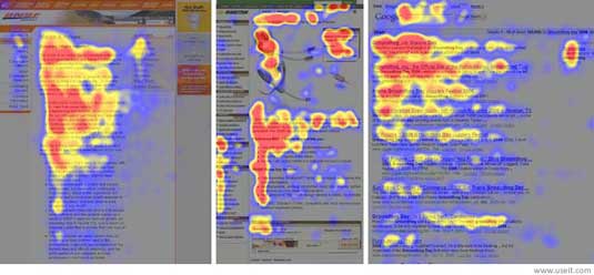
*Interesting Note: See how the attention drifts away from reading the last third of the text in the images on the left and right? Users are reading less and less. Break up long columns of text as in the middle image.
Also, keep in mind because users will rarely read every word of your text, the first two paragraphs are the most important and should contain your point. Start paragraphs, subheads, and bullet points with enticing keywords to draw the eye in.
Sign up to Creative Bloq's daily newsletter, which brings you the latest news and inspiration from the worlds of art, design and technology.
When the boss or client asserts, "make it pop!" or "add more 'UMPH!' to it!" he or she is calling for the simplest form of eye recognition – make it bigger and bolder. By the same token, the use of negative space forces the eye to focus on one specific area which might not be bigger and bolder.
The design principles of the Z and F patterns (aka layout) follow the nature of how the human eye is trained to scan a website. Great creations often rely on the flow of nature for pleasing design.
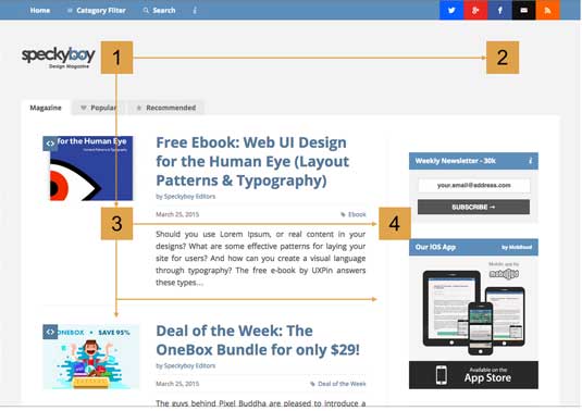
The F-pattern, based on left-to-right-reading, using the Grid pattern, is simple, easy and lays out information in a simple hierarchy for the eye. Headline on top of image with descriptor, followed by a link. Move down and start the next piece of content. Not much thinking required but not exactly exciting, either.
As described in Web UI Design for the Human Eye, the F-pattern is quite helpful for sites that embed advertising or calls to action but don't want to completely crowd out the content. In this case, the sidebar exists to get users involved in a deeper level. As with all patterns, the F-Pattern is a guideline – rather than a template – because the F-pattern can feel boring after the top rows of the F.
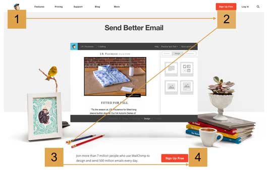
A similar use of eye movement in left-to-right readers is the Z-pattern. Much like the F-pattern, the Z follows the left-to-right reading as an eye scan of the page, placing important elements in the path of the eye's Z scanning.
Websites that use the Z-pattern are usually not text heavy and have a definitive call to action on the page. This pattern of eye scanning will bring the user to the point faster, and faster is better on the web.
02. Learn the rules and when to break them
There are several popular "rules" of design thought. All have valid points and, naturally, all can be successfully "broken"!
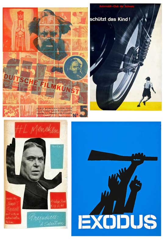
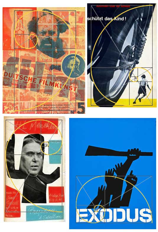
For the purpose of showing how these design rules work, below are some grouped images. One is simple, stock photos. The other is one work from each of four highly respected designers, Piet Zwart, Josef Müller-Brockmann, Paul Rand and Saul Bass. With a few specific websites thrown in, let’s see how these images hold up to different design rules.

03. Using the golden rectangle
Also known as the Golden Ratio, this sea shell-shaped mathematical nightmare has been used through centuries as the source of discovering the sweet spot, the area of maximum attention on a page and the areas that will lead the eye right to it.
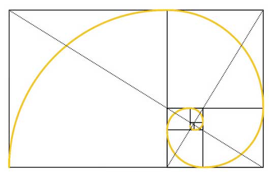
In geometry, a golden rectangle is a rectangle whose side lengths are in the golden ratio:
1 : \tfrac{1 + \sqrt{5}}{2} , which is 1:\varphi (the Greek letter phi), where \varphi is approximately 1.618.
Yes, it's a snap if math is your forté. If not, try this website for a thorough explanation and an interactive chart. A simple explanation is, if you look at the basic shape and focal point (keeping in mind that the shape may be flipped, flopped or rotated, depending on the image and elements in the design), it's easy to overlay the design in your mind.
Using the group of stock photos, see how the Golden Rectangle fits over the design and shows the area of maximum attention?
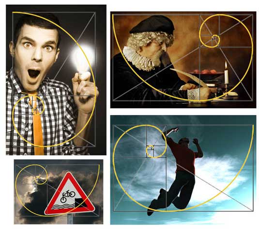
Just using this rule on the background image will enable you to place any element (i.e, block of text, call to action, UI, etc.) where it will definitely draw the user to it.
Using the Golden Rectangle on the work of Zwart, Müller-Brockmann (who is known as the father of the Grid Layout), Rand and Bass (also followers of the grid), you’ll note that while it does show important points the eye will follow on the design, is it truly a necessary step, considering the other layout patterns which show the same "hot" areas?
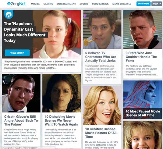
For the past couple of years, the Pinterest layout has been very popular for sites with lots of content. The basic design flow uses the F-pattern. Effective but not exciting to the brain when scanned by the eye.
A content-heavy news website like the New York Times designs its page with the Golden Rectangle to drive the eye from the most important story to the least above the scroll. This is a great way to place multiple text blocks on a website and still have each one take it's place in the hierarchy of the page.
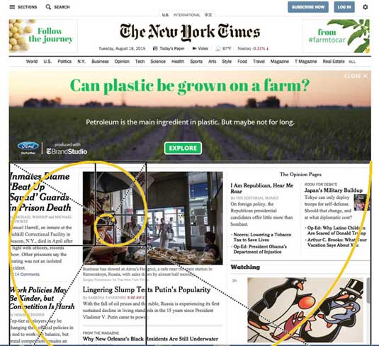
Here's a little cheat for those who don't want to do the math: just copy a Golden Rectangle and place it on a layer over your design. It also shows the areas on maximum attention on a page and is easy to picture in your mind while designing the page.
- Start by drawing a diagonal line from the left, top corner (if you are designing for an audience that reads left-to-right, reverse this step) to the lower right corner.
- From the lower left corner, draw a line to the diagonal cutting the rectangle in half and have it meet that diagonal line at a 90 degree angle.
- Repeat the same from the upper right corner.
The points of the right angles are the two areas of maximum attention for the user's eyes. An easy, quick way to plan the design of a website page.
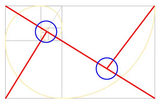
- You can also try these helpful tools to shorten the learning curve:
- Freebie PSD with custom ratios for multiple shapes
- Freebie PSD with resizable ratio rectangles
- Stack Overflow explanation for setting golden ratios in CSS
04. Applying the rule of thirds
Also known as "design to the nine," the Rule of Thirds" (Ro3) is the most common layout pattern used by websites. The sectioning of the design area gives the designer definite areas of importance. The areas can be divided into top, middle and bottom sections, left, middle and right or just one-third as a separate area, such as a sidebar.
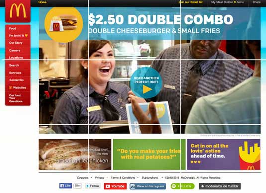
In this current McDonald's homepage (their site changes on a regular basis), the Ro3 carves out space so that your eyes can wander to the following areas:
- Front-and-center CTA takes advantage of content to entice the user to explore further. Because it doesn't focus on the product, this CTA probably experiences less friction.
- WOW! Only $2.50 for that entire meal? I'm hooked before even going on to the smiling employee, who will make my actual user experience more pleasant, unlike the sneering man in the upper right corner, but is not as noticeable, thanks to the impact that area has on my eye scanning.
- Ah-HA! I can see other delightful meal combinations with this call-to-action button. Let's see if I can be upsold by clicking this button at the center of my current universe – this web page.
- But first I'm enticed by these coloured boxes. Yes, grilled chicken is good, and I do wonder if these things in my mouth are real potatoes, but most of all, I am strangely intrigued by the promise of being able to "get in on the lovin' action."
- As a constant remind, the logo and food are visible in the top left. I see what I want and where I can get it!
Looking at how this works with the example images in this article, note that the intersecting lines of the Ro3 grid highlight the most important areas to the eye. Notice, for instance, how the lines intersect around the man’s face and lightbulb in the first stock photo. Also, see how the lines intersect at the writer’s face and at the point of action (his quill and hand).


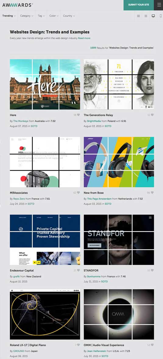
Now look at the Rule of Thirds applied to the websites spotlighted on the trends and examples page from awwwards (above). Again, see how the intersecting areas are points of great interest? Keep that in mind next time you're planning the composition of your interface.
05. Mastering the grid
In design, a grid is a structure made up of a series of intersecting straight or curved guide lines used to structure content. The grid serves as a guide on which a designer can organize graphic elements in a rational, easy to absorb manner for the eye and brain.
As shown below from the useful prototyping tool UXPin, a grid helps organize graphic elements accordingly:
- In relation to a page
- In relation to other graphic elements on the page
- In relation to other parts of the same graphic element in relation to a page, to other graphic elements on the page, or to other parts of the same graphic element.
Still, the grid can be a confusing system for many to understand. This is because it's usually not taught correctly by design teachers.
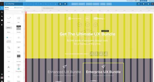
As mentioned previously, Josef Müller-Brockmann is considered one of the fathers of the modern grid layout system. So why is his work so fresh and innovative over 70 years later?
Perhaps creating the grid helped him understand the limitations and the freedom as well. Most people think the grid limits freedom of design. In reality, the grid is not a limitation on design choices but an aide to the design process, helping show element relationship in the all important hierarchy of the page – just like the other design layout rules that are discussed in this article.
A search on Google of "the grid layout" brings up tens of millions of returns. Scanning the images provided by the Google search, your eye will register blocks, horizontal and vertical lines, often equidistant across the entire layout.
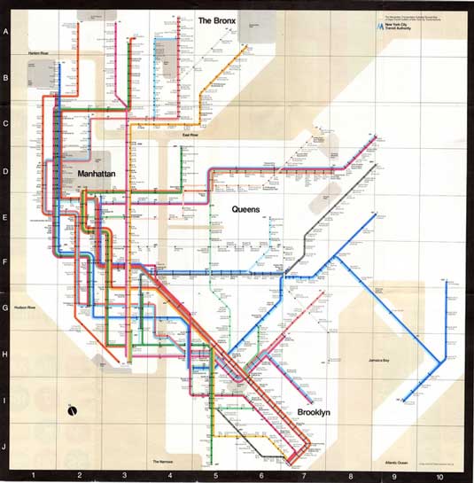
The famous 1972 NYC Subway map, designed by Massimo Vignelli, was an innovative design for a large transit system. It has and still does inspire transit maps all over the world. Obviously it's designed to the grid. It makes heavy use of the grid itself, treating the transit system and four of the boroughs of New York City more as a design, rather than an accurate depiction of miles and distance (which was the chief complaint about the design).
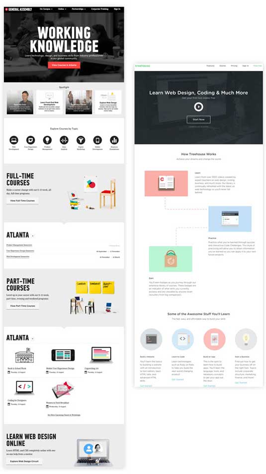
These two websites appear to use the Ro3 if you look above the scroll. but as the entire pages are viewed, it's obvious the pages were designed to the grid.
Here's some key points to remember with the grid as a basis of your UI design:
- The grid is a guide and not a prison of lines and cubes.
- It will help organize your design and placement in the same way the F-pattern, Z-pattern, Rule of 3s and the Golden Rectangle does.
- It is just a beginning layer that helps you place segments of elements on top of it.
- They can be stacked perfectly, or swirl around the page, but in a logical order for the eye to scan and the brain to react.
Why this matters
Since vision is the strongest human sense, a web page must tell a story at first sight.
Your user knows within 10-20 seconds if they're going to leave - you must convince them as quickly as possible.The overall design tells a story and the user must be led from the first chapter of that story to the last. These design patterns are the solution to that challenge.
All creatives have that self-doubt when it comes to design choices. "Is that the right placement?" "I'm finished but not happy" "What can I do to make sure I'm making the right choices?" The layout patterns, when used correctly will help design the UI (or any web related design issue) for maximum efficiency as well as create visual harmony. And since beautiful things work better, all these tactics help craft the best user experience possible.
For more visual UI design tips, take a look at the free e-book Web UI Design Best Practices. It's a thorough but fast-reading guide that teaches through analyzing 33 examples of great design from companies like Houzz, Fitbit, Google, and AIrbnb.
Words: Speider Schneider
Speider Schneider is a product designer who has worked on projects for Disney/Pixar, Warner Bros., Harley-Davidson, ESPN, Mattel, DC and Marvel Comics, Cartoon Network and Nickelodeon among other notable companies. He has also authored hundreds of articles on web design and UI/UX
Liked this? Try these...
- 11 great UI designs
- 10 steps to engaging user experience
- Download the best free fonts

The Creative Bloq team is made up of a group of art and design enthusiasts, and has changed and evolved since Creative Bloq began back in 2012. The current website team consists of eight full-time members of staff: Editor Georgia Coggan, Deputy Editor Rosie Hilder, Ecommerce Editor Beren Neale, Senior News Editor Daniel Piper, Editor, Digital Art and 3D Ian Dean, Tech Reviews Editor Erlingur Einarsson, Ecommerce Writer Beth Nicholls and Staff Writer Natalie Fear, as well as a roster of freelancers from around the world. The ImagineFX magazine team also pitch in, ensuring that content from leading digital art publication ImagineFX is represented on Creative Bloq.
