5 design tips for creating travel websites
Germaine Satia of Infinvision reveals how to design travel websites that are simple to use and beautiful to look at.
03. Full-screen images worth 1,000 words
Aside from the music we hear or the food we taste, a good number of our travel memories are linked to what we see. So it stands to reason that high quality, are an essential ingredient in the digital experience that designers are providing travelers.
Large images not only entice travelers and gets them excited about their upcoming trip, but for many brands it's an effective storytelling tool. By carefully selecting the images that are used, one can significantly reduce the amount of text that has to appear on an interface, thus making the interface simpler.
The website for Praktik Hotels welcomes visitors with a simple "Follow Me…" text and as the user scrolls, a fashionably-dressed lady takes our hand and guides us on a journey through rooftops and markets in Madrid and Barcelona, homes of Praktik hotels.

Other than the discretely placed links in the top left corner of the screen, the focus is on the images which blend fashion and metropolitan sophistication.
The individual websites for each of the brand's hotels also welcome visitors with a statement image that showcases the style and vibe of each hotel. No long, wordy ramblings (though there are dedicated History and Design pages for those seeking more information).
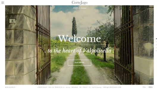
Italian bed & breakfast Corte Jago's website is very much image-driven. The homepage uses five carefully selected images which, together with five short and impactful phrases, tell the story of the experience that guests can expect.

The font used is big and bold but very easy on the eyes and never overpowers, nor does it clash with the images.
Get the Creative Bloq Newsletter
Daily design news, reviews, how-tos and more, as picked by the editors.
Let's Travel Somewhere is one part photojournalism and one part destination inspiration. The focus is on high-quality pictures that immerse readers into the reality of life in every corner of the world, be it the DR Congo or Switzerland.

Visitors to the website are immediately thrown into a different reality from the homepage all the way through each destination's story. Bold photography is showcases along with narrative on simple, white background pages.
04. Layer up with transparencies
Transparencies allow designers to tackle various needs at once.
They allow users to see through different layers of content
They can be very effective when used as a rollover effect
They also help soften up certain images and can lend a touch of refinement to an otherwise dull image.
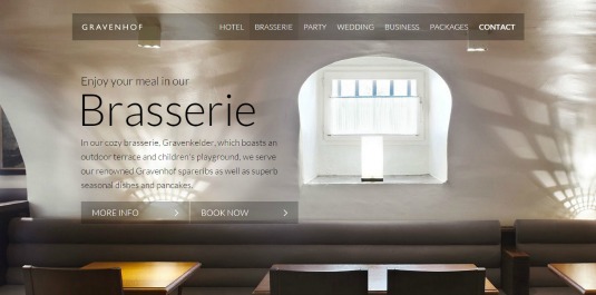
The first thing that stands out on the website for Belgium's Gravenhof Castle is the fact that the navigation bar is contained within a transparent rectangular container.

Rather than create a navigational bar with its own fixed space (thus eating up precious screen real estate) this design uses a transparency to integrate the navigation bar into the images used on each of the site's pages. The result is a very light interface.
One's appreciation of the images is never interrupted by the text and one's ability to read the text is never hindered by background images. All thanks to the transparency which helps separate these two elements. Key call-to-actions such as "Book Now" and "More Info" are always clear and visible no matter which page one falls upon.
The luxury One & Only Resorts group ups the ante when it comes to transparencies and uses it full-screen on their homepage. Scrolling from top to bottom, various content is presented with varying degrees of transparency.

In this particular case the transparencies lend a touch of calm and refinement, which goes along well with the brand's luxury resort offerings.
Berlin's Hotel Zoo uses transparencies on its hotel description and rooms pages to display text. Because showcasing the hotel's décor is crucial to engaging potential guests and securing a reservation, using transparencies to display text on the images means that one's view of the images is never sacrificed.

Yet at the same time the text is present as a non-intrusive support for the images.
05. Classic appeal with Black & White
Black & white is a classic and ever-present style that is used by designers in different industries, be it interior design, photography or cinema.
And of course, digital designers are also embracing this design style, using it to infuse websites with simplicity and a focus on the essentials.
To match the overall black & white interior design of its hotel, the website for Hotel Emile also uses a basic black & white colour scheme to showcase the brand's vibe.

In addition, with the hotel being located in Paris' Marais district – known for its blend unique blend of urban chic – the use of black & white on the site further encapsulates not just the hotel brand, but its location.
The Ludlow Hotel uses black & white images – reminiscent of classic print magazines – all through its website to set the tone for visitors. Here the timelessness of black & white captures the special blend of chic and urban grittiness that are associated with both the hotel's neighborhood and the Ludlow brand itself.

Room descriptions and other information about the hotel are kept to a minimum, with just a few bullet points telling you exactly what you need to know. There is no obvious chest-thumping and self-promotion, yet you can't help but notice and pay attention.
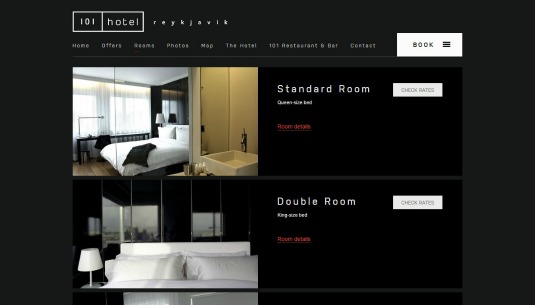
A stark, dark background and white text gives the 101 Hotel's website a very simple and clean look. Important call-to-actions such as "Book" and "Check Rates" stand out easily thanks to the contrast with the dark background.

Images showcasing the property also pop out, but never aggressively. It all feels intimate and easy, which is quite fitting for a boutique brand.
Conclusions
As these examples showcase, there are a variety of ways of simplifying and streamlining your designs for travel websites and apps. You can explore subdued colours. You can go for a layout that is driven by full screen images or content blocks.
The final decision as to which technique to use depends on the brand, the type of content that needs to be showcased and the type of experience that the brand wishes to create for its users. As you evaluate the needs of your next travel design project, you can also look into our latest travel & tourism digital trends report for insights that can help you better focus your approach.
Furthermore, we should always remember that simplicity isn't just about aesthetics. It's about boiling things down to the essentials. It's about taking the time to identify and understand those items that are at the very core of a brand, finding the best way of showcasing them and engaging travellers.
Words: Germaine Satia
Having spent 14 years as a Product Manager and Quality Analyst in the US and France, Germaine Satia now runs Infinvision, a brand experience consultancy. Together with her design and development team, she oversees web and mobile projects, leads workshops, and helps her clients design authentic digital experiences for their audiences.
Like this? Read these!
- How to diagnose your SEO with Google
- Our favourite web fonts – and they don't cost a penny
- Brilliant Wordpress tutorial selection

Thank you for reading 5 articles this month* Join now for unlimited access
Enjoy your first month for just £1 / $1 / €1
*Read 5 free articles per month without a subscription

Join now for unlimited access
Try first month for just £1 / $1 / €1
The Creative Bloq team is made up of a group of design fans, and has changed and evolved since Creative Bloq began back in 2012. The current website team consists of eight full-time members of staff: Editor Georgia Coggan, Deputy Editor Rosie Hilder, Ecommerce Editor Beren Neale, Senior News Editor Daniel Piper, Editor, Digital Art and 3D Ian Dean, Tech Reviews Editor Erlingur Einarsson, Ecommerce Writer Beth Nicholls and Staff Writer Natalie Fear, as well as a roster of freelancers from around the world. The ImagineFX magazine team also pitch in, ensuring that content from leading digital art publication ImagineFX is represented on Creative Bloq.
