4 great examples of food websites
These sites are heaped with ingredients that make a feast for the eyes.
Gone are the days of PDF restaurant menus and plates with bad lighting. Modern food sites are more likely to involve editorial-inspired layouts and creative directors arranging place settings for longer than diners are seated at them. Here are the key ingredients you need for a good food site. Make sure you also see our guide to
Mouth-watering photography
We eat with our eyes first, so not only photography but photo editing must be a priority. The food needs to looks bright and appetising, with no social media-like filters. Plating must be perfect, and dishes, cutlery and glasses carefully arranged – or at least looking thoughtfully haphazard.
Appetising colours
Choosing colours for backgrounds and type can be challenging when it comes to really colourful food. For backgrounds, tie all the elements together by sampling a colour from the representation of the food itself, then lighten it or darken it to bring in something new without distracting from what's on the plate. Do the reverse (darker or lighter) for the typography, or sample a new complementary colour.
Simple typography
Keep typography simple so as to not overshadow the food. Draw inspiration from restaurant menus, cookbooks or handwritten recipes. Many type families have weights that aren't needed, but contrast between content (like subheadlines and ingredients) will leave a good taste.
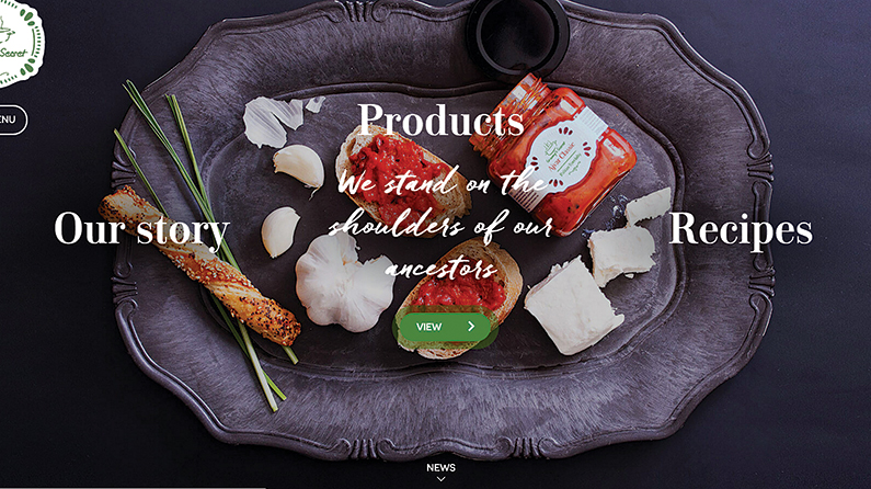
Granny's Secret has a Didone serif and a script face that invokes the feeling of Granny's handwritten recipes.
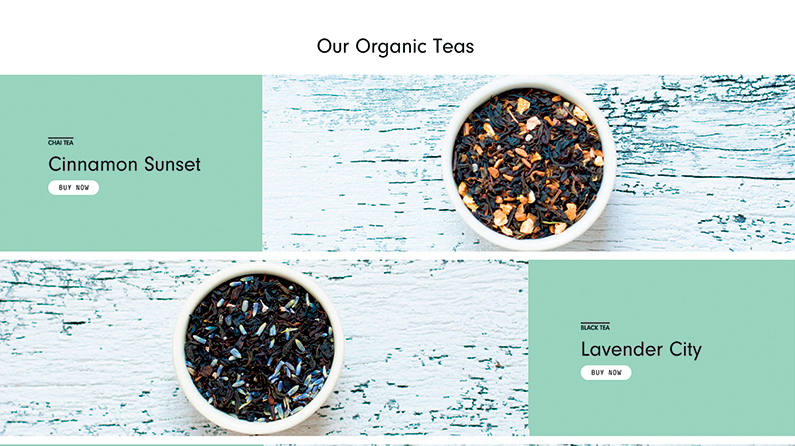
Steep and Jar puts care into consistently framed and edited photos of its teas.
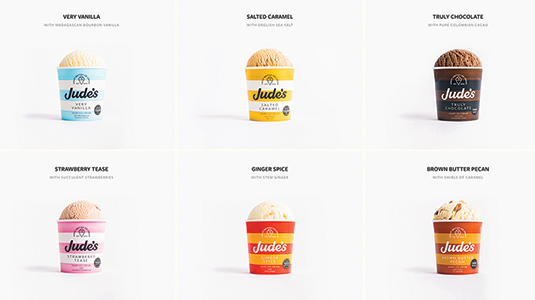
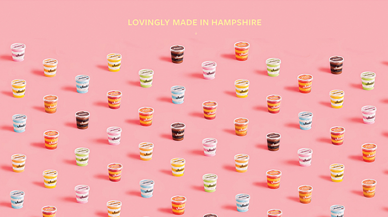
Jude's Ice Cream uses tints from its product packaging to tie all the flavours together.
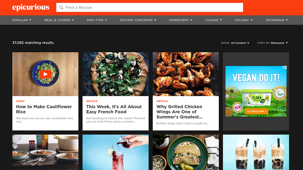
Epicurious decided to ditch the standard, boring, paginated list of search results in favour of a Netflix-style shopping experience.
This article was originally published in net magazine issue 281, with additional contributions from the Creative Bloq team. Buy net 281 here.
Read more:
- Food art: 10 jaw-dropping examples of culinary craft
- This tasty typography turns food into words
- How to photograph food: 10 pro tips

Thank you for reading 5 articles this month* Join now for unlimited access
Enjoy your first month for just £1 / $1 / €1
*Read 5 free articles per month without a subscription

Join now for unlimited access
Try first month for just £1 / $1 / €1
Get the Creative Bloq Newsletter
Daily design news, reviews, how-tos and more, as picked by the editors.

Sam is a designer living in Austin, Texas, who speaks and writes extensively about web and product design, diversity, inclusion, and equity. In 2011, she wrote the first university course on the topic of Responsive Web Design. She is currently Design Director at thoughtbot, and serves on several design advisory boards in Austin.
