The 4 biggest myths about mockups
There's a number of popular misconceptions about creating mockups. Jerry Cao of UXPin puts us straight.
03. You should hand off mockups to developers
Another relic from the waterfall age, the practice of handing off already finished mockups to developers is coming to an end. The new line of thinking is that developers should be brought in as early as possible – they shouldn't be given mockups, they should help make them.
As we mentioned about, feedback influences design. The assembly line, "this is done, now it's your turn" method of doing things just isn't feasible any more. Your developers have input that can help you, so you must incorporate their opinions from the start. At the very least, you'll save time having to go back and redoing something if they point out why it won't work before it becomes an issue.
And this advice isn't just applicable to mockups, but the design process as a whole. Developers should have their say at every major iteration and milestone, not the least of which is the initial brainstorming session where some of the most important decisions are made.
Don't feel embarrassed if your company still follows a “chuck it over the cubicle” mentality. From our research speaking with designers from Fortune 500 companies, we've found that waterfall design still survives because executives usually aren't incentivized to suddenly rock the boat.
When you collaborate from the beginning, you also share the responsibility, which is usually a huge turn-off for tenured executives who've lead product teams for years and enjoy the security of plausible deniability (“Clearly it's design's fault since we shipped it with all the features on-time exactly as requested!”).

Realistically, you won't be able to enact overnight the cultural change required for better designer and developer collaboration. That's the subject of a separate book entirely.
You can, however, slowly chip away at the system by just talking to developers more and involving them informally through over-the-shoulder review sessions. At the start of projects, ask developers what makes their lives difficult and frame collaboration as a means of helping them to avoid last-minute changes. At a minimum, check in periodically (even if it's just 15 minutes) to hear their honest concerns about your mockup or prototype.
Get the Creative Bloq Newsletter
Daily design news, reviews, how-tos and more, as picked by the editors.
The bottom line is that the waterfall model just doesn't work any more, so the farther you get from this ideology, the better. Never underestimate the power of small steps, because once developers start to see the value of even minor involvement, you may find them as your greatest supporters.
04. You need to master Photoshop
Photoshop is the tool most associated with mockups. Starting as photo-editing software, Photoshop has evolved into a go-to tool for all things visual. As a means to create and build images from scratch, Photoshop is an artistic medium in its own right, and as such requires its own individual skill and expertise to use. But if you can't use Photoshop, does that mean you can't make mockups?
Photoshop is by no means the only medium for making mockups. Graphic-editing software works best for that pixel-perfect level of detail, but if Photoshop is beyond you, you can still use Sketch App, which was built from the ground up for web design. From our own experience, we feel that Sketch App has less of a learning curve than Photoshop.
As described in the free Guide to Mockups, multi-screen view is perhaps our favorite feature of Sketch. Even though mockups focus more on visual design details (assuming mid to high fidelity), you never want to lose sight of the overall flow of the experience.
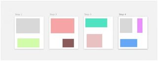
Alternatively, you could even use full-fidelity wireframing and prototyping tools for mockups. These tools usually help speed up the time it takes to duplicate common elements with plenty of built-in libraries and drag-and-drop functionality.
From all the tools we've played around with, the greatest benefit is that you can add interactivity with a few clicks, immediately bridging the gap from static design to useful prototype. Regardless of the tool you choose, however, just remember that you understand the principles of visual and interaction design.
Coded mockups
If, however, your technical skills are up to snuff, you can even create a coded mockup. The benefit here is that you create an even larger bridge directly across to development (in a sense, bypassing prototyping entirely).
The founder and CEO of Spark59 and development speaker Ash Maurya recommends building mockups directly with HTML/CSS/Javascript/Ruby on Rails, if you can.
This circumvents entirely the difficulties in translating mockups into code, and ensures everything you create – including gradients, fonts, and effects – are feasible in the end product. Knowing what you can and can't do right from the beginning eliminates a lot of the waste, including time.
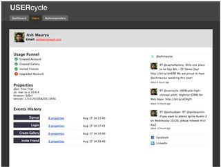
Feel free to choose the method you feel most comfortable with, whether it's a pixel-perfect rendition in Photoshop or Sketch, a customized collage of preexisting elements from prototyping software, or a fully-coded design in HTML.
You can even draw out your ideas on paper if you prefer (though that's the hardest to digitize). Any method will do, as long as you don't use a lack of skill as an excuse to skip over mockups.
Conclusion
If you ask us, mockups are just as essential to design as wireframes and prototypes, despite that the latter two seem to be much hotter topics in modern UX design. By honing in on visuals, mockups fill a niche the other two cannot.. We hope this article cleared up a lot of the confusion about mockups out there today, because they deserve better than a bunch of misguided myths.
For more practical advice on different types of mockups, download the free 80-page Guide to Mockups. Questions are answered regarding fidelity, process, and tools, along with best practices for Photoshop & Sketch.
Words: Jerry Cao
Jerry Cao is a content strategist at UXPin — the wireframing and prototyping app — where he develops in-app and online content for the wireframing and prototyping platform.
Like this? Read these!
- 7 best practices for creating mockups
- How to start a blog
- Useful and inspiring flyer templates

Thank you for reading 5 articles this month* Join now for unlimited access
Enjoy your first month for just £1 / $1 / €1
*Read 5 free articles per month without a subscription

Join now for unlimited access
Try first month for just £1 / $1 / €1
The Creative Bloq team is made up of a group of design fans, and has changed and evolved since Creative Bloq began back in 2012. The current website team consists of eight full-time members of staff: Editor Georgia Coggan, Deputy Editor Rosie Hilder, Ecommerce Editor Beren Neale, Senior News Editor Daniel Piper, Editor, Digital Art and 3D Ian Dean, Tech Reviews Editor Erlingur Einarsson, Ecommerce Writer Beth Nicholls and Staff Writer Natalie Fear, as well as a roster of freelancers from around the world. The ImagineFX magazine team also pitch in, ensuring that content from leading digital art publication ImagineFX is represented on Creative Bloq.
