3 websites that do one thing well
To ensure your message hits home, stop trying to do everything and focus on what youre really trying to say, says Gene Crawford.
Many times I've seen a design brief on a new website project and it calls for three or four different calls to action and has five or six different audience profiles. It's a constant struggle to work with all the stakeholders to narrow down that focus, but it is always a battle worth fighting.
Any sort of marketing or messaging can only really do one thing well. If you try to make everyone happy, then you will most likely wind up making no one happy – or worse, you won't create any conversions or sell any products.
Build your own website with these brilliant WordPress tutorials
It's not all about minimalism. As a conceptual approach, minimalism is a tool in your toolbox of design thinking. If you can keep this concept of 'doing one thing' at the forefront of your mind when planning a project, and work hard to stick to it, the rest will fall into place.
The reasoning for this approach is that we only have one shot to engage with someone. All things being equal, we aren't going to get much in the way of people's time when they first come across a website. It's not all about impressing them, it's about giving them the one thing they want and encouraging them to do the one thing you want them to do.
So, if the website sells socks, set things up so users can see the product and provide what they need to make a decision to buy the socks at once. I know this seems very simple, but I am constantly amazed at the number of websites that don't put their 'one thing' front and centre.
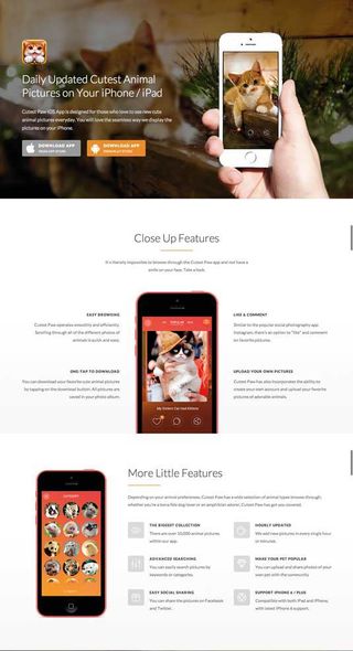
Cutest Paw
The app download page for Cutest Paw, a cute animal pic sharing app is for, well, downloading the app. It's the core feature of the page – that and showing off some cute animals.

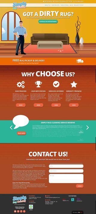
Simply Rug Cleaning
The website for Simply Rug Cleaning really wants you to set up an appointment to have your rug cleaned. So the one thing you see first is a big 'Schedule an appointment' button.

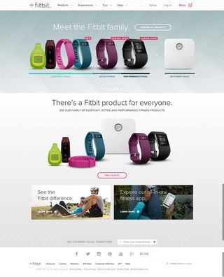
Fitbit
Popular fitness device Fitbit has to overcome the issue of showing you what the device looks like. The one thing the website focuses on is displaying plenty of pictures of all of the company’s devices.

Words: Gene Crawford
Gene’s mission is to work tirelessly to provide inspiration and insight for developers. This article was originally published in net magazine.
Like this? Read these...
- Discover the best blogging platform
- The designer's guide to working from home
- How to start a blog

Thank you for reading 5 articles this month* Join now for unlimited access
Enjoy your first month for just £1 / $1 / €1
*Read 5 free articles per month without a subscription

Join now for unlimited access
Try first month for just £1 / $1 / €1
Get the Creative Bloq Newsletter
Daily design news, reviews, how-tos and more, as picked by the editors.
The Creative Bloq team is made up of a group of design fans, and has changed and evolved since Creative Bloq began back in 2012. The current website team consists of eight full-time members of staff: Editor Georgia Coggan, Deputy Editor Rosie Hilder, Ecommerce Editor Beren Neale, Senior News Editor Daniel Piper, Editor, Digital Art and 3D Ian Dean, Tech Reviews Editor Erlingur Einarsson, Ecommerce Writer Beth Nicholls and Staff Writer Natalie Fear, as well as a roster of freelancers from around the world. The ImagineFX magazine team also pitch in, ensuring that content from leading digital art publication ImagineFX is represented on Creative Bloq.
