3 strategic uses of the hamburger icon
Minimalism is all well and good, but if you want users to interact with something, they need to be able to see it. Don't hide the good stuff.

I've been a long-time proponent of not hiding the important stuff you want your users to get at on your website ... and that means your main navigation. A lot has been written about the use of a hamburger icon, as well as other design patterns that similarly obfuscate navigation choices.
I'm not so much of the school of thought that is all about picking on the hamburger icon specifically. I do think it can work in some situations, for a targeted user type. In a certain setting, it may actually be appropriate and expected.
When reviewing designs for good UX, I like to ask a simple question: where is all the stuff located? Most of the stuff a user will interact with, where most of the user experience is, happens in a single view or page. So check for what you're hiding.
Keeping things like the main navigation, content or related imagery out of sight initially will only make it more likely that your user will never actually reach it. Keeping the interface nice and clean by hiding items under a side menu may not be the way to go.
This brings me to my main point, which is that you need to show the user the things you want them to interact with. This is especially the case with navigation items, which should be very obvious across your website. And if you are going to employ a hamburger-based navigation system, at least use it strategically so people can get to your content, even if they don't know what the menu icon is for.
Here are three intelligent uses of the hamburger icon...
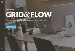
01. Grid & Flow

The hamburger icon on the website for web design firm Grid & Flow is used strategically. It hides background information, ensuring the focus is on the prominently placed link to the agency's portfolio.
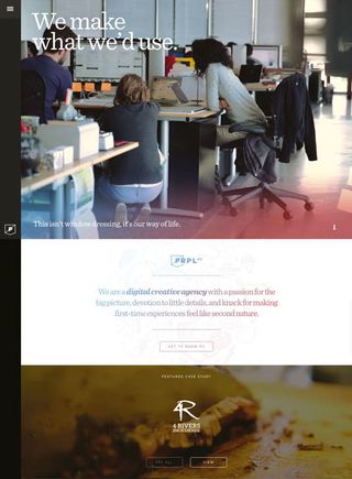
02. PRPL

The website for web design agency PRPL utilises the hamburger for its main navigation, but you can also scroll down and navigate the site without ever discovering what’s under the icon.
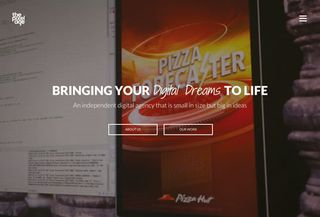
03. Pixelage

The site for web design firm Pixelage uses a hamburger icon-based menu in a way that makes its homepage more of a splash page, moving users in one of two directions, based on the visible links.
Words: Gene Crawford
Liked this? Read these!
- How to create a minimalist site people won't hate
- Hands-on review: Adobe Illustrator CC
- Photoshop tips, tricks and fixes to try today

Thank you for reading 5 articles this month* Join now for unlimited access
Enjoy your first month for just £1 / $1 / €1
*Read 5 free articles per month without a subscription

Join now for unlimited access
Try first month for just £1 / $1 / €1
Get the Creative Bloq Newsletter
Daily design news, reviews, how-tos and more, as picked by the editors.
The Creative Bloq team is made up of a group of design fans, and has changed and evolved since Creative Bloq began back in 2012. The current website team consists of eight full-time members of staff: Editor Georgia Coggan, Deputy Editor Rosie Hilder, Ecommerce Editor Beren Neale, Senior News Editor Daniel Piper, Editor, Digital Art and 3D Ian Dean, Tech Reviews Editor Erlingur Einarsson, Ecommerce Writer Beth Nicholls and Staff Writer Natalie Fear, as well as a roster of freelancers from around the world. The ImagineFX magazine team also pitch in, ensuring that content from leading digital art publication ImagineFX is represented on Creative Bloq.
