3 great examples of website sign-up pages
For many sites, conversion is key. Gene Crawford explores some of the secrets behind what makes a great sign-up page.
If you're running a business that relies on people signing up, signing in or otherwise completing a form of some kind on your website, you'll know that getting them through that process is paramount. There are a number of things you can do to make sure your sign-up process is firing on all cylinders.
The big concept here is 'conversions' – by which we mean 'moving people through our sign-up process'. Anything you do design-wise should be engineered towards improving this.
Try to keep the user's state of mind at the forefront of what you do. You have roughly eight to 10 seconds (if that) to gain someone's trust and secure the all-important conversion.
Convince quickly
I like to ask questions like: Does the page describe what the person is signing up for? Does the page show how the sign-up process works? Does it demonstrate the end result? Does it explain why?
You see, when we as designers are working, we typically think the end user is like us: astute, optimistic and familiar with (or at least interested in) what we are doing. In short we assume they have some level of desire to get past that sign-up process.
This is often not the case. People don't really care – and furthermore, they have little time or patience to put up with things that don't really hit them over the head. So make sure at the point of sign-up or purchase that your site has what it takes to convince someone to care and complete.
01. Design for the Social Web

Design for the Social Web by Joshua Porter is a great resource for providing insights into the 'how' and 'why' of people using your application.
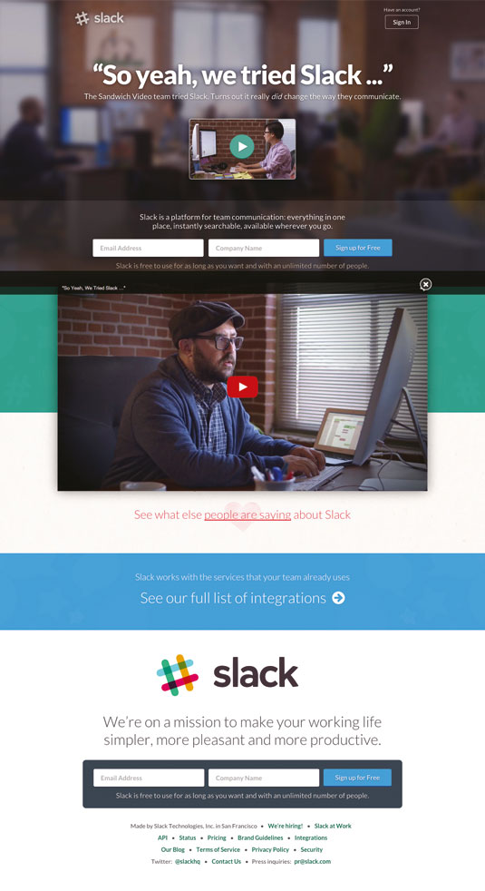
02. Slack

The homepage for Slack – the app for team communication – fires on all cylinders when it comes to getting you to sign up. Even the form looks quick and easy.
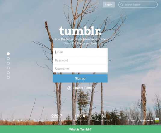
03. Tumblr

The homepage for blogging and social sharing platform Tumblr boasts all the essentials of a clear and quick sign-up process. You just know that all you have to do is complete that easy form and you'll be in and blogging within seconds.
Words: Gene Crawford
Gene's mission is to work tirelessly to provide inspiration and insight for developers. His recent projects include unmatchedstyle.com. This article originally appeared in net magazine issue 266.
Liked this? Read these!

Thank you for reading 5 articles this month* Join now for unlimited access
Enjoy your first month for just £1 / $1 / €1
*Read 5 free articles per month without a subscription

Join now for unlimited access
Try first month for just £1 / $1 / €1
Get the Creative Bloq Newsletter
Daily design news, reviews, how-tos and more, as picked by the editors.

The Creative Bloq team is made up of a group of design fans, and has changed and evolved since Creative Bloq began back in 2012. The current website team consists of eight full-time members of staff: Editor Georgia Coggan, Deputy Editor Rosie Hilder, Ecommerce Editor Beren Neale, Senior News Editor Daniel Piper, Editor, Digital Art and 3D Ian Dean, Tech Reviews Editor Erlingur Einarsson, Ecommerce Writer Beth Nicholls and Staff Writer Natalie Fear, as well as a roster of freelancers from around the world. The ImagineFX magazine team also pitch in, ensuring that content from leading digital art publication ImagineFX is represented on Creative Bloq.
