18 ways Doctor Who can make you a better designer
How Doctor Who taught Jason Cranford Teague to design.
Doctor Who has been with me since the very formative years of my life. As a young pre-teen in the US of A, I discovered my life-long hero one wonderful afternoon when I turned on the local PBS (Public Broadcasting System) channel. Where I lived in the early 1980s, Doctor Who came on everyday at 5:30pm, and I watched him every day at 5:30pm.
Needless to say, the good Doctor has had a profound impact on my life, so I was not too surprised when I realized that most of the lessons I have learned as a designer over the years tied back to what I learned watching the charismatic Timelord.
01. TARDIS: Time and Relative Dimensions in Space

Design is about more than the visual (space), it's also about the temporal (time). You know, "Wibbly-wobbly, Timey-wimey… stuff". With interface design, thinking about how your work behaves in space and time has become a necessity.
02. It's bigger on the inside than the outside
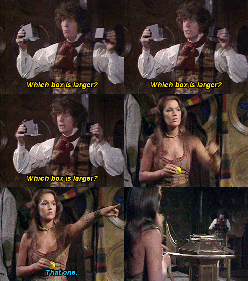
The best designs are always outwardly small and simple, but inwardly deep and complex.
03. Whenever you go into a new situation, you must always believe the best until you find out exactly what the situation's all about. Then, believe the worst

In interface design, we have something called the 'happy path' which is the direction we hope most people will be able to follow, but we have to think just as carefully about the alternatives, since those are often the spaces that our audience will be the most frustrated and need the most help.
04. The trouble with computers is, they're very sophisticated idiots. They do exactly what you tell them at amazing speeds
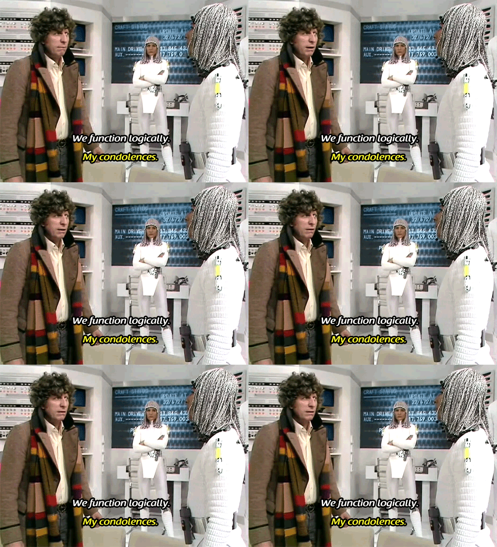
Computers are stupid. We often forget that because they are so fast at doing math. But a computer has no intuition and can't make assumptions about a persons actions, that takes the intelligence of a designer.
05. Spoilers, sweetie
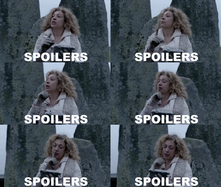
Always let the audience know what's coming up, but don't give away too much before they need to know.
Sign up to Creative Bloq's daily newsletter, which brings you the latest news and inspiration from the worlds of art, design and technology.
06. Reverse the polarity of the neutron flow

Even the most complex problems can benefit from a different point of view. I regularly turn design problems around to try to find better answers.
07. Even the sonic screwdriver won't get me out of this one!
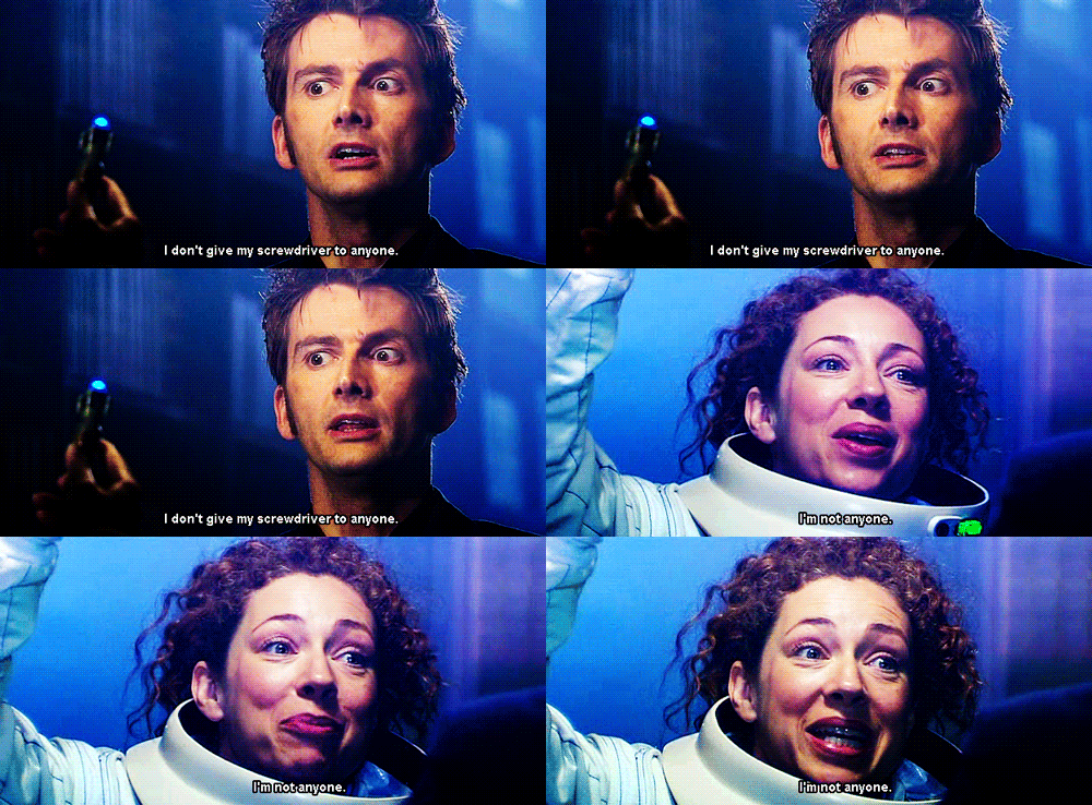
Your tools will not make you a better designer, but they can make design harder for you if they are not the right tool.
08. I've never met anyone who wasn't important
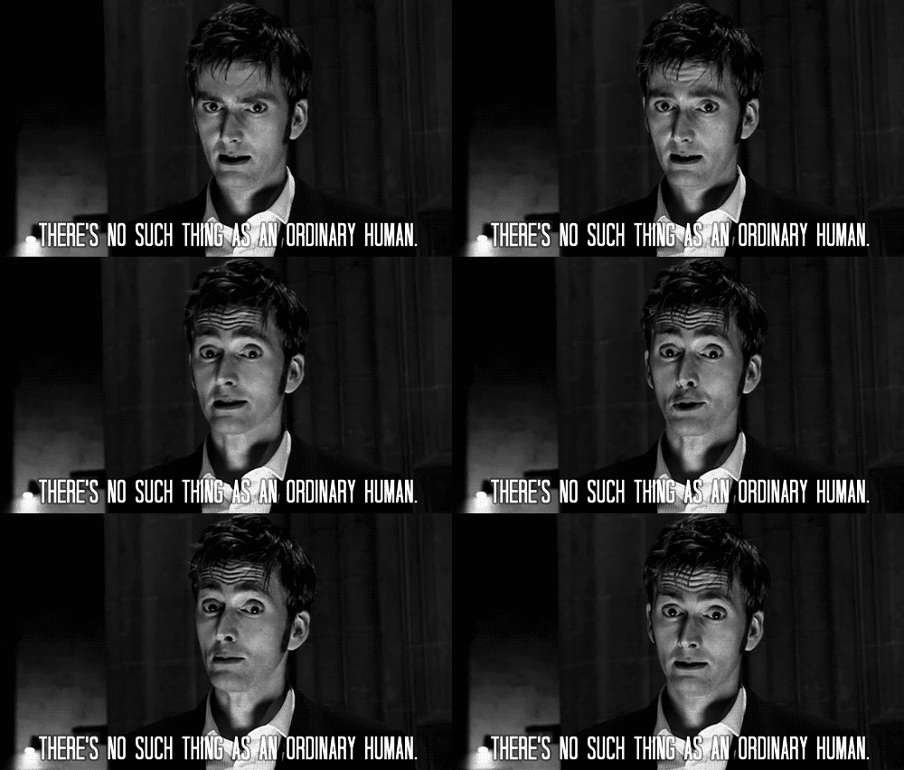
We often think about personas in design, individuals who represent our audiences, and that six test subjects is plenty. But I prefer to get out and talk to as many people as possible, I can never get enough feedback from the people actually engaging with my designs.
09. The least important things lead to the greatest discoveries
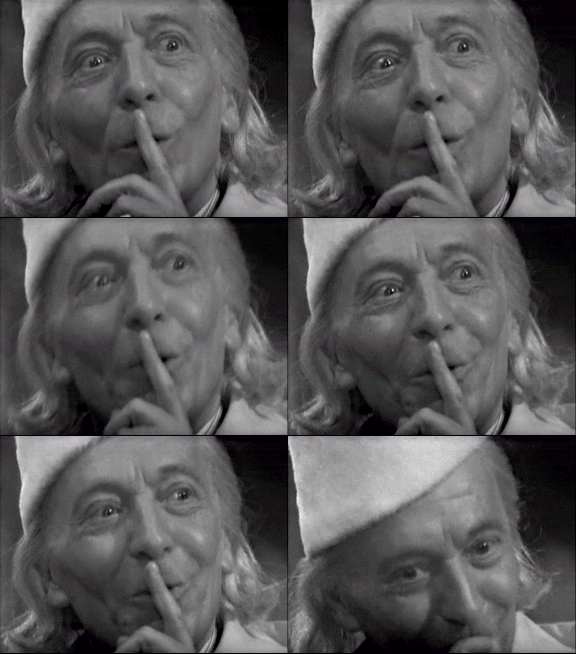
Small elements in a design often need the most attention, because they can lead to the greatest impact if done effectively.
10. Answers are easy. It's asking the right questions which is hard
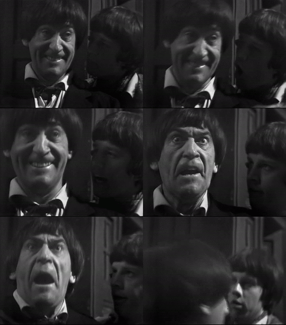
Answers are often obvious in design if you are asking the right questions, but sometimes finding the question is the tricky bit.
11. Time will tell, it always does

When the answer to design questions is not obvious, I've learned to wait and see. Either wait until the development phase or even wait until after launch to see how it works in the real world conditions before making the final decisions.
12. Hold tight and pretend it's a plan
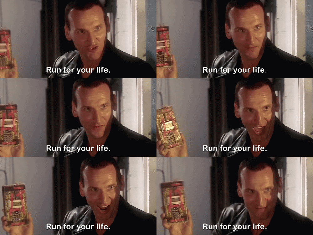
Design intuition means that I can see an answer often before I can explain it. Sometimes that means the people on my team have to trust me, which is not always a given.
13. I love humans… always seeing patterns in things that aren't there
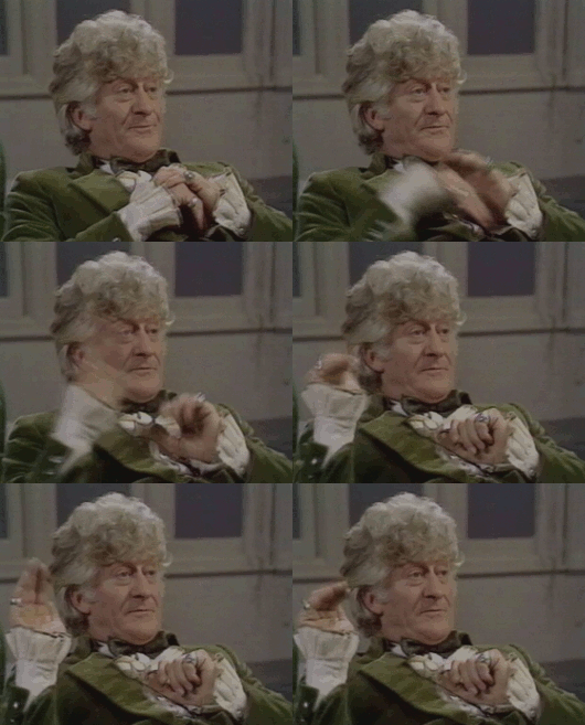
We see patterns everywhere, because we are hard-wired to do it, especially faces, phenomena known as 'Pareidolia'. This is a powerful tool for designers since we can draw audience's attention to or from objects on the page using patterns.
14. Would you like a Jelly Baby?
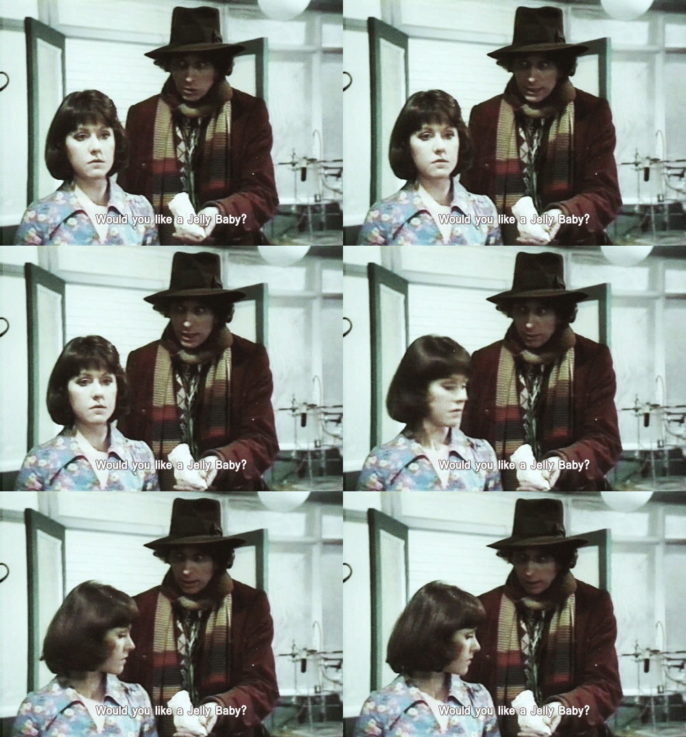
Surprise and delight are powerful tools for crafting an effective interface design. Giving something, no matter how small, to the audience always helps to get them on your side.
15. The very powerful and the very stupid have one thing in common. They don't alter their views to fit the facts. They alter the facts to fit their views
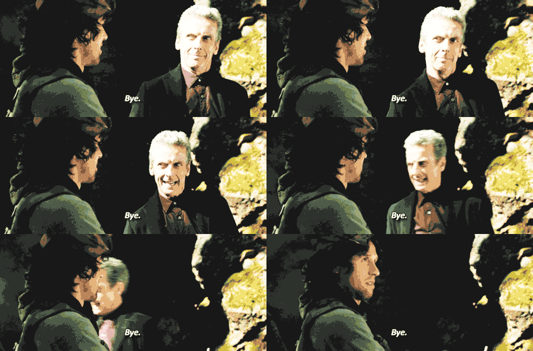
Content is the 'facts' around which we fit our design 'views', but so many designers expect their content to fit whatever they design. I always try to start with the content I am design for first, and then work to make the design fit to that.
16. There's always something to look at if you open your eyes
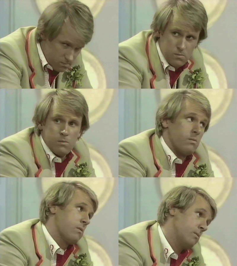
Never stop looking at your designs. You may want to walk away for a bit, or reverse the polarity of the neutron flow, but always keep the designs you are working on in the corner of your eye, even while working on something else, because you never know when inspiration will strike.
17. There's a lot of things you need to get across this universe. Warp drive… wormhole refractors… You know the thing you need most of all? You need a hand to hold
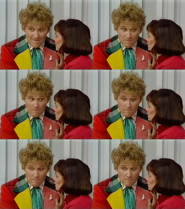
Designers are often thought of as solitary figures, busily sketching away. But what I have learned is that having partners – companions, if you will – always makes for better creation.
18. We're all stories, in the end… just make it a good one, eh?
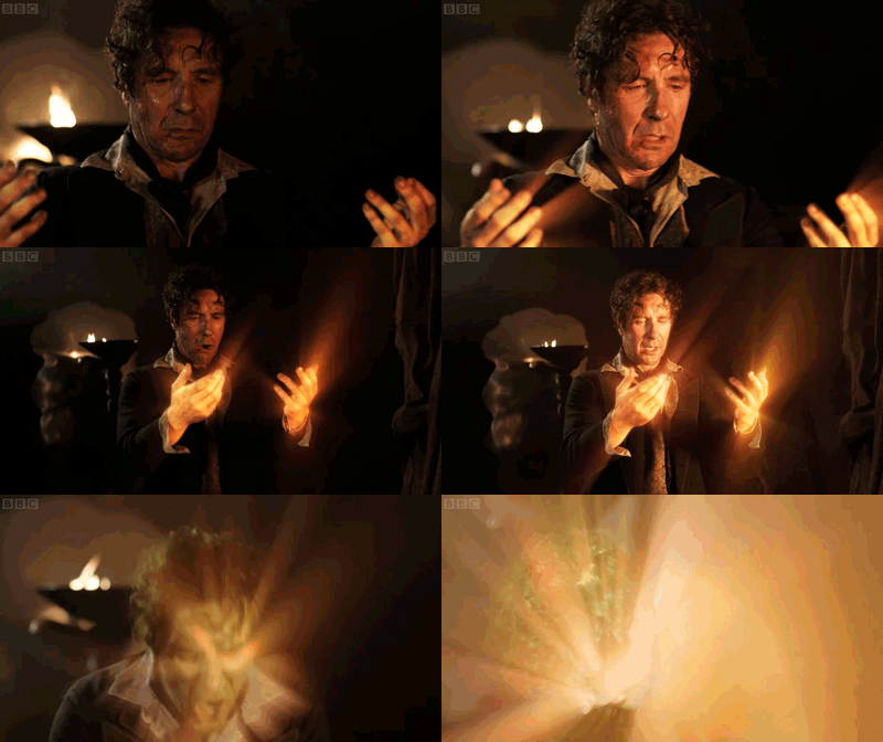
Every design, no matter how seemingly simple, should tell a good story.
Series 9 of Doctor Who starts tomorrow on BBC One in the UK.
Words: Jason Cranford Teague
Jason Cranford Teague is a Senior Creative Director at Capital One and teaches workshops on experience design for developers, development for designs, and temporal design thinking.
Like this? Read these...
- 5 things your portfolio must have
- How to start a blog
- Download the best free fonts

The Creative Bloq team is made up of a group of art and design enthusiasts, and has changed and evolved since Creative Bloq began back in 2012. The current website team consists of eight full-time members of staff: Editor Georgia Coggan, Deputy Editor Rosie Hilder, Ecommerce Editor Beren Neale, Senior News Editor Daniel Piper, Editor, Digital Art and 3D Ian Dean, Tech Reviews Editor Erlingur Einarsson, Ecommerce Writer Beth Nicholls and Staff Writer Natalie Fear, as well as a roster of freelancers from around the world. The ImagineFX magazine team also pitch in, ensuring that content from leading digital art publication ImagineFX is represented on Creative Bloq.
