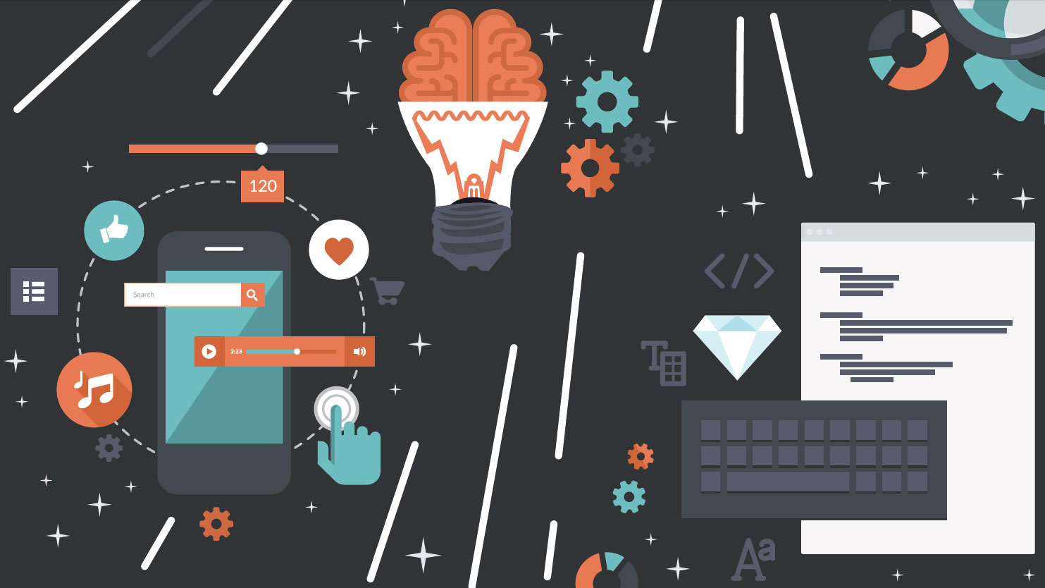
Have you ever wondered how sites like Facebook or apps like Snapchat get users to come back again and again? It's not magic; whether they know it or not, they are using psychological tools that play on our emotions and biological instincts.
The fascinating thing is that humans usually don't realise why we are drawn to something or moved to do something at first. Studying the psychological triggers that spur users on will help us understand how to utilise these to make more effective products.
At ZURB, we utilise psychological triggers and patterns to increase engagement with the products we design. Over the last two decades, we've helped over 300 companies do just this. In this article, I've pulled together 10 techniques we use at ZURB to help us build addictive and effective products.
01. Familiarity bias
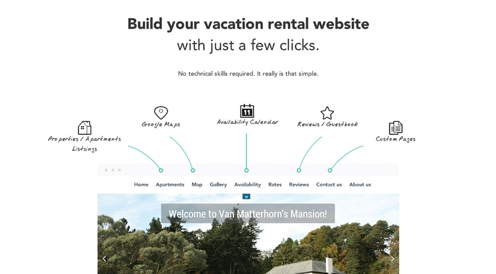
People are naturally biased towards things they find familiar. People like and trust what they know; change is scary and uncomfortable. That's why the best new products and experiences use familiar patterns.
Familiar moments create trust, while unfamiliar patterns create confusion (at least at first). When the pull-to-refresh option was first introduced on Twitter, many people were baffled. Now that interaction is near-universal. With repeated exposure, users can develop a fondness for things that they initially disliked or didn't understand.
Not every feature needs to be new for it to be memorable. When the iPhone was first released, it was a very foreign idea: it was a phone that was completely touchscreen, with no physical keyboard, and it used brand new gestures like pinch-to-zoom.
People like and trust what they know; change is scary and uncomfortable
The interface, however, was very familiar. Apple designed a calendar that resembled a physical calendar. The iPhone's virtual keypad looked like the buttons from its physical counterpart. Apple chose use familiar patterns rather than abstract representations.
Get the Creative Bloq Newsletter
Daily design news, reviews, how-tos and more, as picked by the editors.
Designing the iPhone's interface this way meant the phone immediately felt familiar to users. These interactions and metaphors for the real world helped people adapt faster while learning how to use the new device. When the iPhone's patterns started to enjoy much more widespread adoption, Apple was able to abstract its interface by pushing for flatter designs.
Takeaway: Make it easy for users to get to know you! Provide a tour or demo to introduce users to your product. Familiarity bias is powerful, so use things that are known to your audience to help them adopt your product faster.
02. Relative Value
Have you ever suffered from choice paralysis? Don't worry, we all do. It's difficult to evaluate the cost or value of an item on its own. People are wired to compare. Having a starting point to help you choose is always going to be easier than appraising with no reference.
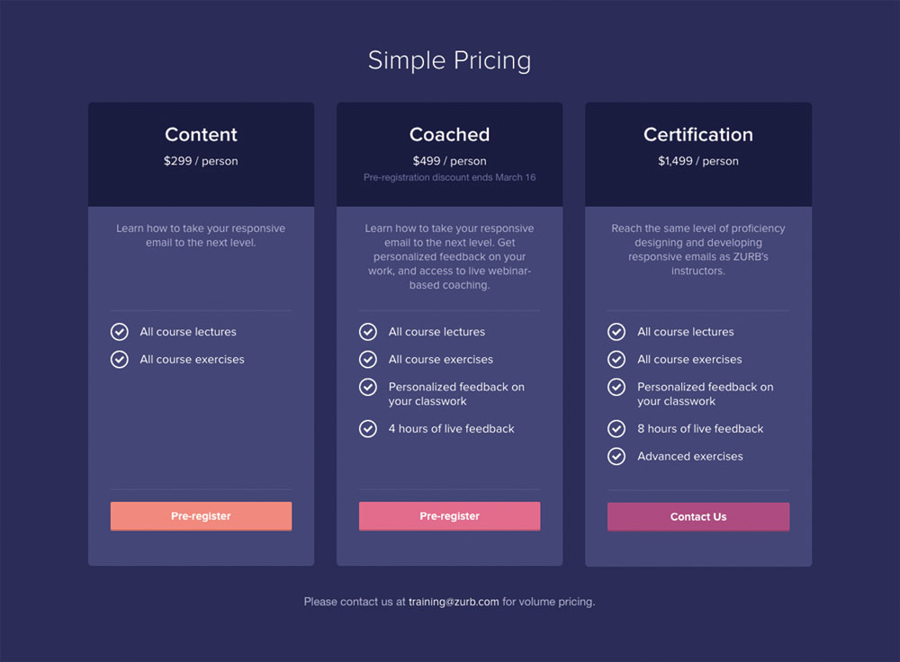
Relative value techniques work remarkably well in helping users make decisions and follow through on purchases. The tried-and-true example of this is a pricing table. When people are trying to make a decision, they feel more comfortable about it if they can compare it to something else. Making other prices visible helps reassure them they've made the right decision.
Options also make us feel in control. The pricing table for ZURB's responsive email course displays pricing in three tiers, so the user can clearly see their different options. This helps them evaluate what's included in each tier and make a better decision.
Takeaway: When possible, highlight the key features of a product in comparison to other packages or even to competitors. This makes it easier for users to make a decision and determine which option will provide the most value.
03. Bandwagon
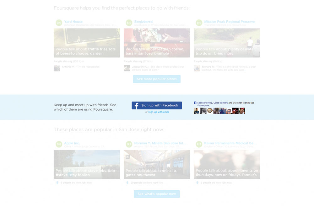
Whether it's signing up for a new app or sharing a new meme, we've all jumped onto a bandwagon at one point or another. That's because we, as consumers, are easily swayed by the behaviour and opinions of others.
When people see others enjoying a product or service it impels them to try it out as well. Even if their own personal interest in the product is low, seeing that friends, family or large numbers of people have joined already heightens their curiosity.
FOMO ('fear of missing out') can be a powerful trigger. When creating products, you can home in on this by highlighting the ways people are enjoying your product.
If a product is new, there are methods that can be employed to suggest it has a much bigger community than it may have in reality. For example, including imagery of people using the product or service can give the illusion that many people are already benefiting and enjoying the experience.
Takeaway: Highlight the activity of users' connections to demonstrate the popularity of the product or the benefits of specific features. The greater the number of users someone perceives a product to have, the more likely it is they will be swayed.
04. Authority

When people are told to do something by an authority figure, they tend to obey the direction and rarely question it. Authority can trump our own instincts.
There was a classic experiment at Yale University by psychologist Stanley Milgram that demonstrates the strength of this phenomenon. When someone posing as the teacher instructed study participants to administer an electric shock to another man posing as a fellow student when they answered a question incorrectly, 65 per cent of participants obeyed even though didn't want to. Why? Because they had been instructed to by an authority figure.
As designers, we can establish our organisation as an authority in its space through building trust. Infographics and statistics can help users see the value in something and show your organisation is reliable.
Like many other companies, on its website Campaign Monitor supports its offerings by featuring testimonials from big, trusted brands like Airbnb and 37 Signals. If the user has had positive experiences with any of those other companies, they will be inclined to feel positively about Campaign Monitor before they even start using its services.
Takeaway: By establishing authority through testimonials, data and reviews, designers can build trust in a product. Make testimonials and data clearly visible on websites and place them strategically around barrier points.
05. Faith in aesthetics

People judge a product by its appearance first, before considering its content. The visual design affects more than just surface aesthetics; users often describe more attractive sites as easier to use.
When presented with the option of a brand name medicine like Bayer Aspirin or a generic pharmacy brand, most people automatically feel like the brand name is better quality. Why? It has a lot to do with the design and look of the packaging.
Humans judge if something is trustworthy or not within seconds. For most people, the more attractive something is, the more trustworthy it seems. In a study asking people if they would trust a health website, 83 per cent of negative comments stemmed from the aesthetics rather than the content, criticising things like the visuals, text size or the name of the site.
Takeaway: Don't underestimate the power of beautiful and consistent design. Understand that users will extend their opinions about how a site looks to make assumptions about its credibility and backend functionality. Paying attention to usability alone isn't enough – for people to use your site, it also needs to look good.
06. Achievement
We have a biological drive to succeed. In turn, achieving our goals makes us feel good and increases our motivation to take on more challenges.
People want to be rewarded for their efforts and enjoy being pitted against others to demonstrate they have the drive to succeed. Nike+ and Fitbit have capitalised on this desire to win with their leaderboards. Not only do these help people reach their goals, they also promote more engagement with the companies' products.
However, keep in mind that while your users may enjoy competition, no one likes something that is completely out of their reach. Learn from Fitbit, which calculates its leaderboard for each week, instead of an overall basis.
Takeaway: Play on our instinctive drive to succeed by giving users achievable goals. Make it social so they can compete against friends, to increase user engagement and satisfaction. Go for the win!
07. Zeigarnik effect
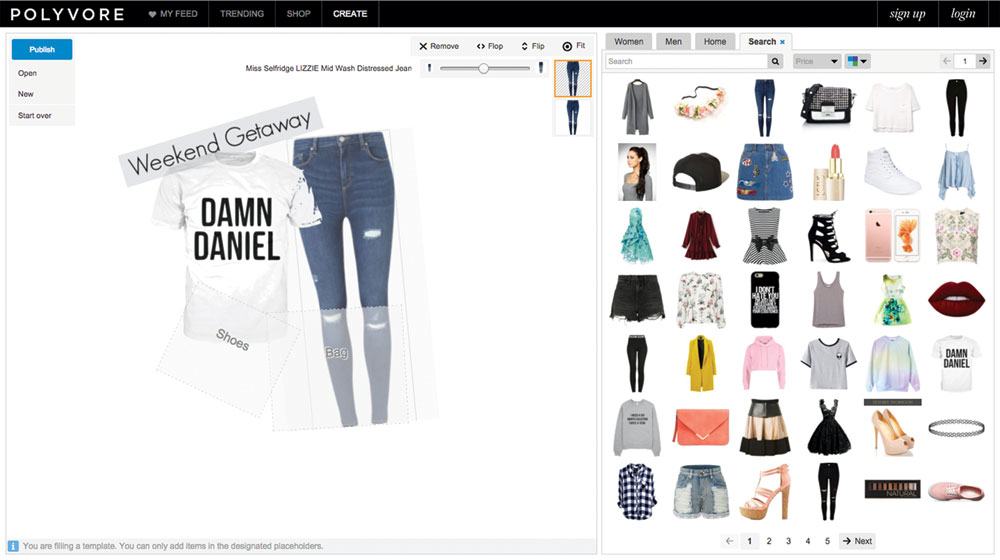
Humans love to complete things. It's satisfying to finish and celebrate. Tasks that remain uncompleted can linger in people's minds even after their attention has been focused towards new goals. It's often easier to recall details of uncompleted tasks – the closure gained from completing a task frees you from the responsibility to remember it.
LinkedIn does a great job of getting users to do things with its stepped approach. It uses notifications to inform users of how complete their profiles are, as a percentage. This plays on users' desire to finish things and encourages them to figure out how they can reach 100 per cent completion.
Takeaway: The key is to get people to start something so they want to complete it. Make barriers to entry low and vary the length of steps to keep people motivated.
08. Self-expression
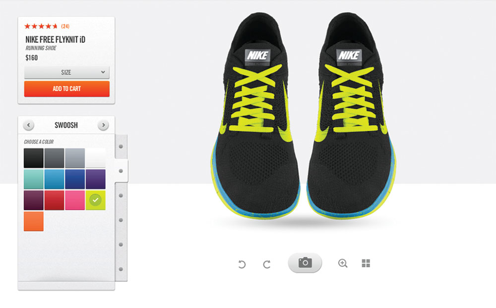
Users feel a stronger connection to products that reflect and display their own sense of identity. Customisation provides a way to transform products into unique versions that represent each user's sense of self. When people can add something to a website to make it more personal to them, they feel more ownership of it.
Nike allows its customers to customise the colours of their trainers, so they aren't stuck with the colours a company has defined for them. The standard options may not quite reflect someone's personality and could be deterring them from buying. People perceive things they own (or create) as being more valuable, and in turn want to show others how unique they are.
Takeaway: Find ways to make the user experience feel more personalised and less transactional and cold. Don't be afraid to have a little fun. Letting your users show off their style in a small way can boost their enjoyment of an app, website or product.
09. Reciprocity
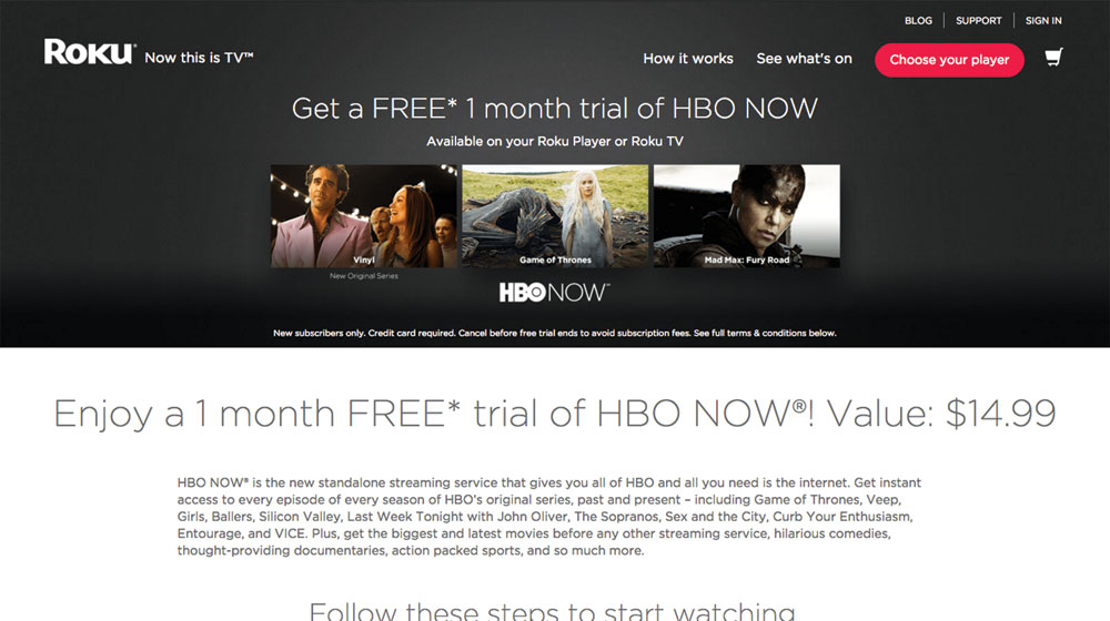
Humans don't like the feeling of owing anything to anyone. When people receive a gift or someone does them a favour, they feel socially obligated to return the favour. Designers can use this to their benefit by providing something exclusive as a gift. This can keep that feeling of indebtedness on users' minds. Offering free samples or trials is a great marketing strategy.
Takeaway: Start giving before you request anything back. Hook users by first giving something for free to create a feeling of obligation.
10. Surprise and delight
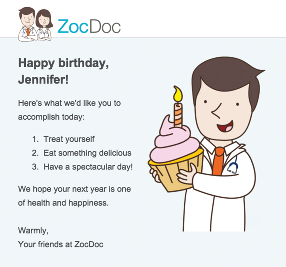
Unexpected perks can increase levels of user satisfaction and make an experience more exciting. Interesting rewards produce increased levels of dopamine in the brain.
Give a little extra thought to a product to include exciting and unexpected details. Surprise is an addictive feeling and turbo-charges emotions to foster loyalty in your products.
Takeaway: Surprise your users with a special birthday gift, even if it's just a note in their inbox. Or delight your users with an Easter egg – it'll keep them coming back and they might even share it with their friends.
Guide your users to success
Among many other things, being a product designer means understanding how users make decisions. Since the invention of advertising, we have been aware of a number of emotional and cognitive triggers. Designers can pull on these strings to help encourage users to adopt their product.
Unlike a design trend, which may change in less than a year, these triggers will remain relevant for decades. When skilfully used by a designer, these tactics can make products more intuitive and addictive, resulting in a more satisfying experience for our users.
This article originally appeared in net magazine issue 280; buy it now!

Thank you for reading 5 articles this month* Join now for unlimited access
Enjoy your first month for just £1 / $1 / €1
*Read 5 free articles per month without a subscription

Join now for unlimited access
Try first month for just £1 / $1 / €1
