9 essential responsive web design tools
We run through the hottest tools you need to build sites that work on any device.
06. Chrome DevTools
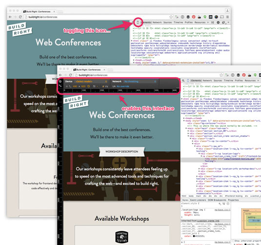
I will never forget the first time I used FireBug to debug my CSS. The ability to modify, in real time, the HTML and CSS on my page completely blew my mind. It also revolutionised how I worked on the web. Since those days, I've made the shift to Chrome and the Chrome DevTools.
Just as most modern browsers are constantly being developed, so are the developer tools that ship with them. Recently, Chrome has added a few features which I've found very useful in responsive web design. Here, I want to highlight three specific features which I think are worth looking at.
These are most easily accessed by toggling 'device mode' in the Chrome DevTools. You get there by inspecting the page and clicking the little 'phone' icon in the top-left of the inspector, next to the search icon.
Article continues below 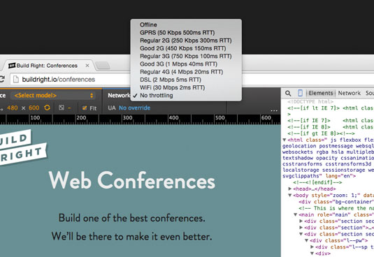
Network Simulator
Poor performance has been a huge criticism of responsive web design over the past few years. Some of the reasons for this are outlined in a post by Guy Podjarny. While I find myself more aligned with Tim Kadlec, who suggests the real fault is in the implementation, not the technique, our implementations obviously need some work (see 'Performance Budgets' boxout). Part of the conversation needs to be around tooling that helps bring performance into the conversation earlier. Chrome's network simulator does just this.
With the network simulator, you can – you guessed it – simulate various network speeds. The idea itself isn't new; we've been able to do this for a while now with other tools. However, having this ability right in Chrome DevTools brings it immediately to the forefront of the development process – where it should be.
Screen Emulator
Sign up to Creative Bloq's daily newsletter, which brings you the latest news and inspiration from the worlds of art, design and technology.
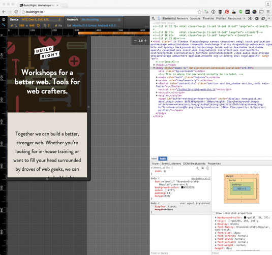
The screen emulator does more than just change the size of the viewport to match the size of a specific device – it also specifies the user agent string and pixel ratio. There are a handful of very useful presets, and you can also create your own and save them for later use. For more information on how Chrome's device mode works, check the Chrome developer site.
Media Query Inspector
Much of our work in responsive web design involves the serving of style adjustments to specific subsets of media types and features. You and I call those media queries, and the media query inspector in Chrome's DevTools makes it very easy to dig into those queries.
You can bring this feature on-screen by clicking the 'media query' icon. Assuming the site you're inspecting has media queries, you'll see a series of coloured lines across the top of the inspector. Blue represents max-width queries and orange represents min-width queries, while green represents query widths within a range.
Clicking these coloured bars resizes the mock-viewport and shows you the width at which those styles apply. You can also right-click the coloured bars to reveal where the queries they represent live in the source. All quite useful!
07. BrowserSync
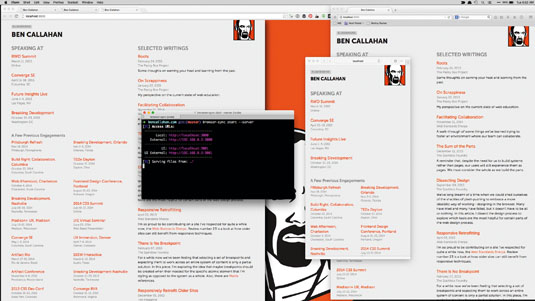
One big challenge these days is how we accommodate the growing population of devices on the market. Even if you only focus on the top six or eight devices, testing and debugging can feel like a serious hindrance to your productivity.
Enter BrowserSync; a free, open source tool for testing and debugging sites across all the devices in your testing lab. Not only does it sync the URL of any browser, it also syncs scroll position, clicks, form inputs, toggles and submits, and refreshes or injects CSS as you make changes. It comes with a slick UI (available by default at localhost:3001) and includes the open source project weinre which enables you to remote debug any of the devices connected to your localhost.
BrowserSync has an official Grunt plugin and works seamlessly with Gulp. It's also got an API for those looking to develop other integrations. When you're dealing with today's web, BrowserSync is seriously useful. [For more on BrowserSync, check out our tutorial in the next issue].
08. Skitch
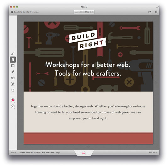
Skitch is a native app for Mac, iPad and iPhone (sorry, all you non-Mac users), which makes grabbing and annotating screenshots amazingly simple. It's built by the folks at Evernote, but you can use it even if you're not an Evernote user.
I've included it here because of how easily it allows you to provide feedback on a prototype. Plus, you can drag straight from Skitch into GitHub issues to attach your annotated screen capture. We use Skitch relentlessly when we're testing. Providing helpful, detailed feedback has never been easier.
09. RICG

My final tool is not actually a tool at all. The folks that participate in this group are largely responsible for the new
Element queries will enable us to selectively apply styles based on the width of the containing element, not just the width of the viewport or device. Combine this with the ideas of pattern-driven design and new specs like Web Components and the future is looking pretty bright!
Wrapping it up
It's a great time to be working on the web. The landscape is challenging, but we're finding good solutions. Our tooling is evolving as fast as the problems we're trying to solve.
In the end, though, tools alone are not enough. Remember that most of the reasons projects fail are not for technical reasons, but because of the people involved. Now, go make the web!
This article originally appeared in issue 268 of net magazine.
