10 design concepts that every web developer needs to know
Kyle Fiedler introduces ten basic design concepts and practices that each and every developer should know and understand.
Over the last few years I've been teaching a workshop on visual design basics aimed at developers. As with most things on the web, I've found a diverse level of design knowledge and interest from both the students who've taken my workshop, as well as from the developers I've worked with.
This list is intended to be a shortlist of the concepts that I'd like the developers I work with to understand about design. It's meant to steer developers in the right direction as an introduction to thinking and communicating about design.
01. Design isn't just visual
Design isn't just the façade; it's the personality beneath. For some reason, design has a stigma as solely the visual part of the website. This couldn't be more false or misunderstood. Design is the entire experience from the moment users enter your site to well after they've left.
Design is the 'how' and 'why' people want to use the site; the speed at which the site loads; the interaction between hover, click and touch; and the pace at which you deliver new features and content. All of these concepts comprise design.
Because design is more than visual aspects and affects the entire experience, every person on a project is a designer. Any team member who sets out to discover how the user interacts with the site is a designer. The frontend, backend and project management should all be thinking about design.
02. Be user-centric
Users are paramount and should always be at the forefront of every decision about your site or app. Designs should enable your users to reach their goals with speed, effectiveness and, most importantly, pleasure.
In my workshop, I get students to create an initial design brief after they've chosen a project to work on. Though I give them simple guidelines to follow, for the most part, they're focused on the user: who are they, what are they doing on your site and what is the feeling you want them to have when they visit as well as when they leave?
Though this works well for the workshop's small projects, when it comes to larger projects, you should be thinking about this foundation on a larger scale. Designers use personas, storytelling and more to indicate who the site users are and what they want to be doing on the site. Delve into these guidelines in whatever form they take on your project and use them to influence all of your design decisions.
The designer shouldn't have to shoulder all of the user experience; designers should just lead it. The experience should instead be shared by the entire team (if one exists). There are many instances where I've relied on developers to help me figure out the best way to create the greatest user experience. Not only do they know their limits better, they also have a clearer idea of all possibilities.
03. Design is in detail
Details are capable of making a 'good' design 'great'. Attention to detail in a user experience can be the difference between a satisfied user and an annoyed one. Having the right shade of blue or wrapping the link around particular text really matters. The problem with details is that it's easy to get caught up in them. Focusing on the details too early is unnecessary and can slow down the process. It's important to know when to focus on specific details or when it's beneficial to visualise the entire, larger picture.
04. When designing, sketch often
The benefits of sketching user experiences are well documented. Sketching helps you think about content, hierarchy and flow among other aspects. Sketches are cheap, easy to do and very fast. You should be able to create one new idea every thirty seconds. Sketching is also one of the best ways to communicate ideas about layout, user experience and user flow for a site.
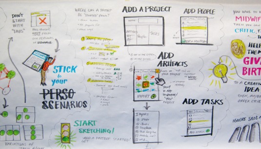
My first college professor ingrained this in me when I was a student. She wouldn't let us use the computer until she saw pages upon pages of sketches. Young designers tend to skimp on the sketches or omit them altogether. I still see many designers transition too early from sketches to a higher fidelity design without first exploring all possible solutions.
The best part of sketching is that anyone can do it. Everyone knows how to draw boxes, squiggled lines and arrows. These are the foundational tools you need to begin designing - it really is that simple. We're not looking for priceless pieces of artwork, and you certainly don't need a fancy art degree. You just need to be able to clearly communicate your sketches and the thought process behind them.
05. Use white space
It seems to be the hardest concept for developers to grasp: the biggest benefit to having the proper amount of white space is giving the user a break. Breaks are important for processing information, especially when there's a fair amount to process. It's why we have paragraphs and sentences instead of just a single, long block of running text.
The key is to ensure that white space has a relationship with other objects on the page, including the other space. If you have a single column of white space, make sure there's another single column of white space around to balance it.
For vertical space, just use fractions of the body font size. I tend to keep things simple and use a scale of .25, but there are several other scales that you can use. For example, if the body font size is 16px(1em): 4, 8, 12, 16, 20, 24, 28, 32, 40, 48. This allows for choosing font sizes by simply moving up and down the scale as I want larger or smaller type.
06. Grids aren't just CSS frameworks
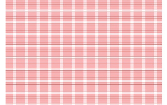
Crazy, right? Grids first found prominence in design in what's now called International Typographic Style.
A grid should be used to:
- Create relationships between objects
- Provide a base system for visual alignment
- Help create a horizontal and vertical rhythm
- Help create optical balance
All of these concepts work together to best allow you create a better visual system for your users. The grid you choose affects the unity of the design; choosing a grid based on which is easiest to implement won't necessarily be the best design choice for your content and users. In the end, it's still just a tool and will only be as good as the person wielding it.
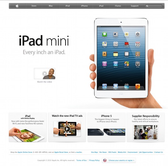
07. When everything has emphasis, nothing does
It's like having a conversation with a group of people who are all yelling at you simultaneously to do different things. Only one element should have emphasis on the page: the most important one. Giving emphasis to a single element and having a clear hierarchy provides flow for readers and should point them in the desired direction.
08. Keep an inspiration folder
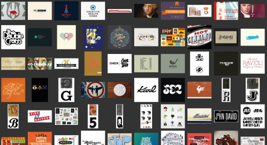
Keep a gallery of all of the things that inspire you visually. These can be photos, videos, posters, T-shirts and websites; anything that may spark ideas for a solution to the particular design problem you're facing.
Not only does this act as a reference point, it also forces you to constantly be looking and evaluating design. The simple process of selecting pieces of design and saving them to a folder forces you to utilise those design analysis muscles.
09. Design is all about problem solving
You should approach design as a set of problems that require solutions. Everything on the page should have a reason for being there and be solving a specific problem for the user or design. I have the tendency to remove features from the feature set until the problem I'm solving becomes very apparent.
Sometimes it's hard for us to state the problems rather than jumping to a solution. Working backwards really helps with this. When deciding whether something should be red, for instance, stop and think of the reasons you wanted it red in the first place. Ask yourself: what am I trying to achieve by making it red? What was my thought process? You may end up back where you started, but you will have a better understanding of why and what you are doing.
10. Know how to talk about and critique design
A sure way to annoy a designer is to tell them that a red block should be blue, that a piece of text should be moved over, or to make the logo bigger. I think you get the idea.
The best way to give constructive feedback is to call attention to the problems with the design. Have evidence based on the users, site flow, design goals and visual principles to support the problems that you see with the design. This then supports your opinion of what should change and provides a strong basis for what success is for the user as well as the design.
Then, hopefully, the designer will work with you to form a solution to the problem. This is your opportunity to suggest a resolution; just don't ask to make the logo bigger.
Resources and workshop
If you've found this interesting, feel free to check out my design for developers resources and design learning trails. I'd also love to see you in either the online version or at the face-to-face version of the workshop.
Words: Kyle Fiedler
Kyle Fiedler is a designer at thoughtbot, helping to build Rails and iOS applications. He has been designing and developing, in some form, since the dot-com boom (and bust) and hasn't stopped since.
This article originally appeared in net magazine issue 244.
Liked this? Read these!
- Useful mind mapping tools for designers
- The designer's guide to the Golden Ratio
- Pro tips for the perfect website layout
Got a great design tip? Share it in the comments!

Thank you for reading 5 articles this month* Join now for unlimited access
Enjoy your first month for just £1 / $1 / €1
*Read 5 free articles per month without a subscription

Join now for unlimited access
Try first month for just £1 / $1 / €1
Get the Creative Bloq Newsletter
Daily design news, reviews, how-tos and more, as picked by the editors.

The Creative Bloq team is made up of a group of art and design enthusiasts, and has changed and evolved since Creative Bloq began back in 2012. The current website team consists of eight full-time members of staff: Editor Georgia Coggan, Deputy Editor Rosie Hilder, Ecommerce Editor Beren Neale, Senior News Editor Daniel Piper, Editor, Digital Art and 3D Ian Dean, Tech Reviews Editor Erlingur Einarsson, Ecommerce Writer Beth Nicholls and Staff Writer Natalie Fear, as well as a roster of freelancers from around the world. The ImagineFX magazine team also pitch in, ensuring that content from leading digital art publication ImagineFX is represented on Creative Bloq.
