How to create dynamic lighting in Photoshop
Concept artist Nathan Fowkes shows you how to bring your concept art and environment designs to life.
06. Ker-plowee!
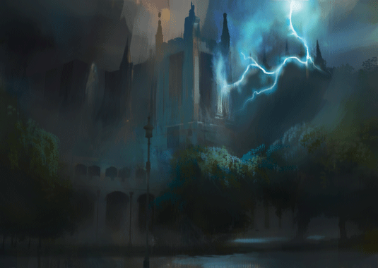
A concept artist must design the light such that the wind, sky and land cry out to the audience. So I'm reworking everything to make the lightning flash inescapable.
The background now disappears against the sky, a warm patch in the sky contrasts with the lightning and the glow has been limited. Regrettably, we can't rely on lightning for every image so let's paint some…
07. …Zombies!
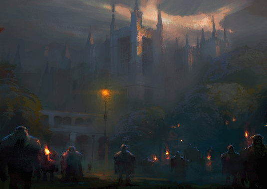
I know, I know, zombies are so last year. This is really about changing the emphasis in the scene from sky and architecture to characters. Try strong rim light on characters or important objects to give them visual importance.
08. Pretty in pink
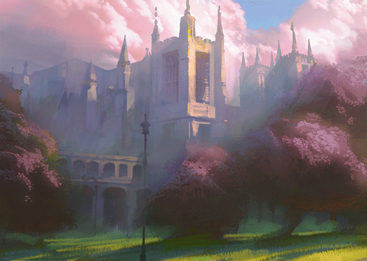
I have to admit something at this point: notice that every one of my previous images lean towards dark and moody? Well, we're artists, we love dark and moody!
But I've seen far too many hopeful concept artists get really good at dark and moody without any range beyond the monochromatic. This becomes a ceiling that keeps us from rising above the crowd, so for that reason I'm going with an anti-zombie pink in this one.
09. Creating a volume of atmosphere
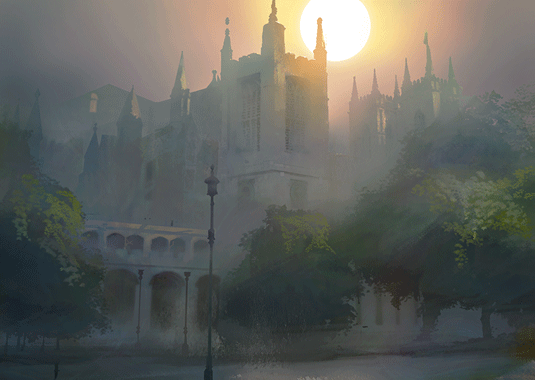
One of the tricks of the impressionists was using backlighting. It's a wonderful lighting setup because it enhances the simple silhouettes of scenes and sends a unifying warm light cascading through the work.
The result is an image that looks as if the space is coming alive as a volume of light. For visual interest I'm letting cool skylight fill the atmosphere in the distances away from the sun.
Get the Creative Bloq Newsletter
Daily design news, reviews, how-tos and more, as picked by the editors.
10. Black night of magic
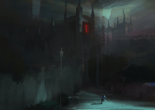
Okay, enough sunshine now. I can't resist getting back to the dark and moody. This is a great opportunity to explore the elimination of detail. In this one, shadows lose all information and unimportant edges disappear into the night.
11. What's inside?
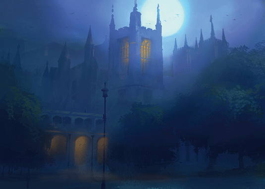
I'm using calmer night-time lighting now, because the lighting is no longer about the drama of the environment, it's about what’s on the inside.
This is my big opportunity to focus on the interior, so I'm lighting up those windows. Scenes like this are often used in film to establish a location before the camera cuts to the interior.
12. Extremes of light
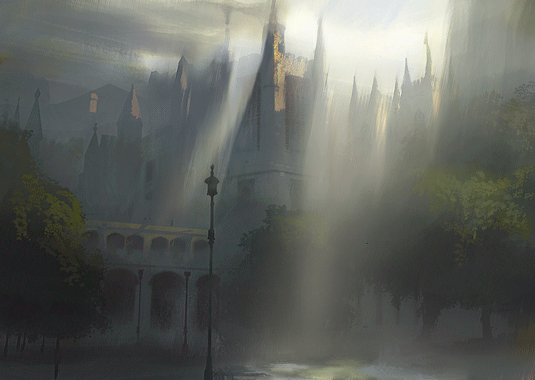
Here I want to emphasise that you don't have to resort to a lightning flash to give light a powerful presence. I'm combining top-light with atmosphere so the light becomes a penetrating force in the scene.
13. Light to soothe the soul
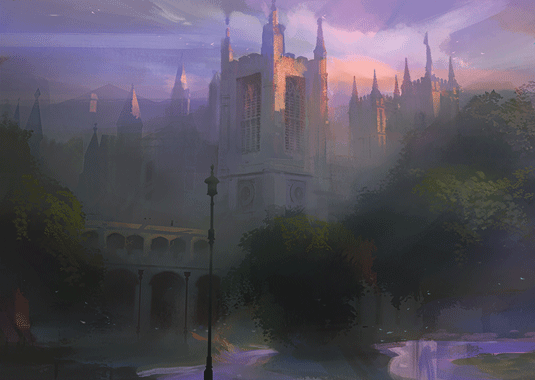
No, I'm not a New Age kind of guy, but I do need to be able to convey the natural magic of light. This can be achieved by "golden hour lighting" when the harsh light is reduced but the warm and cool contrasts are increased in the last light of day.
This happens because the redder wavelengths of light are able to penetrate the angular volume of atmosphere, but the bluer wavelengths are reflected away into the atmosphere. Hence the dimmer light and stronger warm/cool contrasts.
14. Into the full light of day
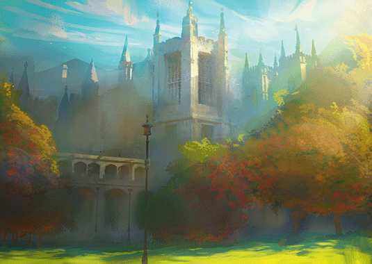
I've been falling back toward too much mood and drama again, so let's go out on a ray of sunshine. The secret to strong sunshine is actually in the shadows; the bright lighting has a tendency to bounce warm tones into adjacent shadows.
Add to that the vivid blues that fall on shadowy top planes from the sky and you have brilliant shadows that only exist in the full light of day.
Words: Nathan Fowkes
Nathan is a concept artist with screen credits on 11 feature films. He's worked for clients throughout the animation and gaming industries including DreamWorks, Disney, Blizzard Entertainment and Ubisoft.
Like this? Read these!

Thank you for reading 5 articles this month* Join now for unlimited access
Enjoy your first month for just £1 / $1 / €1
*Read 5 free articles per month without a subscription

Join now for unlimited access
Try first month for just £1 / $1 / €1

The Creative Bloq team is made up of a group of art and design enthusiasts, and has changed and evolved since Creative Bloq began back in 2012. The current website team consists of eight full-time members of staff: Editor Georgia Coggan, Deputy Editor Rosie Hilder, Ecommerce Editor Beren Neale, Senior News Editor Daniel Piper, Editor, Digital Art and 3D Ian Dean, Tech Reviews Editor Erlingur Einarsson, Ecommerce Writer Beth Nicholls and Staff Writer Natalie Fear, as well as a roster of freelancers from around the world. The ImagineFX magazine team also pitch in, ensuring that content from leading digital art publication ImagineFX is represented on Creative Bloq.
