How to create dynamic lighting in Photoshop
Concept artist Nathan Fowkes shows you how to bring your concept art and environment designs to life.

As concept artists, our job is to reach out to our audience and connect with them on a profound emotional level. One of our primary tools to achieve this goal is lighting design. For this workshop I'll build a scene using light to create visual interest and emotion.
My process is to explore the idea through thumbnails, then bring them into Photoshop for colour development and finish. I'll rework the scene several times using different lighting palettes to create a range of emotional beats. Learning to do this gives each of us the ability to become a visual storyteller, much like a musician who can score an entire movie with its emotional highs and lows rather than striking a single cord.
Watch the full tutorial
I'll use light to design the emphasis for each scene. My first decision must be to decide what the scene is about and then to design the light accordingly. Concept artists must be cinematographers, exposing their designs to the light of day and hiding distractions in the shadows. This process can bring emphasis and emotion to any part of a scene: the sky, background, mid-ground or foreground.
I invite you to commit to becoming a master of designing with light. It's only through mastery of the core concepts of draftsmanship, colour, pictorial composition and lighting design that will enable you to create artwork which resonates with your audience.
01. Sketching out initial ideas
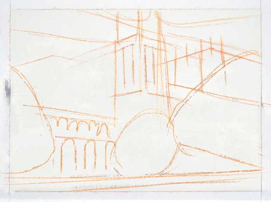
I like to start by working out ideas in my sketchbook. I find this step enjoyable because the pressure is off and I can just play around with ideas.
Here I'm using a pocket-sized sketchbook (a Hand Book Artist Journal) and a Prismacolor Verithin orange pencil. The architecture is loosely inspired by a trip to Westminster Abbey in London. I'm intentionally giving the scene three-point perspective for dramatic effect.
02. Tonal rough
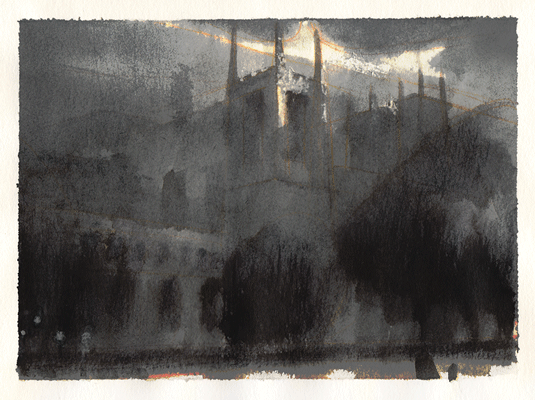
The finished rough is painted over the line art with a Pentel water-soluble ink brush and a waterbrush. Technique isn't important here: any medium that will give you a full range of values will do.
Get the Creative Bloq Newsletter
Daily design news, reviews, how-tos and more, as picked by the editors.
The benefit of simple sketchbook work becomes apparent in this stage. Notice that only the face and silhouette of the façade has been emphasised.
03. Background lay-in
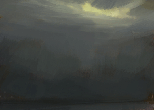
Here I'm setting the stage for a stormy sky and misty grey landscape. I like to start with a warm wash before laying my neutrals over it.
This creates an impressionistic richness that gives a sense of natural light and visual interest to the scene. The simple statement at this stage is a gradation from a light sky to a shadowy ground.
04. Large silhouettes
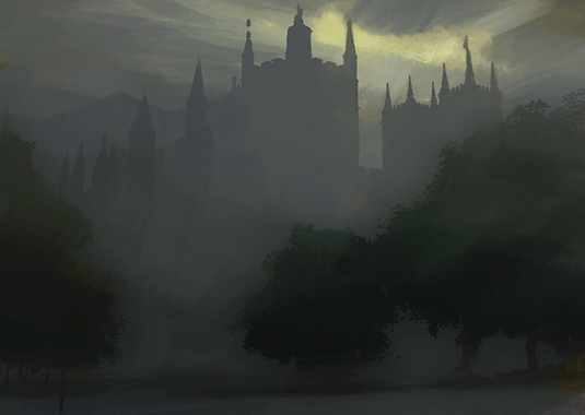
I create selections for key elements in the image, such as the clouds, layers of architecture, doors, windows and trees. I save each selection as a channel and click them as needed to rough in the establishing silhouettes.
The light patch in the sky emphasises the central building. It darkens toward the edges to give the other building lower contrast and therefore less importance.
05. Lighting detail
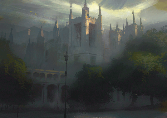
Because the big masses of the scene are already established, I can now bring out architectural details and paint in the light raking across the building tops.
I treat the central building as a character close-up, with dramatic lighting falling around the head. This completes the base image, but it's not nearly good enough. I'll try to improve it during the next stage.
Next page: the final steps

Thank you for reading 5 articles this month* Join now for unlimited access
Enjoy your first month for just £1 / $1 / €1
*Read 5 free articles per month without a subscription

Join now for unlimited access
Try first month for just £1 / $1 / €1
The Creative Bloq team is made up of a group of design fans, and has changed and evolved since Creative Bloq began back in 2012. The current website team consists of eight full-time members of staff: Editor Georgia Coggan, Deputy Editor Rosie Hilder, Ecommerce Editor Beren Neale, Senior News Editor Daniel Piper, Editor, Digital Art and 3D Ian Dean, Tech Reviews Editor Erlingur Einarsson and Ecommerce Writer Beth Nicholls and Staff Writer Natalie Fear, as well as a roster of freelancers from around the world. The 3D World and ImagineFX magazine teams also pitch in, ensuring that content from 3D World and ImagineFX is represented on Creative Bloq.
