Video tutorial: Using Illustrator's Appearance panel
Steven Bonner shows you how to harness the power of the Appearance panel
- Software Illustrator CS3 or later
- Time needed 10 minutes
- Skills-Add complex effects while retaining the ability to edit-Create new graphic styles
Illustrator has a lot of tools on offer to help your workflow, but arguably there are none more important than the Appearance panel. It’s the most useful addition to the application in recent years, and once you get into the habit of using it, you’ll wonder how you worked before.
In this quick tutorial I’ll run over the basics of how to add multiple strokes and fills to an object, and work with each one individually, while considering how they affect each other as a group.
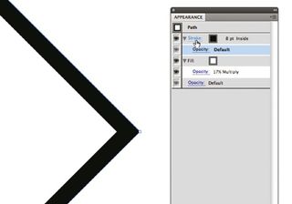
01 The Appearance panel is essentially the index for every asset in your Illustrator file. First, select an object and then open the panel. You’ll see that it displays the stroke and fill information. Clicking on either will let you edit their properties. In the flyout menu and among the icons at the bottom of the window you’ll find more options to add new strokes and fills, and to apply effects to them.
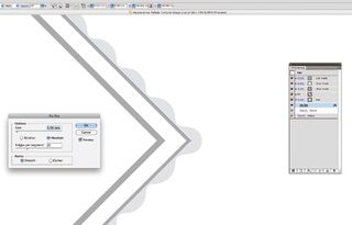
02 When you’re working with an object’s properties, it’s important to view the Appearance panel in a similar fashion to the Layers panel. Every stroke you add will work differently, depending on the order it’s placed in the panel. Here, I’ve added four strokes of varying widths, all aligned to the inside of the diamond. The order they’re placed in gives the illusion of multiple offset shapes. You can add effects too – I’ve added a zig-zag filter to the bottom stroke for a scalloped feel.
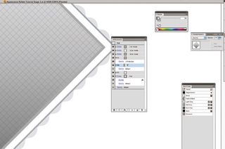
03 The same principles are used when dealing with fills. In this case, I’ve added three: one solid grey background, a pattern swatch with its opacity lowered and also a soft grey-to-clear gradient. Again, the order of the fills will affect how the object will look.
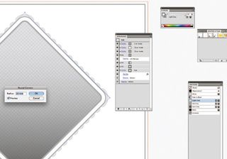
04 To gain the same result by traditionally layering different objects you would be working with set shapes – so if you wanted to go back and change something, you would need to make the change to each element. With the Appearance panel, you’re only ever working with one object – so any changes you make to the shape will affect each fill and stroke. This speeds up your workflow and is incredibly useful for those last-minute client changes. For example, here I decided to add rounded corners to the shape by clicking Effect>Stylise> Rounded Corners and inputting a radius of 10mm.
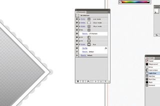
05 Another great advantage to using the Appearance panel is that once you’ve set your style, you can save it as a graphic style for use on other objects. Go to Window>Graphic Styles and drag your shape onto the panel to save it to the document’s memory. Now you can apply it to anything you like, including editable type.

Steven Bonner
Stirling-based Steven is a multi-disciplined designer and illustrator, working for clients such as Harper Collins, Cadbury and Diesel. A love of type is a recurring feature of his work.
www.stevenbonner.com
Get the Creative Bloq Newsletter
Daily design news, reviews, how-tos and more, as picked by the editors.

Thank you for reading 5 articles this month* Join now for unlimited access
Enjoy your first month for just £1 / $1 / €1
*Read 5 free articles per month without a subscription

Join now for unlimited access
Try first month for just £1 / $1 / €1
The Creative Bloq team is made up of a group of design fans, and has changed and evolved since Creative Bloq began back in 2012. The current website team consists of eight full-time members of staff: Editor Georgia Coggan, Deputy Editor Rosie Hilder, Ecommerce Editor Beren Neale, Senior News Editor Daniel Piper, Editor, Digital Art and 3D Ian Dean, Tech Reviews Editor Erlingur Einarsson and Ecommerce Writer Beth Nicholls and Staff Writer Natalie Fear, as well as a roster of freelancers from around the world. The 3D World and ImagineFX magazine teams also pitch in, ensuring that content from 3D World and ImagineFX is represented on Creative Bloq.

