How to create a CG corporate video
Lance Evans reveals the in and outs, and pitfalls and pratfalls of producing a CG corp video.
Having just completed production on a corporate video that was very heavy on computer graphics (CG), I wanted to share some of the successes, mistakes, and problem solving I get to take complete credit and/or blame for.
Some 'filmmakers' look down on the lowly corporate video. Not being a filmmaker, I don't share that point of view. For me, time-based projects are an opportunity to build upon the other creative work I do, combining other disciplines. Photography becomes cinematography, audio gets some twists, lighting, storytelling, music, sound effects…
The list goes on. A challenging list that a person either loves, or runs away from, tail between legs. Below is the final version, so you can see it before reading further.
Establishing Parameters, Goals & Message
My client for the video is in the business of providing unique technology services to one of the world's most intense markets, the construction industry based in New York City. Competition is fierce.
In our first meeting I asked, "Who is the target for this video, the CEOs or middle managers?" Messaging to each would be different, as CEO's would likely prefer hearing about bottom line benefits and broader strokes. While middle managers, potentially working directly with the technology, would want more specifics. We decided this video would be directed to the CEOs.
What marketing information should be included? Understandably, clients often want to include more, rather than less. This is understandable as marketing costs them money, and they want to ensure a good ROI. However like with medicine, more isn't always better. Instead I explain that we want to shoot for the right amount, of the right stuff.
My client sent over their marketing material, and I did a quick copy/paste of their highlighted "must have" content to begin the core of a rough script. It ran over 5 minute. Cutting would be needed, and I convinced them to bring this down to under 3 minutes. Longer than that can be deadly on the web.
CG: not your dad's corporate video
What would the video look like? I believe even business-to-business (B2B) communications should be produced and treated like business-to-consumer (B2C). So it was agreed that successful branding required the video be stylish.
I discussed with my client the concept of including user testimonials, expert interviews, and their staff talking about their product. We also discussed shooting b-roll at their offices and production floors. Approval was left in their court, but was never acted on as they were in the middle of a very busy time.
To move things along, I then suggested we just go with a spokesperson. And to make it more interesting, why don't we shoot it in a seminar-style format, with an audience? Everyone loved this idea, but client-side logistics and budget limitations made it difficult.
I then offered a riskier alternative: I suggested that I shoot the entire thing in my studio with green screen, and then fabricate the theater, audience, backgrounds, and anything else we needed, in post CG. The upside to such a plan was greater control. The downside was all the work that would be involved with such a task. Essentially, the entire video would be one long special effect shot. Needless to say, this was the concept that got signed-off on.
I got the script down to about 3 minutes, and storyboarded it to have some idea of the visuals I would need to shoot. I felt that three front views (full body, mid-body and a head & shoulder), and one side/angled shot would give me what I needed in post.
Production begins
One would think that finding a good actor/spokesperson in New York City should not be difficult. Yet, finding someone with just the right mix is never all that easy. I posted a casting call with Breakdown Services and quickly had over 150 replies to go through, looking only at those that visually fit the type, and hopefully had a video reel online.
I culled the best 25 for in-person auditions. Our winner was actor Drew Moore who not only had the looks and talent, but was a total professional as well. (He even arrived with his own teleprompter on shoot day!)
Let's get techie. Shooting green screen video isn't hard today, as the technology has gotten more forgiving. Head and shoulder shots are particularly easy in making sure the background is evenly lit, and having enough light to allow for ideal aperture (f-stop), frame duration, and digital film speed (ISO).
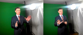
But the wider the shot becomes, like half or full body, the need for light increases logarithmically. And the harder it is to get perfectly even light across the entire green screen.
I shot on a Canon T3i using lenses from Canon, Sigma and Rokinon (great for video!), recorded all audio on a Zoom H5, used a wired Audio-Technica lapel mic, and had an assortment of lighting from Flashpoint and other vendors. Sound absorbing blankets killed any studio sound reflections. With my assistant calling in sick, I ran all of the rigs myself while directing the talent on set.
My weeks in post-production
Truthfully, sitting down to the computer was when my work really began. It's also when I got to see what things I did well during the shoot, and where I messed up. This is normal.
Green screen and workflow
I had hoped to be able to do the green screen removal in Adobe After Effects (AE) using the included Keylight plugin, and then either export the clips, or maybe use Adobe's Dynamic Link feature to bring it all into Adobe Premiere.
But I knew that the amount of effects and visual control I was looking for would be difficult to achieve in a video editing program. And that I would likely be producing this entirely in After Effects.
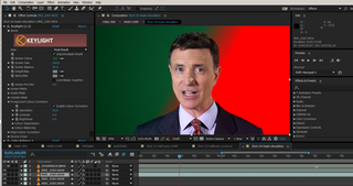
The green screen I had shot was not as even as I would have liked. This is partly due to me wearing too many hats. But it's also a result of the constraints in shooting a full length figure in a smaller studio. The result was my having to spend more time getting the green screen making right. Some shots needed two passes of the Keylight plugin, each addressing a different range of greens. Some needed hand-tooled garbage masking.
Compositing and editing
Masking complete, I began dropping the four clips into their intended sections of the video. For example, the full body shot was only used once in the wide 'theater' scene. The side shot was only used once midway to break things up a bit. All other sections with our actor Drew used either the medium or talking head shot.
The opening section
I created the opening section in its own comp/timeline. I first tried an architectural scene and lived with it for a while, but it just wasn't working. I then swapped in the cloud/reflection video clip which was compelling stock imagery. But there was a problem: it was time-lapsed resulting in the clouds moving far too fast.
There are two ways to correct this. One is to remake it, either in 3D, or by hanging out some window. I didn't have the time for first, or the (cough-cough) for the other. The other option was to try and fix it in AE by running the clip through the "Pixel Motion Blur", which creates motion blur and let me slow it down a good deal. Perfect? No, but it made a wonderful clip usable. The clip also needed a great deal of color correction, with split adjustments for clouds and building which both varied along the timeline.
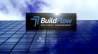
The product logo was added in 3D space and animated. And a 'reflection' of it on the building was created by duplicating the layer, flipping vertically, then adding distortion and blur. Heavily modified lens flares were added – you will see a lot of them throughout the video.
The virtual theater
Since we didn't book and shoot in a real studio, I had to create one. Getting this just right isn't the easiest thing. Choosing the right angle and finding usable stock audience imagery isn't easy. (As an aside, I recently did some collateral for the new Star Wars movie, and had to create a huge audience almost person by person – ugh!).
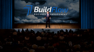
I did find video stock with an applauding audience. Hoever it starts sitting and then breaks into applause. So I needed to reverse the clip to go from applause to sitting still. Compositing that over the stage wasn't easy as there was no mask. I kludged a few layers, one set to multiply, another to something else, forcing it to work. Note that the first three rows from the bottom are actually from another static audience shot, placed on top of the video to extend it. The stage was created completely from scratch in Photoshop and AE.
Realistic or not, the results have the style I was looking for, above all other criteria.
The puppet master
As I worked my way through the project I came upon a few problems that one might think were beyond fixing.
In doing the four different video takes I should have done extra versions that had long pauses between sections. Why? Because that would give me that hold shot on the actor that would allow a couple of seconds for a transition. I had some of this, but not enough in a few sections.
One popular fix is to stretch the last few frames of a section, by 300% or more. This can work sometimes. But just as often the human eye can see the slow-mo. Not good. But AE's 'Puppet' tool, which allows controlled distortions, can be used to do magic here.
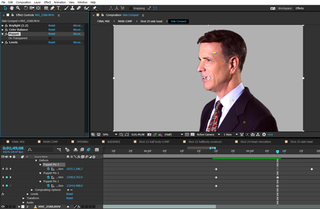
I played the last few seconds of the clip to see what direction Drew's head was moving, and used the Puppet anchors to animate the extended head clip in the same direction. Done subtly, I think it was rather invisible.
Puppeted audience
Go to the profile scene (1:26) and look at the audience, But, not super close ok, nobody else will! The impression is of a real audience sitting behind the actor, right? Ah, if only I could have found such a video clip at the right angle, in stock. But I couldn't. The best I could find was one single still photo of an audience at that angle.
What I did was break it into a few layers, the people sitting in the front were one layer, and all others as another. I then added a lot of blur to make it appropriately out of focus. Then using Puppet anchors I began animating some human motion into the still photo of the front row. Perfect? No. But totally passable if you weren't reading this, right?
By the way, the rest of the scene was created in Photoshop, the back wall, back screen and curtain. It's was then animated to feel like the cameraman was moving to make room for the graphics that are about to appear.
Pulling it together
There were many other special treatments, like the lens flare white-burst transitions, along with more pedestrian graphics that were added. But even with the bullet point text graphics, I tried to add a clean style. And everything, I mean everything, received a good deal of color correction work.
Since we didn't have the chance to do b-roll shots, you will easily spot the stock video clips. Efforts were taken to color correct the clips. Sometimes that meant drastic re-coloring of a terribly balanced clip (2:12), balancing the monitor screen images differently than the rest of the scene (2:16), or drastic Levels adjustments (2:20).

The final scene's Manhattan skyline image (2:48) was also a time-lapse clip with cars traveling at dizzying speeds. This was treated with the 'Pixel Motion Blur'. But I also converted one frame to a still, and dropped that on top at 50% opacity, to further mute the traffic.
Audio tweaks
I leave the audio for last, but it is hardly an afterthought. I actually love doing audio work. As you watch the video, make sure to LISTEN as well. Or just listen once with your eyes closed, because there is a whole lot of work in the audio you might otherwise miss. In some ways, that is how it should be.
Drew's voice recorded wonderfully using the Audio-Technica mic and the Zoom H5. Note the difference between the introduction audio clip that is studio clean (and voiced by yours truly), and the standing-on-stage mildly reverberating sound. You will also notice the intentionally heavy-handed reverb used in the theater shot, to better jive with the back of theater position.
Audience sound effects were added throughout, including applause and light laughter. You will also hear some specific sound effects which accompany the white burst transitions.
'Plotives', from powerful Ps and Ts were removed, and I manually raised and lowered the volume of individual passages, and even specific words.
Music was hard to choose, as it needed to have style, excitement at the start, but not be distracting along the way. The Brazilian jazz sound worked well, but notice the continuous volume tweaks throughout, ensuring that every section would work.
Words: Lance Evans
Lance Evans is creative director of Graphlink Media.
Like this? Read these...
- How to build an app: try these great tutorials
- Free graphic design software available to you right now!
- Brilliant Wordpress tutorial selection

Thank you for reading 5 articles this month* Join now for unlimited access
Enjoy your first month for just £1 / $1 / €1
*Read 5 free articles per month without a subscription

Join now for unlimited access
Try first month for just £1 / $1 / €1
Get the Creative Bloq Newsletter
Daily design news, reviews, how-tos and more, as picked by the editors.
The Creative Bloq team is made up of a group of design fans, and has changed and evolved since Creative Bloq began back in 2012. The current website team consists of eight full-time members of staff: Editor Georgia Coggan, Deputy Editor Rosie Hilder, Ecommerce Editor Beren Neale, Senior News Editor Daniel Piper, Editor, Digital Art and 3D Ian Dean, Tech Reviews Editor Erlingur Einarsson and Ecommerce Writer Beth Nicholls and Staff Writer Natalie Fear, as well as a roster of freelancers from around the world. The 3D World and ImagineFX magazine teams also pitch in, ensuring that content from 3D World and ImagineFX is represented on Creative Bloq.
