5 tips for understanding colour theory
Create a stronger emotional response to your work using colour with these handy tips.
Colour, more than any other element of a designer's work, has the greatest influence on how viewers feel. Understanding colour theory, its cultural symbolism and the relationship between colours is necessary to becoming a better artist and designer.
It's always better to learn the basics before striking out to develop your own colour language. We are surrounded by colour every moment of our lives and certain things become ingrained on our consciousness, so we immediately understand what the colour is supposed to make us think or feel.
Take red, for example. If you see a red sign in a public building, or a red road sign, you instantly know that it is likely to be a warning sign. You don't need to be aware of the content of the sign or even its shape to immediately get the sense of potential danger.
Article continues belowHowever in Eastern Asia, for example, this cultural understanding could lead to a misunderstanding. That's because the colour red in Eastern Asia is often used to signify good fortune or prosperity.
Sparking an emotional response
There is another side to this language of colour, and that is emotion. Studies have shown that some colours can spark a emotional response – yellow is uplifting and cheering while blue is calming, for example.
This emotional language may have a cultural basis, but the relationships between colours are fixed. Complementary colours are the same no matter where you are in the world, and a colour triad is fixed and not influenced by cultural background.
This means it is easy to build a colour palette for your project where the results work together (not in harmony, that is something else again!). It's up to you to judge whether the scheme works in its context.
Sign up to Creative Bloq's daily newsletter, which brings you the latest news and inspiration from the worlds of art, design and technology.
The basis of all colours is the three primary colours: red, yellow and blue. Mixing these together, you can make any other colour you want. However, bear in mind that to get the shade you want, you may have to alter the brightness or saturation (this is assuming that you are working digitally).
To understand how complementary colours work, I recommend using a colour wheel. Here are some more tips to help you really get to grips with colour...
01. Colour can be used to subtly affect perception

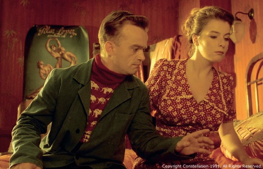
Some film directors use colour in a very deliberate way, in order to help the viewer understand where they are in a film and to 'stamp' it with their own distinctive style. Jean-Pierre Jeunet has an instantly recognisable style and visual language that is consistent across all his films. This still, from the film Delicatessen, has a very similar look and feel to his other movies, where colour is used to convey atmosphere, even if it's not accurate. In fact, colour use is as much about perception as it is realism.
02. Shared colour associations can create an emotional response

Moonlight isn't blue, it's just our visual perception playing tricks on us. When we look up at the moon, what we're actually seeing is the white light of the sun reflecting back at us off the moon's grey surface. There's nothing there to give the light a blue tone. So why is moonlight blue in films? Because of a shared understanding of colour and its meaning, where we accept blue as a calming moonlit night and red as fierce daylight. Perception is key to communication in your use of colour.
03. Colour can add or remove warmth

Temperature relates to how 'warm' or 'cool' a colour is. Although there are actual mathematical values for this – temperature is defined in Kelvins – most people refer to the red end of the spectrum as warm and blues as cool. Saturation is a measure of how much of a colour is present. The easiest way to visualise this is to turn your TV's colour setting down to black and white. By decreasing the colour saturation, you will just be left with various shades of grey.
04. Use colour tools to pick the right palette

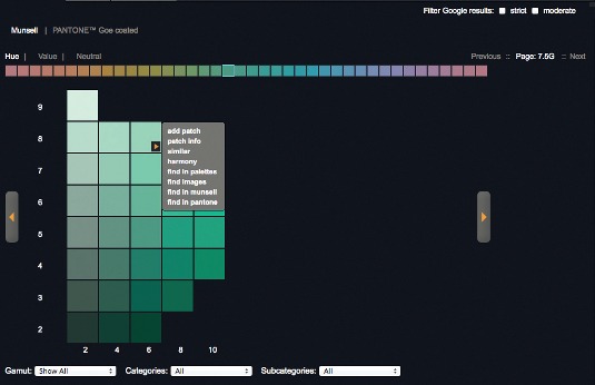
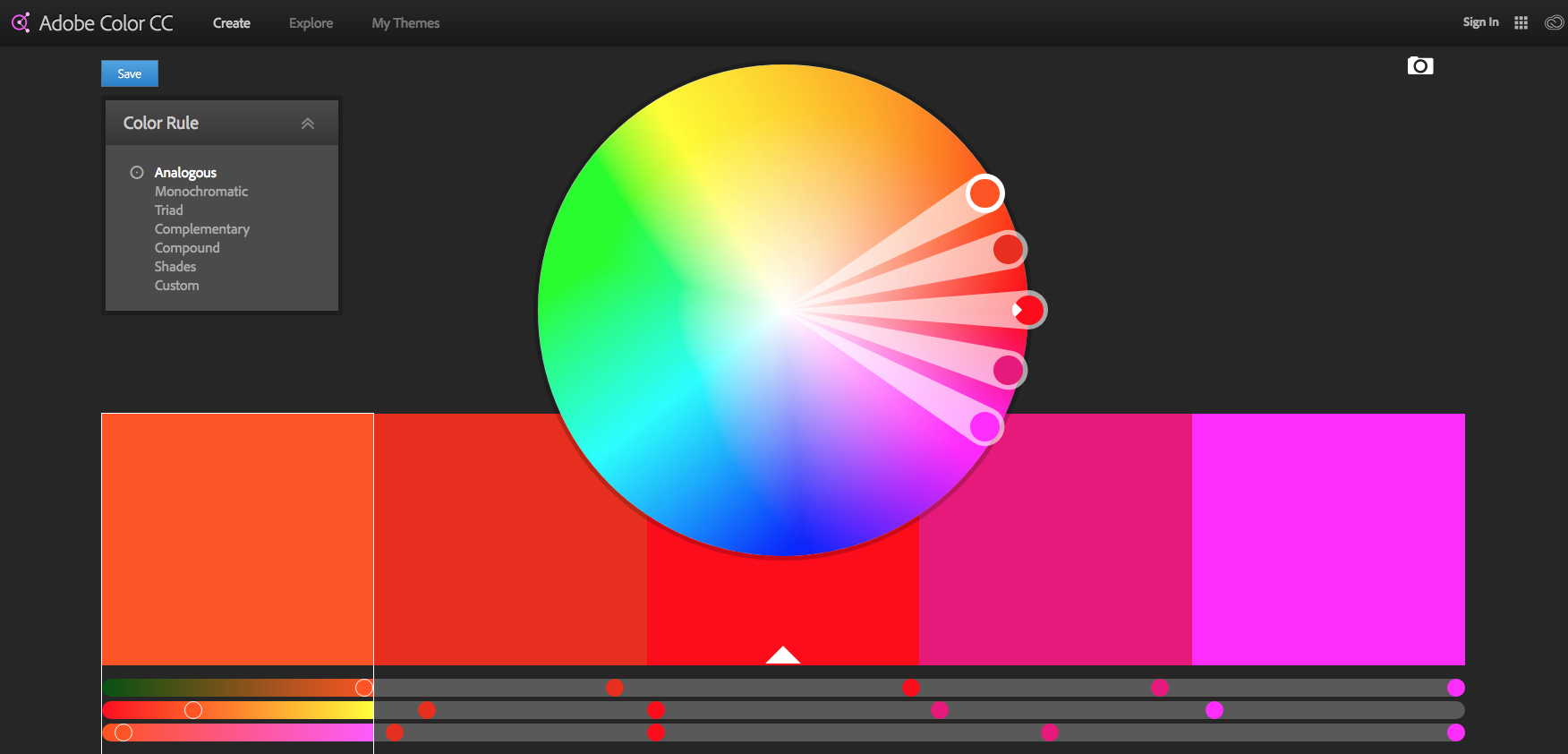
Although there is no replacement for learning and observing, there are tools that can help you speed up your understanding of colour and give you a helping hand along the way. These can be traditional, such as colour wheels (there are many to choose from and explore for different reasons) or handy apps, like Adobe Color CC , which is part of the Creative Cloud.
05. Experiment with Adobe Color

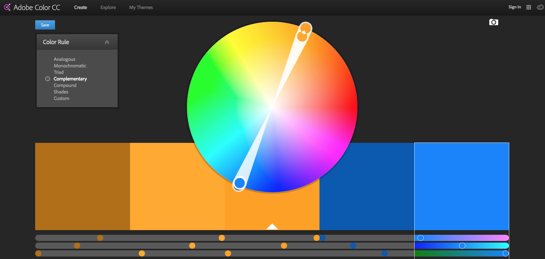
I'm after a new colour palette so setting my mode in Adobe Color to Complementary. You can see that the blues are opposite the oranges on the colour wheel, which is a great start.
All that needs doing now is to change the saturation using the arrow markers, and then tweak the results. You can see my approximation in the screengrab above. It really is that easy, and a great way to set a unified colour palette in your work.
Book your Vertex 2018 ticket now
On 13 March we’re launching Vertex 2018: a one-day event in London for the CG community. Featuring a jam-packed schedule of inspiring talks from the industry’s most exciting practitioners, there will also be workshops, networking opportunities, a busy expo and lots more. Get your ticket to Vertex 2018 now.
This article originally appeared in 3D World magazine; subscribe here.
Related articles:

Rob Redman is the editor of ImagineFX magazines and former editor of 3D World magazine. Rob has a background in animation, visual effects, and photography.
