UI design pattern tips: walkthroughs and coach marks
In the latest in a series looking at website design patterns, Chris Bank of UXPin looks at walkthroughs and coach marks.
Once someone starts using your website or web application, they need to know where to go and how to get there at any point. If they can't navigate through your your application easily, you'll quickly lose them. Thus, designing effective navigation in your web application is crucial.
In this series for Creative Bloq, Chris Bank of UXPin, the UX design app, discusses the importance of navigation design patterns and details examples from some of the hottest websites and web apps today.
You can see previous posts in this series here. Meanwhile, for more examples of web design patterns, download UXPin's free e-book, Web UI Design Patterns 2014.
The problem
The user wants to know how to use the different features of the application.
The solution
Design a walkthrough or tutorial that demonstrates how each function works.

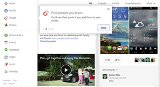
A lot of web apps have begun using this technique to show users around when they first launch and there are two basic ways of doing this. Some web apps, like Google Plus or Slack go the route of overlay instructions, highlighting important parts of the UI with "coach marks" to explain what they do. Slack takes things to the next level by integrating a chat bot that helps users set up their profile.
This makes perfect sense given that Slack is a chat app, and the "Slackbot" walks the users through filling in their profile information like phone number and display name like a conversation.

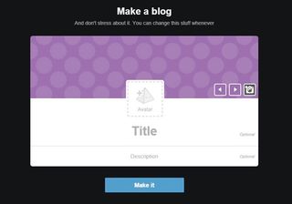
Alternatively, Tumblr presents a walkthrough to help the user get acquainted. This walkthrough is also a great time to collect important information that goes beyond simple registrations, much like a setup wizard.
The importance of this pattern cannot be stressed enough for any application that isn't immediately intuitive because the more a user knows about your product, the more reasons they'll have to come back.
Words: Chris Bank
Chris Bank is the growth lead at UXPin, a UX design app that creates responsive interactive wireframes and prototypes.

Thank you for reading 5 articles this month* Join now for unlimited access
Enjoy your first month for just £1 / $1 / €1
*Read 5 free articles per month without a subscription

Join now for unlimited access
Try first month for just £1 / $1 / €1
Get the Creative Bloq Newsletter
Daily design news, reviews, how-tos and more, as picked by the editors.
The Creative Bloq team is made up of a group of design fans, and has changed and evolved since Creative Bloq began back in 2012. The current website team consists of eight full-time members of staff: Editor Georgia Coggan, Deputy Editor Rosie Hilder, Ecommerce Editor Beren Neale, Senior News Editor Daniel Piper, Editor, Digital Art and 3D Ian Dean, Tech Reviews Editor Erlingur Einarsson and Ecommerce Writer Beth Nicholls and Staff Writer Natalie Fear, as well as a roster of freelancers from around the world. The 3D World and ImagineFX magazine teams also pitch in, ensuring that content from 3D World and ImagineFX is represented on Creative Bloq.
