UI design pattern tips: guiding visitors to the next step
Chris Bank of UXPin looks at how to guide visitors to the next step in your UI design.
Once someone starts using your website or web application, they need to know where to go and how to get there at any point. If they can't navigate through your your application easily, you'll quickly lose them. Thus, designing effective navigation in your web application is crucial.
In this series for Creative Bloq, Chris Bank of UXPin, the UX design app, discusses the importance of navigation design patterns and details examples from some of the hottest websites and web apps today.
You can see previous posts in this series here. Meanwhile, for more examples of web design patterns, download UXPin's free e-book, Web UI Design Patterns 2014.
The problem
The user wants to know what next steps to take after finishing a task.
The solution
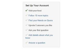
Give the user a clear list of next steps that they can follow to enrich their experience. Quora, for example, creates a to-do list for users to follow to complete their profile.

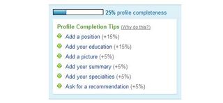
LinkedIn does the same by showing a list of sections the user can add to their profile, pairing it with the Completeness Meter pattern to provide users with an incentive.
Most complex web apps have multiple user flows, so providing users with a to-do list can be a great way of guiding them along.

Another pattern this can be paired well with is Related Content; Medium does this well, by showing the teaser for another article when the user reaches the end of the current one. This keeps the user engaged and immersed in your UI.
Words: Chris Bank
Chris Bank is the growth lead at UXPin, a UX design app that creates responsive interactive wireframes and prototypes.

Thank you for reading 5 articles this month* Join now for unlimited access
Enjoy your first month for just £1 / $1 / €1
*Read 5 free articles per month without a subscription

Join now for unlimited access
Try first month for just £1 / $1 / €1
Get the Creative Bloq Newsletter
Daily design news, reviews, how-tos and more, as picked by the editors.
The Creative Bloq team is made up of a group of design fans, and has changed and evolved since Creative Bloq began back in 2012. The current website team consists of eight full-time members of staff: Editor Georgia Coggan, Deputy Editor Rosie Hilder, Ecommerce Editor Beren Neale, Senior News Editor Daniel Piper, Editor, Digital Art and 3D Ian Dean, Tech Reviews Editor Erlingur Einarsson, Ecommerce Writer Beth Nicholls and Staff Writer Natalie Fear, as well as a roster of freelancers from around the world. The ImagineFX magazine team also pitch in, ensuring that content from leading digital art publication ImagineFX is represented on Creative Bloq.
