UI design pattern tips: featured content
In the latest in a series looking at website design patterns, Chris Bank of UXPin looks at featured content.
Once someone starts using your website or web application, they need to know where to go and how to get there at any point. If they can't navigate through your your application easily, you'll quickly lose them. Thus, designing effective navigation in your web application is crucial.
In this series for Creative Bloq, Chris Bank of UXPin, the UX design app, discusses the importance of navigation design patterns and details examples from some of the hottest websites and web apps today.
You can see previous posts in this series here. Meanwhile, for more examples of web design patterns, download UXPin’s free e-book, Web UI Design Patterns 2014.
The problem
The website visitor wants to know what kind of content can be created with the app.
The solution
Feature specific content front-and-centre for users without it getting lost in the mix of often time-related content. This content could be paid, popular, new, or some other important variable.

Featured content serves to show users the possibilities and helps them understand what the platform can accomplish as well as the things other users are using it for.
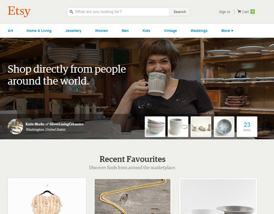
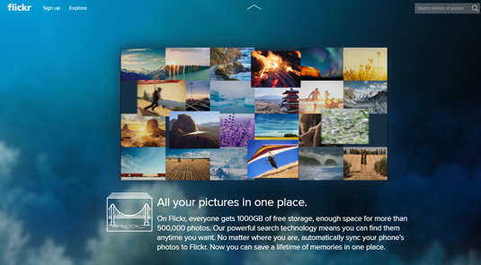
Sites like Airbnb, Etsy and Flickr show random content on the front page that helps users explore the site without having to make a commitment beforehand, as well as encourages existing users by helping them reach greater audiences.

On the other hand, it can also help particular pieces of content gain traction by giving it particular importance. Paid or 'featured' content can be marked as such to clarify expectations.
Words: Chris Bank
Chris Bank is the growth lead at UXPin, a UX design app that creates responsive interactive wireframes and prototypes.

Thank you for reading 5 articles this month* Join now for unlimited access
Enjoy your first month for just £1 / $1 / €1
*Read 5 free articles per month without a subscription

Join now for unlimited access
Try first month for just £1 / $1 / €1
Get the Creative Bloq Newsletter
Daily design news, reviews, how-tos and more, as picked by the editors.

The Creative Bloq team is made up of a group of art and design enthusiasts, and has changed and evolved since Creative Bloq began back in 2012. The current website team consists of eight full-time members of staff: Editor Georgia Coggan, Deputy Editor Rosie Hilder, Ecommerce Editor Beren Neale, Senior News Editor Daniel Piper, Editor, Digital Art and 3D Ian Dean, Tech Reviews Editor Erlingur Einarsson, Ecommerce Writer Beth Nicholls and Staff Writer Natalie Fear, as well as a roster of freelancers from around the world. The ImagineFX magazine team also pitch in, ensuring that content from leading digital art publication ImagineFX is represented on Creative Bloq.
