6 things to do to stop climbing the prototyping fidelity cliff
Don't focus on the prototype so much that you forget about the reality, says Jason Cranford Teague.
"…In that Empire, the Art of Cartography attained such Perfection that the map of a single Province occupied the entirety of a City, and the map of the Empire, the entirety of a Province. In time, those Unconscionable Maps no longer satisfied, and the Cartographers Guilds struck a Map of the Empire whose size was that of the Empire, and which coincided point for point with it. The following Generations, who were not so fond of the Study of Cartography as their Forebears had been, saw that that vast Map was Useless, and not without some Pitilessness was it, that they delivered it up to the Inclemencies of Sun and Winters. In the Deserts of the West, still today, there are Tattered Ruins of that Map, inhabited by Animals and Beggars; in all the Land there is no other Relic of the Disciplines of Geography." – Suarez Miranda,Viajes de varones prudentes, Libro IV, Cap. XLV, Lerida, 1658
From Jorge Luis Borges, Collected Fictions, Translated by Andrew Hurley © Penguin 1999.
If you haven't already, go ahead and read the (very) short story in the quote above. Go ahead, it's important…
…If you are an experience designer, you can't but help see the story of the empire of maps as a parable the way we approach interface design. Like the cartographers of old, we try to create 1:1 representations of our ideas in static format, even though we know these prototypes will never be able to exactly mimic the real thing.
A prototype is a model of something we want to build or make, simplified to make it faster to test concepts before taking the time and expense to produce the final version. At their best, a prototype is about helping us answer "What If…" questions – "What if the button flashes when clicked?", "What if we use blue instead of green for the progress bar?", "What if we blame the sign-up module on the right instead of the left side of the page?" – allowing us and others to actually see what we are thinking.
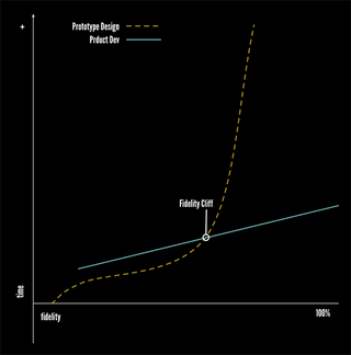
But a prototype is not the final product, only an abstract representation of it. So what happens when we start spending more time improving the 'map' than working on the reality? That's what I call climbing the fidelity cliff.
The 'fidelity cliff'
There is a consistent problem with all forms of prototyping that I have run into again and again. Most design projects start out with a bit of ramp up time (see image below), and then progress along at a steady pace, improving prototype and concept fidelity steadily over time.

There is a point, however, at which the amount of time you spend to refine your deign begins to increase faster then the improvement of the fidelity of the prototype. In other words, you are spending more and more time, for less and less usefulness. You spend more time making minute adjustments to placement, to colors, to menu name options, to all of the little details that to try and make the design looks exactly what you want the final product to look like.
The base of the Fidelity Cliff is the point where you start spinning your wheels in client and team meetings trying to create a perfect prototype rather than getting on with the actual development. It's the point where you stop asking the "What if…?" questions and try to use a prototype to answer "How…?" questions.
What causes the fidelity cliff
Over the years, I've found three main reason designers start to climb the fidelity cliff:
Desire for pixel perfect deliverables
At the risk of invoking the wrath of Adobe, I have to tell you that Photoshop is not the Web. Neither is Illustrator, InDesign, Sketch, or even more dynamic tools such as Macaw, Just in Mind, and Azure. They can represent the look and to a limited extent the action.
However, just like trying to make a 1:1 map, you are fooling yourself if you think they can perfectly represent the final product. Perusing this goal leads to a lot of wasted time with little to show for it.
Thinking all experience design questions can be answered in the design phase
We want our designs to be "bullet proof" when they get to the developers but my experience time after time is that there are just some questions that cannot be answered until the rubber hits the road.
Thinking static prototypes can fill in for temporal designs
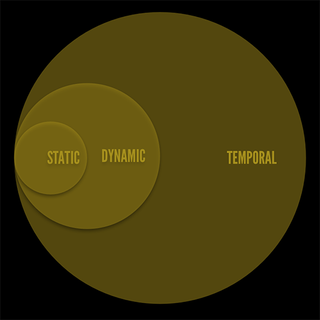
No matter how hard you try, a paper prototype will never be able to answer "What if…?" questions about temporal designs (see image below). Oh, you can talk about the ideas, create static interfaces with all sorts of labels. You can even story board dynamic and temporal ideas out, but you can never truly prototype the idea in order to test it.

How to avoid the fidelity cliff
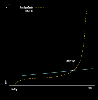
You can never completely eliminate the prototyping fidelity cliff, but you can move the base further down in the process and know when you have reached it in the project (see image below). To do this, the UX profession will need to start to completely rethink how we work, moving away from what were tried and true methodologies to more, dare I say it, lean and agile methodologies.

Here are a few ideas to get you started on your path.
01. Forget 'pixel perfect' during the design phase
No, this does not mean you get to be sloppy or only create rough designs, but you should know that you are not going to hit every possible design option with perfect clarity. Instead, working on close is close enough and then rely on the techniques below to get the development version to pixel perfection.
02. Iterate, but set time limits
Part of the churn and spin comes when we don't set hard and fast deadlines for ourselves. The story goes that Leonardo DaVinci worked on the Mona Lisa for over 15 years trying to perfect the work of art, but was never truly satisfied. He was caught in a perfection loop, iterating to an imaginary perfection that does not exist. We are not artists, though, and we need to produce something we are satisfied with in the time we have.
03. Set the scope (and don't creep)
Setting clear objectives for the project, milestones, and sprints is imperative to making sure you have the time you need to iterate, without getting caught in the perfection loop.
04. Talk and make notes in place of detailed deliverables
I don't know how many times projects spin their wheels and derail simply because the team members won't just walk over to each other's desks and have a conversation. Don't worry about creating beautiful deliverables, worry about communicating using the most direct, effective, and quick ways possible.
05. Create Style Guides
A style guide can be worth a thousand visual comps. It should the most up-to-date agreed upon rules for how the product is to be put together. Need to change the format for how paragraphs appear? You could change it in dozens of comps or simple change the rule in the style guide.
06. Designers need to learn HTML & CSS – developers need to learn UX
If you are a designer and you don't know how the basic core web technologies work, then you are doing a disservice to yourself and your audience. You will overlook new idea, new patterns, and best practices.
If you are a developer and you do not understand the basic tenets of experience design, then you are doing a disservice to yourself and your audience. Even the best design interface will cause frustration if the developer doesn't ensure that attention is given to making sure the product works well. We are all UX professionals!
Words: Jason Cranford Teague
Jason Cranford Teague is a Senior Creative Director at Capital One and teaches workshops on experience design for developers, development for designs, and temporal design thinking.
Like this? Read these...
- 5 things your portfolio must have
- How to start a blog
- Download the best free fonts

Thank you for reading 5 articles this month* Join now for unlimited access
Enjoy your first month for just £1 / $1 / €1
*Read 5 free articles per month without a subscription

Join now for unlimited access
Try first month for just £1 / $1 / €1
Get the Creative Bloq Newsletter
Daily design news, reviews, how-tos and more, as picked by the editors.
The Creative Bloq team is made up of a group of design fans, and has changed and evolved since Creative Bloq began back in 2012. The current website team consists of eight full-time members of staff: Editor Georgia Coggan, Deputy Editor Rosie Hilder, Ecommerce Editor Beren Neale, Senior News Editor Daniel Piper, Editor, Digital Art and 3D Ian Dean, Tech Reviews Editor Erlingur Einarsson, Ecommerce Writer Beth Nicholls and Staff Writer Natalie Fear, as well as a roster of freelancers from around the world. The ImagineFX magazine team also pitch in, ensuring that content from leading digital art publication ImagineFX is represented on Creative Bloq.
