19 common UX problems and how to fix them
Use these 19 popular design patterns and your website visitors will love you!
In this article, Chris Bank of UXPin – The UX Design App discusses the importance of user input design patterns and details examples from some of the hottest websites and web apps today – more examples of these patterns and over 50 additional web design patterns are covered in detail in UXPin's free e-book, Web UI Design Patterns 2014.
For any website or web application, nothing will ever happen without some initial and ongoing input from the user. It is, therefore, critical that web product designers, developer and product managers understand the best ways to allow them to do so.
Although websites and web applications – and the users who use them – are often unique, there are many common patterns (new and old) used solve this particular problem.
An overview of the patterns
Here's an overview of the design patterns we've detailed in this article and at even greater length in our e-book, Web UI Design Patterns 2014:
- Flagging/Reporting
- Tagging
- Inline (Conversational) Forms
- Input Hints
- Natural Language Inputs
- Forgiving Formats
- Inline Validation
- Wizards/Stepped Forms
- Completeness Meters
- Action Context
- Keyboard Shortcuts
- Drag-and-Drop Actions
- Default Values & Autocomplete
- Immediate Immersion (or 'Lazy Signups')
- Social Login
- Notifications
- Discoverable Controls
- Expandable Inputs
- Undo
01. Flagging/Reporting
- Problem: The user wants to mark content that isn't helpful.
- Solution: Give users a way to easily mark and report content that doesn't fit with the site's standards or offends them in some way.
- Examples: Pinterest, Airbnb
This UI pattern lets the user community moderate itself in a way by letting users play the part of content-police. For web apps and communities that rely on user generated content to attract and engage their audiences, this is an essential part of giving users control over what goes on in the network.
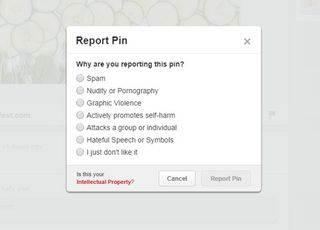
This UI pattern lets the user community moderate itself in a way by letting users play the part of content-police. For web apps and communities that rely on user generated content to attract and engage their audiences, this is an essential part of giving users control over what goes on in the network.
Sites like Facebook, Pinterest and Yelp let users flag content that violates site policies or is otherwise undesirable. Airbnb and OKCupid let users mark profiles and listings that are suspicious and many sites like Amazon let users mark user reviews as either helpful or not.
Get the Creative Bloq Newsletter
Daily design news, reviews, how-tos and more, as picked by the editors.

While it eventually does submit a report to Facebook itself, the act of reporting it also helps the user clean up their timeline.
This helps add credibility to the user-generated content that is visible, and it can also be a good way of providing users with help. For example Facebook walks users through some questions about why they're reporting a profile or Page.
02. Tagging
- Problem: The user wants to categorize content.
- Solution: Let users organize content by adding appropriate keywords to help categorize it.
- Examples: Behance, Flickr
This helps the user organize their own content and also makes it easier for other users to find similar content that has been tagged with the same keyword.
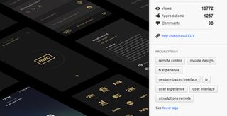
Tags can be seen as an informal categorization as opposed to a top-down structure imposed by the site's creators.
For example Flickr allows users to organize photos in albums collections, but also by tagging them based on keywords that apply to the individual photo in a way that moves across the album hierarchy.

Twitter popularized hashtags for users to 'categorize' their tweet according to a topic or idea, and we're seeing it being copied to other networks like Facebook and Google+ as well.
03. Conversational forms
- Problem: The user sees filling in an online form as an arduous task.
- Solution: Use a conversational tone in forms, putting their function in context with what the user wants to accomplish rather than what your app wants to get out of them.
- Examples: IFTTT, Tumblr
Good UI is user-centric rather than data collection centric, and this pattern can force the former. Virgin America's, for example, flight booking form integrates the form field into user-centered action phrase.
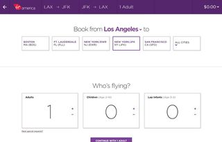
Not only does this look much better than standard dropdowns or radio buttons, it clearly indicates what the form will accomplish. The user logs on to the website with a clear objective (i.e. they want to book a flight from X to Y) and the form simply translates that into an action where X and Y can be modified.
Kickstarter lays out their search filters similarly. Phrasing user input fields in this way can also have the benefit of eliminating errors or confusion about what kind of input is required. Instead of wordy form labels, you have an entire sentence to provide context.
This 'fill-in-the-blank' pattern also has the advantage of being more engaging, although it doesn't fit well with long and complex forms. Virgin solves this problem by combining this with a Stepped Form, which we'll look at later on.
04. Input hints
- Problem: The user wants to know what kind of data to enter in an input field.
- Solution: Show instructions, examples or hints to help users figure out what they need to enter in an input field.
- Examples: Facebook, Twitter
If you're not using the conversational pattern, some sort of input hints are a must but there are several ways of providing them. HTML5 allows an easy implementation of inline text that can appear as placeholders inside the input field. Alternatively, you can also provide hints and explanations as plain text below or to the side of the input field.
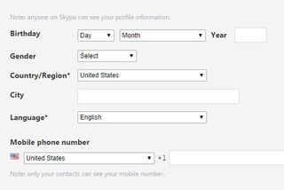
Another way of showing this information is as a popover that appears when the user focuses on the particular field. The hint can stay visible for as long as the user is interacting with that field or it can disappear when they begin entering their own information.
Input hints are a great way of minimizing clutter around input fields while also eliminating confusion and possible errors that the user might face when dealing with them.
05. Natural language inputs
- Problem: The user wants to enter data without having to worry about formats.
- Solution: Accept user input as sentences formed in natural language, leaving the interpretation to the system rather than having the user enter the information into multiple input fields.
- Examples: Facebook, Google Calendar
The most popular implementation of this is perhaps Facebook's Graph Search, which lets you phrase search queries like 'People from Austin, TX who like Coldplay' or 'Married men who like prostitutes'.

Similarly, to-do list manager Remember the Milk lets users create tasks like 'Meeting with Marcin on Tuesday', which the app recognizes as an item with the due date of this Tuesday.
While this is a resource-intensive pattern that requires some complex programming-fu in the backend, natural language inputs are a giant step towards simplifying the UX and making the interaction easier for the user.
06. Forgiving Formats
- Problem: The user wants to enter data without having to worry about formats.
- Solution: Accept multiple formats and variations in your form fields, leaving the interpretation to the system rather than to the user, who doesn't want to think about the 'correct' way of doing it.
- Examples: Twitter, Yelp
When there are multiple options or criteria for user input, indicating all the options can be messy – or, more importantly, fewer users than desired may be able to complete the desired action. Instead of cluttering the UI, you can instead have a single input field accept all the options and interpret them in the backend.

When there are multiple options or criteria for user input, indicating all the options can be messy – or, more importantly, fewer users than desired may be able to complete the desired action. Instead of cluttering the UI, you can instead have a single input field accept all the options and interpret them in the backend.
Weather Underground for example uses a single field to accept zip codes, city, states, airports or countries. Similarly time tracking tool Harvest allows users to enter time in varying formats, for example 1.5 or 1:30 to specify an hour and a half.
The Facebook and Twitter login forms allow users to enter their username or email address to login instead of forcing them to choose one.
07. Inline Validation
- Problem: The user wants immediate feedback about entered data.
- Solution: Inspect and validate user input as it is entered, rather than waiting for them to hit the submit button and bombarding them with validation errors.
- Examples: Facebook, Gmail
This makes data entry a more interactive process, saving the user's time by catching problems as they occur. Inline validation can be used to check if users have entered required information, to check for formatting errors in phone numbers or email addresses which are often mistyped, or even as feedback about the user's input.
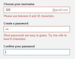
The Gmail and Twitter signup forms also provide immediate feedback about the strength of the user's desired password. Showing validation data inline against the relevant item prevents any confusion about what went wrong. The immediate feedback keeps the user's focus on the problem.
Inline validation is especially important when dealing with account registration, long forms with many fields or complex formatting requirements.
08. Wizards/stepped forms
- Problem: The user wants to provide information in as simple and contextually relevant way as possible.
- Solution: Break the user input process into smaller, more manageable steps that are presented to the user one at a time.
- Examples: Virgin America
This pattern makes the most sense when the user's input shapes how things proceed but it also smooths the user experience in situations that involve a lot of data entry.
By breaking the process into steps or subtasks, you can provide the user detailed guidance for each step as well as adapt according to what the user has already entered, providing a cleaner and more personalized experience.
Stepped input forms are also a great way of reducing the entry barrier for new users. For example, Mint.com starts the signup process by only asking for the user's email, password and zip code – all the other details they need come later. Users will tend to put off or altogether avoid forms that are too long and demand too much cognitive load – everyone's in a hurry these days.
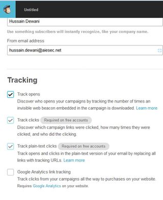
Big tasks broken into smaller, bite-sized tasks are much easier to begin. The stepped form can keep the user's focus by using 'Back' and 'Forward' buttons and also show them how many steps are left until they reach the end.
Stepped forms also allow for pre-filled information to be used in later stages when the next step is loaded, and even change the number or type of inputs available based on prior answers, which could further simplify the task. The option of skipping certain steps also makes life easier for the user.
09. Completeness meters
- Problem: The user wants to know how far they have come in completing a particular goal.
- Solution: Provide the user with a visual representation of their progress towards a goal.
- Examples: LinkedIn, Google+
Most often this is shown as a percentage that quantifies how far they've come and how far they have to go to reach '100%'. The goal in question could be an arbitrary one aimed to increase engagement with the app or elicit particular actions such as getting more personal information to build a richer user experience, linking other accounts, inviting other users, sharing on social media, and so forth.

For example, LinkedIn provides users with a profile 'Strength Meter' that fills up as they add more information and sections to their profile. Combined with the Next Steps pattern to provide users with linked actions gives users a clear indication of what they need to do next to complete their end of the deal, making their interaction even more frictionless.
10. Action context
- Problem: The user wants to know the impact of their actions.
- Solution: Use language and statistics to show context around a user's actions.
- Examples: Quora, Spotify
There are several important contexts the user needs to be aware of, for example the time or effort it will take to complete a certain action, what it will impact and whether it is time-sensitive.

Booking.com pulls this off by adding a notification that informs the user when the last booking was made in the hotel they're looking at, as well as how many people are currently viewing it, to give the user an indication of how much in demand the hotel is.
Quora achieves the same effect by making a note of how many people are 'waiting for an answer' by following a question, enticing the user to submit an answer. Spotify and Amazon on the other hand provide context around their recommendations which are based on data collected from multiple users.
11. Keyboard Shortcuts
- Problem: The user wants to quickly complete certain tasks.
- Solution: Add shortcuts and hotkeys to your app that allow users to perform certain actions quickly using their keyboard instead of navigating with the mouse to press a button.
- Examples: Dropbox, Asana
This comes in especially handy for repetitive tasks, for example navigating through emails or handling tasks in Asana. While keyboard shortcuts are generally seen only as an accessibility feature, the added usability is helpful across the board for all users and can significantly improve the UX for advanced users.
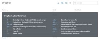
The problem with keyboard shortcuts however is that not everyone can remember them. Gmail solves this by showing a glossary when the user presses Ctrl+?; Dropbox does the same except with Ctrl+/, while Asana shows essential combinations across the bottom of the screen.
12. Drag-and-drop action
- Problem: The user wants to quickly and naturally perform an action on a website using relevant content or objects.
- Solution: Allow users to interact with content or objects through direct manipulation such as dragging-and-dropping.
- Examples: Dropbox, Asana
This action can be used for rearranging items as in Google Drive or Asana, and it can also be used for initiating file uploads. This translates the dragging patterns built in to OS interactions to the web much like the Draggable Content pattern.
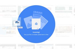
For example, when uploading a file, the user would usually switch from the file explorer to the browser's upload window. This pattern replaces the clumsiness with a more seamless transition, letting users select and drop any number of files into the browser window to upload it without having to click through file hierarchies to find and upload a file.
Google Drive clearly indicates that it can accept a dropped file by drawing an animated overlay over the page's regular content. Dropbox, however, only indicates this with a border around the window and a small notification.
Depending on your target users, though, it may be best to create an obvious indication rather than risk confusion. Asana and many other web applications also let you upload files by dragging-and-dropping.
13. Default values and autocomplete
- Problem: The user wants to complete actions quickly.
- Solution: Anticipate frequently selected items and make data entry easier for the user by providing them with pre-populated default values or prompts based on suggestions and previously entered data.
- Examples: YouTube, Amazon
The UI can automatically adapt to smart defaults and input fields can be prefilled with the most common data. YouTube for example automatically sets the language and region based on where the user is browsing from – this can be changed easily with controls at the bottom of the page, but most users will never need to even think about it.
This can be paired with autocomplete functionality like in Google search, which significantly speeds up the user's actions but also serves as hints or guides for users who want to explore a topic or theme.

Google also prefills the country and phone number country code based on the user's location, letting users skip a couple of steps. Twitter speeds things up by placing links to matched profiles in the search box so that the user can skip an interstitial search results page and go to the profile directly.
This pattern can be particularly useful in standardizing user input and anticipating problems before they occur.
14. Immediate immersion ('Lazy Signups')
- Problem: The user wants to try things out before making a commitment.
- Solution: More applications are letting users immediately immerse themselves in an app before anything else – even signing up or logging in.
- Examples: Airbnb
Remember, people can only do one thing at a time, and have limited time to test every new product out. With the growing specialization of web apps, it's increasingly important that you find quality user or customer leads before nurturing them – they may hate your product or quickly realize it's not what they wanted.
Asking users for the information you need to register their accounts can be a tough ask, and lower signup conversion rates even for qualified visitors.
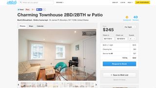
On a positive note, by letting them immediately experience your product, they may get more hooked because of how deeply they were able to explore the app on the first experience. This can work better than the onboarding walkthrough UI pattern we cover next, because it shows the user instead of telling them how things work.
AirBnb allows you to browse through different living spaces and even create a listing before requiring sign up. SoundCloud allows people to listen to other people's mashups/remixes without requiring sign up and Yelp lets users write reviews before asking for a login.
This creates a much more welcoming environment for a large audience of music lovers who can enjoy listening to unique remixes of their favorite songs, while generating an attractive platform for current and future members who want to upload and share their own music with the largest population possible.
Oftentimes, registration comes with an added benefit which makes it more attractive. Late registrations may not always be a good idea, but the option to 'try-before-you-register' can be a great way to increase engagement with your app.
15. Social login
- Problem: The user wants an easier way of signing up and logging in.
- Solution: Integrate social sign-in methods that allow users to login through their existing accounts. This means they have one less username/password combination to worry about, and at the same time, you don't have to worry about password security as much.
- Examples: Spotify, Pinterest
Facebook, Twitter and Google are the major OAuth login providers and depending on the platform and target audience, you can implement all or either of these in your app instead of having users set up a separate account that they may or may not end up using in the future.

Using this signup and login pattern can also provide you with some basic data about the user (which feeds into data auto-population as they use the application), all the while making it easier on them by not forcing them to type their details into the strange new app they just downloaded.
This simple feature can go a long way in drastically improving your UX, and no wonder this pattern is well on its way to becoming an expectation.
16. Notifications
- Problem: The user wants to know about new activity or actions they should take at a glance.
- Solution: Highlight recent activity by visually marking new content.
- Example: Pinterest, Twitter
There are several implementations of this pattern. Placing a small numbered badge on the menu label was popularized by iOS but can be seen seeping into web interfaces as well with many other web apps now like in LinkedIn, Facebook or Quora.

Twitter does this as well but also highlights the label with a dot to indicate new activity in a more subtle way. Another way to display notifications is with a banner or other element in the page to get the user's attention.
17. Discoverable controls
- Problem: The user wants quick access to controls that are secondary or only relevant to specific sections or content on the web page.
- Solution: Clear up the clutter and let users discover particular actions only when they need them.
- Example: Pinterest
Users can usually access these invisible controls by either hovering over specific sections or content on the web page or scrolling through the website.

This allows for certain actions to stay off-screen until it makes sense to use them, saving valuable real estate and offering a cleaner user interface.

Individual settings for items in the Timeline on Facebook can be 'discovered' behind a subtle triangle menu. Spotify uses a click-and-hold action to let users preview songs or playlists while browsing.
18. Expandable Inputs
- Problem: The user wants to focus on the content instead of sacrificing screen real estate to controls.
- Solution: Design controls that expand when the user clicks on them. This keeps these controls out of the way until the user needs them.
- Example: Facebook
For example, Quartz conserves screen space by hiding the search bar behind an icon that expands into a search bar when the user clicks on it. Facebook collapses the comments sections on most posts in the Timeline until the user explicitly clicks on the Comment link.

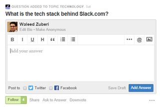
Another way of conserving screenspace is to have the input fields automatically expand to accommodate larger amounts of text. The Facebook comments field enlarges itself depending on how much text you write, but by default it is a single line.
Similarly, Quora hides the WYSIWYG editor and only shows a plain text box until the user clicks on it.
19. Undo
- Problem: The user wants to take actions quickly without interruptions (ex: confirmations) but with the option of reverting accidental actions.
- Solution: Provide an easy way for users to undo their actions instead of just asking them to confirm beforehand.
- Examples: Google Calendar, Asana
Situations where an action can cause inconvenience or loss of data if done by accident or in haste, for example deleting an email or editing some text. The user may have completed an action because they didn't know what to expect; a forgiving UI that let's them experiment can be more engaging and friendly.

The ability to undo is also great for power users, who will appreciate feeling more in control without the UI holding their hand throughout the process repeatedly asking if they're sure they want to proceed.
A confirmation popup can be useful at explaining what's about to happen, but users may not understand the implications until they see the result of their action. Not to mention the time it saves. In cases like these it's best to get out of the way while providing a safety net in case of mistakes. Allowing users to edit their input is another way of giving users a chance to 'undo' their actions.
Get your user's input
Keep track of where you're supposed to be getting input from your users, whether they ever view those input areas, how often they use those input controls, where they're coming from and going to in the application (ie the user flow) and so on.

Keep rearranging, re-sequencing, re-sizing, and tweaking those controls until you get more of the desired actions. And, of course, think deeply about how the user is actually using your mobile application when they're able to give inputs – make sure you're not missing something obvious when designing your app.
For a deeper look at how some of the hottest companies are implementing new and existing user input design patterns as well as 50+ other patterns, check out UXPin's new e-book, Web UI Design Patterns 2014. Use what you need and scrap the rest – but make sure to tailor them to solve your own problems and, most importantly, those of your users.
Words: Chris Bank
Chris Bank is the growth lead at UXPin, a UX design app that creates responsive interactive wireframes and prototypes.

Thank you for reading 5 articles this month* Join now for unlimited access
Enjoy your first month for just £1 / $1 / €1
*Read 5 free articles per month without a subscription

Join now for unlimited access
Try first month for just £1 / $1 / €1
The Creative Bloq team is made up of a group of design fans, and has changed and evolved since Creative Bloq began back in 2012. The current website team consists of eight full-time members of staff: Editor Georgia Coggan, Deputy Editor Rosie Hilder, Ecommerce Editor Beren Neale, Senior News Editor Daniel Piper, Editor, Digital Art and 3D Ian Dean, Tech Reviews Editor Erlingur Einarsson and Ecommerce Writer Beth Nicholls and Staff Writer Natalie Fear, as well as a roster of freelancers from around the world. The 3D World and ImagineFX magazine teams also pitch in, ensuring that content from 3D World and ImagineFX is represented on Creative Bloq.


