When to paginate and when to infinite scroll
Preston Pierce examines pagination and scrolling and attempts to come up with a definitive answer.
Seasons have passed and advancements have been made, but there's not a single trace of verdict been delivered on the debate of infinite scrolling versus pagination. As a result, some designers are still refereeing a tug-o-war between the two methods to decide which to implement into their projects.
Those who march ahead without good idea of when or how to use either of the methods properly, tend to end up exhausting their resources and frustrating their users… regardless of the method.
But why would a user be irritated? To understand why, read on.
Infinite scrolling
Infinite scrolling is a technique that breaks or hides the scroll bar, allowing the user to scroll through a massive chunk of content with no finishing-line in sight. You may also see it on one-page websites using parallax scrolling. Tempting as it may sound, the technique isn't a one-size-fits-all case for every website.

Not only does the technique overwhelm you with its plenitude of content mined from around web, but also deprives you of the control on the data you intend to explore.
According to a research paper, Psychology in Human-Computer Interaction, by David Kieras, Professor at University of Michigan, it is noted that "reaching an end point provides a sense of control". The research further clarifies that when the user is given limited yet relevant results, he is able to determine easily if what he's seeking is actually there or not. This allows the user to make fine assessment of the data, rather than skimming an infinite chunk.
Another problem that I believe with infinite scrolling is that it is highly inefficient when it comes to searching and locating the desired item. Thanks to its endless stream of data, the user is unable to pin point the exact location of the desired data. Even if he does so, he would still need to look for it all over again, from the top, if he revisits the web page at another time.
Get the Creative Bloq Newsletter
Daily design news, reviews, how-tos and more, as picked by the editors.
Adverse effect of infinite scrolling on user experience
Earlier, what I meant by a frustrated/irritated user is an unsatisfying, or rather annoying, user experience. As I said, you can't find the item you've located on a page if you've kept scrolling for more. The technique doesn't come with the most important ability of saving the scrolling state of the user.
Suppose that you are looking for an image of a 'cake', and you found one. However, you're tempted by the other images you see on the web page, which made you keep scrolling. At the end, you didn't like any of those and tried to get back the one you found earlier by clicking the back button. To your surprise and annoyance, you are transported to the start of the page, having to scroll through the chunk all over again to re-locate that image.
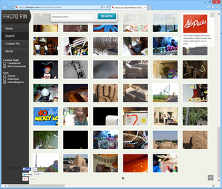
This inability to determine the scrolling position of the user not only causes annoyance or confusion to the users but also hurts the overall user experience, as a result.
Apart from the above problem, infinite scrolling can be bad for your web page performance as well as it feeds a lot on the browser's memory. After all, you're listing never-ending content on a single page.
Plus, no end point in sight due to ceaseless torrent of data also irritates users who are scrolling down to the footer looking for more links, for instance TOS, privacy policy, etc.
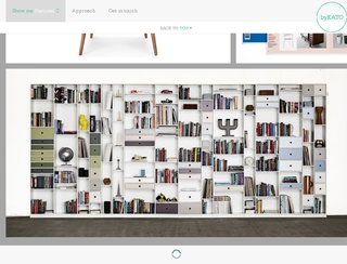
All in all, if not done properly and with due diligence, infinite scrolling might end up being the bane of user experience and usability than being a blessing.
How pagination fares against scrolling
Pagination comes with a beginning as well as an end point. Users usually love pagination because they can easily determine whether the information they came looking for is there or not. If it is, then they also know at which position they can find it.
They know that they have a limited, but relevant, result before them, which is why they don't need to go to extra miles to look up anything. In short, pagination offers users greater control on their searches. With a sense of control, comes the sense of completion and with the latter comes the sense of contentment.
Contentment, of course, is what a successful user experience sets to accomplish.
Pagination brings conversion unlike infinite scrolling
The paramount benefit of paginating the content instead of leaving it at the mercy of infinite scrolling is that pagination brings conversion. After all, pagination focuses on usability rather than simple styling or offering eye candy elements.
When you use scrolling as your prime method of exploring the data, it may make the user to stay longer on your web page, and so increase engagement. However, the user won't be clicking much due to all the glittering content you occupied him with.
Pagination, in contrast, gives the user less time to surf the data and more time decision-making, and thus clicking the desired information. As a result, you get a good conversion!

You may measure the benefits of pagination with the example of Google web search. After all, it has made its paginated web search a symbolic means to its key business model… and thus given rise to SEO, which is an entirely different discussion – read our essential SEO checklist for web designers for more.
Final Comparison
Infinite scrolling is best suited for websites that boast user-generated content (Twitter, Facebook), visual content – given that it offers limited viewing like Google image search – or sites that intend to balance the traffic load on their content like Mashable.
Pagination, on the other hand, is a universal option, and best for platforms that intend to satisfy the goal-oriented activities of the visitors like Google web search, and so on.
So, there's my verdict – do you agree with my findings or not? Do share your opinions below.
Words: Preston Pierce
Preston Pierce is creative head and blogger at Logo Ping. He has five years' experience in graphic design, mostly brand identity and web UI designs.
Like this? Read these!
- How to start a blog
- The ultimate guide to logo design
- Useful and inspiring flyer templates

Thank you for reading 5 articles this month* Join now for unlimited access
Enjoy your first month for just £1 / $1 / €1
*Read 5 free articles per month without a subscription

Join now for unlimited access
Try first month for just £1 / $1 / €1
The Creative Bloq team is made up of a group of design fans, and has changed and evolved since Creative Bloq began back in 2012. The current website team consists of eight full-time members of staff: Editor Georgia Coggan, Deputy Editor Rosie Hilder, Ecommerce Editor Beren Neale, Senior News Editor Daniel Piper, Editor, Digital Art and 3D Ian Dean, Tech Reviews Editor Erlingur Einarsson and Ecommerce Writer Beth Nicholls and Staff Writer Natalie Fear, as well as a roster of freelancers from around the world. The 3D World and ImagineFX magazine teams also pitch in, ensuring that content from 3D World and ImagineFX is represented on Creative Bloq.
