How to use UI patterns in 5 easy steps
UI patterns are a great way to ensure your websites meet the needs of your users, explains Chris Bank of UXPin.
In this article, Chris Bank of UXPin – the wireframing & prototyping app – explains the theory and practices applying UI patterns to your website. For analysis of UI examples from over 33 companies, feel check out Web UI Best Practices.
More than being creative, a good artist must also consider subtleties like composition, colours, size, what to include, and – perhaps more importantly – what to leave out. That's no easy feat, which is why we hold the masters like da Vinci and Van Gogh in such high regard.
Web UI designers must do the same. As discussed in Web UI Best Practices, a website is a form of visual art in its own right, and follows many of the same rules as more traditional artforms. It's the science of aesthetics, mixed with the principles of business, and an extraordinary website interface must feel effortless yet enticing.
01. What are UI patterns?
Once you've determined the overall visual hierarchy of the website, you still need to determine the fine details of your web interface such as how users can input data, how the site provides feedback, and many other functional and aesthetic factors.
The best ways to consistently address these needs are UI patterns. You’ll rarely be able to create an interface just by stitching different patterns together, but they are a great foundation for customization.
A UI design pattern is a reusable solution to a commonly occurring problem – not just a feature that can be plugged into your design or a finished design ready to be coded. In Web UI Design Patterns 2014, we explain the proper application of web UI patterns by looking at 63 examples from sites like Amazon, Facebook, and Pinterest.

It’s best to think of UI patterns as best practices for core site functions such as:
Get the Creative Bloq Newsletter
Daily design news, reviews, how-tos and more, as picked by the editors.
- Getting Input – How will users provide you data, and how will the site give them feedback?
- Navigation – What menus and tabs will guide the user along?
- Content Structuring – How is your content presented and accessed?
- Social Sharing – How can your site encourage more social sharing and interaction?
02. How to use UI patterns
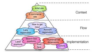
Anders Toxboe, designer at Benjamin Interactive in Copenhagen, theorizes that patterns can aid a site in three ways: context, flow, and implementation.
The broadest benefit of patterns, implementation, is the most cut-and-dry. A search box should be in the upper right-hand corner, form labels should be directly under the field box, etc. Instead of recreating the hierarchy for each page, a UI pattern ensures site-wide consistency.
When using patterns for flow, things get a bit more interesting. Patterns of this type force the designer to answer critical questions about their site. Would my site benefit more from lazy or account registration? What is the best way to get input from my users, given my target audience and the type of site? (Answering these questions will be easier by referencing your personas and scenarios from the previous chapter.)
Last (but in the grand scheme of things, first) we have patterns of context. This is basically choosing what type of site you want, and following patterns specific to that type. For example, let’s say you’re building a site for a professional entertainer: you’ll need to include things like an event calendar, biography, and portfolio. If you’re making a ecommerce site, you won’t get very far without a checkout system.
03. Pick the right UI Patterns
The process for selecting a UI pattern can be simplified as:
- Figure out the problems that need to be solved.
- Find out how others have solved it.
- Examine a good example of its use on other sites.
- Detail the patterns proper usage.
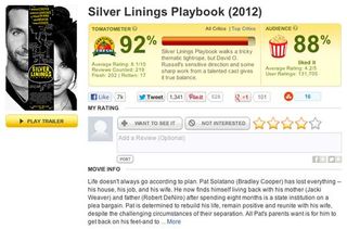
The criteria for determining the right pattern is elaborated on by Melissa Joy Kung, editor-in-chief of Technori, in her post about the topic. While the above process is focused on finding the right patterns, hers discusses how to decide whether or not a pattern is right for you. She illustrates her points through the example of a 'ratings' style pattern used by Rotten Tomatoes.

- Define the pattern – Understand what the pattern does. As shown above, the ratings patterns gives users quick feedback and allows their voice to be heard, plus it is useful in collecting user data.
- Find a strong example – Search the web and find a site that uses the pattern well, in this case, Rotten Tomatoes.
- List the problems the pattern solves – For the ratings example, it creates more reliable and direct feedback, it makes the site more interactive and fun, and it gives the users’ opinions more weight, which they appreciate.
- Know when to use the pattern – Be aware of when the pattern is appropriate. A ratings pattern is used when your product requires additional feedback, or when you want to expand on existing feedback like a written review.
- Know how to use the pattern – Know the technical details. A good use of the rating pattern will include an aggregated average of the user ratings, an option to change the rating later, a display that lights up when you hover on it, a cue to let the user know their rating is accepted, etc.
04. Keep track with pattern libraries
Unless you're a hardened UI designer with years of experience, it's hard to keep track of all the patterns at your disposal. Missing out on a useful pattern can waste your time with finding a solution that others have thought of already. In order to stay up-to-date, below are some quick references for pattern libraries.
- UI Patterns – A convenient web pattern library with patterns organized by category; however, it has not been updated recently.
- Pattern Tap – A community of designers for web design education and resources.
- Web UI Kit – Collection of 30 patterns compatible for Axure, Omnigraffle, Photoshop and Sketch.
05. Going further
Understanding visual hierarchy and applying design patterns are two of the most important skills in good web UI design. They are fundamental and interconnected: once you know how to visually prioritize information, you’ll have a better grasp of how to apply existing design patterns.
For a comprehensive source of UI patterns, you can check out this listing of over 40 online pattern libraries from Smashing Magazine.
Prioritize your interface based on how people scan for information. Then, apply colour, contrast, size, and spacing for further accentuation. Web UI patterns are great guidelines, but just remember they are not templates – more like a formalized best practice that's open to your own creative freedom.
Words: Chris Bank
Chris Bank is the growth lead at UXPin, a UX design app that creates responsive interactive wireframes and prototypes.

Thank you for reading 5 articles this month* Join now for unlimited access
Enjoy your first month for just £1 / $1 / €1
*Read 5 free articles per month without a subscription

Join now for unlimited access
Try first month for just £1 / $1 / €1
The Creative Bloq team is made up of a group of design fans, and has changed and evolved since Creative Bloq began back in 2012. The current website team consists of eight full-time members of staff: Editor Georgia Coggan, Deputy Editor Rosie Hilder, Ecommerce Editor Beren Neale, Senior News Editor Daniel Piper, Editor, Digital Art and 3D Ian Dean, Tech Reviews Editor Erlingur Einarsson, Ecommerce Writer Beth Nicholls and Staff Writer Natalie Fear, as well as a roster of freelancers from around the world. The ImagineFX magazine team also pitch in, ensuring that content from leading digital art publication ImagineFX is represented on Creative Bloq.
