How to properly simplify your web design
Everyone loves a simple site. Jerry Cao explains how to design one without losing vital information.
How to apply Hick's Law to web design
Decision-making extends far beyond deciding which menu option to use – in fact, the choice to use a menu at all is also a decision. This new line of thinking requires a broader abstract interpretation of Hick's Law that's actually quite practical
When analyzing the spirit of Hick's Law (instead of just the words), several new strategies emerge for simplifying user decisions. In our experience, we advise designers to trim content when possible, return to the fundamentals, and keep eye scanning in mind. Let's take a deeper look below
01. Reduce secondary content
Consider minimalism. The heart of Hick's Law is that more options mean more cognitive stress and more competition for your user's attention. Less options, then means less stress – and a higher likelihood that your users will choose the actions you want them to.
Secondary content like widgets, external ads, and sidebar tools may seem to enhance your product; however, the cost is that they water down the main content
If you want draw more attention to your primary content, trim the secondary content.
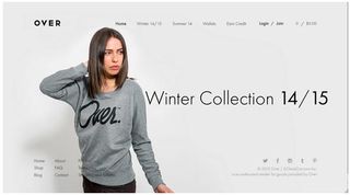
At Over Clothing, the choices are simple, and the site is aesthetically pleasing. Users are presented with only the basic options on the homepage, with the popular Winter Collection 14/15 selection easily the most visible
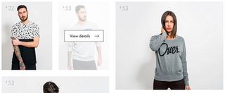
Once users select a collection, the site creates an exploratory experience by only providing details on hover. The visuals allow the clothing speak for itself, enticing users to know more. As Stephen P. Anderson alludes to in his book on the topic, this simple approach lures users into deeper engagement with the site by alluding to (instead of plastering) the next steps.
Get the Creative Bloq Newsletter
Daily design news, reviews, how-tos and more, as picked by the editors.
Of course, remember to design around the persona. In this case, the target users are likely younger people who shop to keep up with the latest looks. This alluring site flow works because they enjoy the experience, and the product selection is highly limited.
Now, if you were an online department store whose audience consisted mostly of middle-aged parents buying clothes for kids, you'd probably want to provide the guidance of traditional sidebars and callouts. In either case, make sure you provide only enough secondary content to move users towards their goal. Overdo it, and you disrupt the pace of the experience.
02. Execute the fundamentals flawlessly
As a designer, you probably know the basics of good interface design. If you execute them well, they will naturally help with smoothing out the decisionmaking process – especially for primary decisions.
Within 50 milliseconds, users will know if they want to stay on your site. Design your top-tier decisions – namely the main navigation options – to be as clear as possible. To achieve this, remember a the fundamentals of UI design described in Web UI Best Practices such as:
- Layout – Are your primary choices displayed prominently, or are they subdued by less-important options?
- Structure – Is your information displayed coherently? Make sure even first-time users know how to access content
- colour/Contrast – If you're opting for a minimalist approach, use colour and negative space to accentuate the important decisions
- Spacing – Are objects on the interface each given adequate space, or are they jumbled together? Space creates breathing room, which creates relationships between content
- UI Patterns – Holistically, does your site feel somewhat familiar with users? Does it use recognizable patterns as described in Web UI Patterns 2014 and shown on UI-Patterns? Make sure your site is consistent with best practices, but also consistent with itself
Let's look at Fitbit below for some inspiration on layout, organization, colour, and spacing.
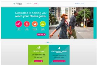
Top-level decisions like Get Active and Eat Better are called out with a round icon and white contrast font. If users are already sold on the value and want to find a product, a grid treatment on the bottom of the page helps differentiate that decision. The design also employs grey space to create distance between these two types of decisions (value vs. product).
Similar shades of blue are also used in the fitness goals and product sections, which cleverly creates an association between the two (and draws clicks to the most valuable parts of the interface). In terms of overall layout, Fitbit has clearly used a Z-pattern that maps to how people naturally scan sites.
To make sure your site is as enticing as the above example, make sure every decision decision is preceded by 3 simple questions:
- What is this? (Familiarity)
- How do I use it? (Learnability/ Usability)
- Why should I care? (Usability/Desirability)
03. Anticipate scanning of information
Not only do more options strain your users, they also encourage users to skim more and pay less attention. If your site includes is content-heavy, you must design it knowing that users are not reading linearly.
How could this impact the interface design of your website? Take a look below
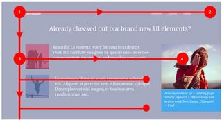
You can see in the above image that prime content is immediately visible, with more detailed content (and a call to action) located below for quick scanning. This F-pattern helps sites that want to embed advertising or calls to action without distracting from content (such as The New Yorker below).
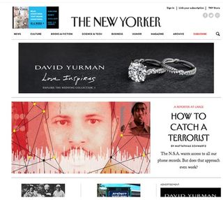
As with all patterns, the F-Pattern is a guideline – not a template – because the pattern can feel boring after the top rows of the 'F'. As you'll see below, designers can also adapt the pattern for sites that aren't text-heavy.
Kickstarter actually adds in some widgets (laid out horizontally) to keep the design visually interesting beyond the first 1000 pixels.
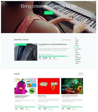
Since exploring popular ideas is core to the Kickstarter experience, the popular projects are visually prioritized over the sidebar. As you scroll down the page from the banner to popular projects, the number of choices available feels just right.
As an alternative, you can also consider the Z-Pattern. To learn more about the Z-Pattern, check out this excellent piece from tuts+.
Conclusion
Ultimately, the key to simplifying user decisions is prioritizing site content. It may sound counter-intuitive since you might think we want to trim content in order to achieve a simpler layout. But there's a huge difference between a minimalist aesthetic, and a minimalist philosophy.
Always apply a minimalist philosophy to your web layouts. Think about the best way to present the primary content in the most visually digestible manner, then provide just enough menus and navigation so that the experience unfolds logically.
Like we described in Interaction Design Best Practices, users don't need to access any relevant page within 3 clicks. It is far more important that each click feel smooth and frictionless.
To learn more about mastering the intangible aspects of web design, feel free to check out our free ebook on the topic. We've included 80+ pages of practical advice on designing for time and behavior, relying upon analysis of real-world examples from MailChimp, Apple, AirBnB, Netflix, Google, and other companies.
Words: Jerry Cao
Jerry Cao is a content strategist at UXPin — the wireframing and prototyping app — where he develops in-app and online content for the wireframing and prototyping platform. To learn how to use mockups of all types and fidelities, check out The Guide to Mockups.
Like this? Read these...
- How to build an app: try these great tutorials
- Free graphic design software available to you right now!
- Download the best free fonts

Thank you for reading 5 articles this month* Join now for unlimited access
Enjoy your first month for just £1 / $1 / €1
*Read 5 free articles per month without a subscription

Join now for unlimited access
Try first month for just £1 / $1 / €1
The Creative Bloq team is made up of a group of design fans, and has changed and evolved since Creative Bloq began back in 2012. The current website team consists of eight full-time members of staff: Editor Georgia Coggan, Deputy Editor Rosie Hilder, Ecommerce Editor Beren Neale, Senior News Editor Daniel Piper, Editor, Digital Art and 3D Ian Dean, Tech Reviews Editor Erlingur Einarsson and Ecommerce Writer Beth Nicholls and Staff Writer Natalie Fear, as well as a roster of freelancers from around the world. The 3D World and ImagineFX magazine teams also pitch in, ensuring that content from 3D World and ImagineFX is represented on Creative Bloq.
