The UX guide to defining web content
This free book extract explains how to create better web content with user stories.
Content Strategy A Guide for UX Designers by Liam King is a free, hands-on guide for UX designers exploring the intersection of content strategy and UX design on a website design project.
The book shows you how to embed content-first thinking into popular UX design techniques to reveal powerful insights about the content, that lead to a better user experience. To see how these principles can be applied to the real world, the fictitious client Balmain University is used as an example project.
Below, we share the first chapter of the book, 'Define Content', to offer a taster of what it has in store... Download your copy of the full book for free here.
Content considerations
We have already asked the client some revealing questions
that should influence the design process. The design has to be
appropriate to the client and their ability to sustain that content.
- the existing site has about 150 pages
- there will be a team of three writers on the project to rewrite
- the content for the new site: two from the Comms Team and
- one hired writer to support them
- they have the resources to typically spend one day per week
- adding and maintaining content to the site - there are no plans
- to increase this for the new site
- the University has a content style guide that the International
- Student site must follow
As a project team we’ve identified 80+ user needs which we have articulated as user stories.
01. Prioritise
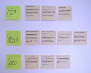
Step one: we prioritise the user stories with the client in an Agile release planning meeting
02. Update
Step two: We update the user story backlog in our Google sheet
Get the Creative Bloq Newsletter
Daily design news, reviews, how-tos and more, as picked by the editors.
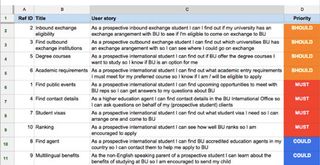
What is our inner content strategist thinking?
- There’s already a growing list of likely content types emerging: events, contact details, something around exchange partners
- Do these types of content already exist on the current site or are there new additions to sustain?
- How many items are there for each content type? Does BU have a few exchange partner institutions or thousands to list? A dozen accredited agents or hundreds?
- What’s included in the current versions of the content types?
- Is there a single source of truth for contact details for BU staff? If so, where is it?
- Multilingual content was prioritised as a could, but we need to keep an eye on it because that has all kinds of translation and maintenance considerations
- Is there any likely content that the International Office (our client) does not have direct control over? If so, what? And who controls it?
03. 'Must' stories first
Step three: Looking at the prioritised user stories we can see that we [the project team] need to work on the Must stories first
We will start with this user story...
Find contact details: “As a higher education agent I can find contact details in the BU International Office so I can ask questions on behalf of my (prospective student) clients”
If you aren’t overly familiar with them, a user story includes:
- the person using the service (actor)
- what the user needs the service for (narrative)
- why the user needs it (goal)
The UK Government’s Service Manual has some great guidance on writing user stories: https://www.gov.uk/service-manual/agile/writing-user-stories.html
Prepare for content governance: We are keeping a list of potential risks, considerations and implications of maintaining and sustaining the content as we go through the UX design process. Example: Who is going to translate content during the project and beyond?
Activity: Competitor Analysis: Let’s look at how BU’s competitors have used content to achieve the user story we’re working on. Asking these sorts of questions will reveal insights to inform our UX design work:
- what language and labels do they use? Any patterns emerging?
- how granular is their content?
- what content elements / attributes do they include?
- what content mediums are they using and how?
- what tone of voice do they use?
- what content do they leave out?
- what content are they translating?
04. Review
Step four: We review (click around) 5-6 competitor sites and annotate screenshots
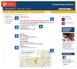
What is our inner content strategist thinking? In 60 seconds we can draw out a bunch of insights (and follow up questions) from this single Sydney University example:
- They use the term “contact us” but others are using “enquire” – which term should [BU] use?
- They stress that only ‘Future students’ should use these contact details - is this true for BU? How else do we need to screen enquiries?
- They are using single letters, e.g. ‘F’ for the fax number - is this convention helpful and meaningful to an international audience?
- They have a different number for calls from overseas - Q. do BU have one too?
- Does BU have (or need) to present a separate mailing address? If so, what?
- They include (if a little hidden) office hours - what are the client’s office hours? What about dates the office is closed like public holidays?
- They use Google maps – if we were to include a map does BU have a preferred map type?
And some general insights and questions:
- The various contact channels (email, call, form) have the same weighting - but does our client want to encourage users to opt for particular channels?
- There are no contact details for individual staff members - are we going to present actual people and their contact details? If so that might require a special content type
- How are we going to handle displaying international dialing codes in phone numbers? Does the BU International Office already have a convention for this? We should add this to the content style guide
- Presumably BU contact details already exist and we want to use those (and not create a duplicate) - but that will mean syndicating content from another system? Do we know which system?
We upload our annotated screenshots and analysis bullet points to the project team’s shared space (Basecamp). We present our insights to the project team for a wider discussion.
Activity: Mapping User Flows: We now start to map out the user flows for our priority user stories to reveal the templates and key interfaces we need to design.
We consider where users arrive from, plus the step / actions they will take after their visit. This gives us more context to design the parts of the experience we have control over.
Find contact details
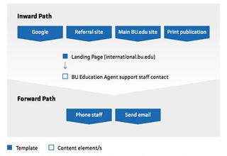
What is our inner content strategist thinking?
Which pages will be the top landing pages on the site? Which are the top landing pages on the current site, and what content do they include?
- Will a regular article page template be sufficient or do we need a dedicated landing page template?
- Will the contact details for the staff that support the Education Agents be embedded in article pages on the topic or in a dedicated contact us page, or both? Is there a duplication risk?
- Do we need a content type in the CMS for contact details so we can have a single source of truth that can be published in multiple places on the site?
- How many BU staff members will actually be taking enquiries from Education Agents - one, two, a dozen?
- Do the contact details (name, email, phone number) we need to satisfy the user story already exist? Where can we see them?
- What other info may the Education Agent need to make a successful enquiry? Office hours (especially for calling)?
- Will we need some screening questions to make sure they aren’t wasting BU staff time? Do any policies and protocols already exist about this?
Note potential templates and content types
Build a simple, running list of templates and CMS content types as they emerge during these early UX design activities. A table or bulleted list in a project Wiki, a shared Google doc, or Basecamp writeboard are all perfectly good options at this stage.
Download the full book for free here
Liked this? Read these!

Thank you for reading 5 articles this month* Join now for unlimited access
Enjoy your first month for just £1 / $1 / €1
*Read 5 free articles per month without a subscription

Join now for unlimited access
Try first month for just £1 / $1 / €1
The Creative Bloq team is made up of a group of design fans, and has changed and evolved since Creative Bloq began back in 2012. The current website team consists of eight full-time members of staff: Editor Georgia Coggan, Deputy Editor Rosie Hilder, Ecommerce Editor Beren Neale, Senior News Editor Daniel Piper, Editor, Digital Art and 3D Ian Dean, Tech Reviews Editor Erlingur Einarsson and Ecommerce Writer Beth Nicholls and Staff Writer Natalie Fear, as well as a roster of freelancers from around the world. The 3D World and ImagineFX magazine teams also pitch in, ensuring that content from 3D World and ImagineFX is represented on Creative Bloq.
