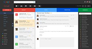
Could this be the next Gmail UI design?
This design concept reimagines a new, cleaner Gmail that takes cues from Google's latest branding.

Google's attempts to stray from its search brief have been hit-or-miss, but Gmail is undoubtedly one of the Mountain View company's biggest hits. Simplicity was key to Gmail's success when the web-based email client first appeared in 2004, particularly compared to the overcomplicated user interfaces of rivals Hotmail and Yahoo! Mail, but years of additions including Google Talk, Calendar and Adwords integration, plus Labs extensions and deeper personalisation options, have left Gmail in danger of losing its stripped-back USP.
Srinath Srinivasarao wants Google to address this and has come up with a concept for a new Gmail, drawing upon the search giant's latest design cues witnessed in recent Chromebook releases, Google+ branding, and new Google Drive app icons. The result is at the top of this article, and rather good it looks too.
You can take a closer look at Srinivasarao's concept on Behance, and whether you like the look or not it certainly has opened the debate about the direction Gmail's UI is heading. If you have any opinions on this, why not share them with us in the comments below?

Thank you for reading 5 articles this month* Join now for unlimited access
Enjoy your first month for just £1 / $1 / €1
*Read 5 free articles per month without a subscription

Join now for unlimited access
Try first month for just £1 / $1 / €1
Get the Creative Bloq Newsletter
Daily design news, reviews, how-tos and more, as picked by the editors.

Craig Stewart is a writer, SEO strategist and content marketer, and is a former editor of Creative Bloq. Craig has written about design, typography, tech and football for publications including Creative Bloq, T3, FourFourTwo and DSG, and he has written a book on motoring for Haynes. When he's not writing, you'll usually find Craig under his old car learning about DIY repairs the hard way.