3 animation techniques UX designers need to know
If you're going to use motion design on the web, you'd better get it right.
If you look five years back, the use of animation and motion in user interfaces was considered a crime rather than a best practice. It was associated with flashy websites, jumping popups and blinking buttons. But this has changed tremendously over the last year – for three reasons.
- Hardware is ready: Mobile devices are equipped with strong processors and GPUs
- Software is ready: Browsers are way more powerful than ever before with animations working across them (more or less). Front-end frameworks allow for some heavy lifting, along with HTML5 and CSS3 catering for dynamic animations. There's also been a rise in JavaScript animation libraries.
- Designers are ready: Previous generations of designers were more likely to come from communication design which follows a rather static way of thinking. The newer generations of UI/UX designers already got in touch with motion design during their college education. Plus, since the introduction of the iPhone and mobile apps, many designers gained some experience with the possibilities of dynamic animation.
Being familiar with the core principles of motion design is crucial if designers want to stay in the game. In this article, we'll give you some best practices so that you can add a little motion to your next project.
Know the basics
Before smartphones and the internet even, there existed the 12 principles of motion design.
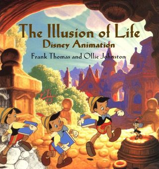
As described in the free ebook Interaction Design & Complex Animations, these guidelines come from the reigning tsar of animation, Disney. Frank Thomas and Ollie Johnston wrote the book on animation, Illusion of Life: Disney Animation, which outlines these principles as we know them.
Although all of the principles are important, let's distill them down into three concepts that every UI/UX designer needs to know.
Physicality
Objects need to feel like they have actual physical mass and respond in ways that the human mind anticipates. They need to contract or stretch when moved. There has to be a level of realism so that users can relate.
Whenever you can relate with your UI to something that the user already knows, the experience feels more inviting and fulfilling.
Get the Creative Bloq Newsletter
Daily design news, reviews, how-tos and more, as picked by the editors.
Now we're not advocating for a return to skeuomorphism, where lifelike reigned supreme, but something in-between that and the hot trend of flat design. Use drop shadows to help imitate a physical object.

The Jelly app is a great example, which you can see in action in this Capptivate animation. The cards below have a weight to them without being a simulacrum. The stacking depth and shadow further suggests that these can be flicked through.
Don't forget that for every action there is an equal and opposite reaction, as Newton's Third Law of Physics tells us. And that holds true for motion in design.
Visual orientation
Animated transitions can work as intermediaries between different UI states and can help orientate users.
The user can follow the motion of an element to understand how these two states relate to each other. High-priority UI elements of a screen can initiate the state-switch by morphing into each other.
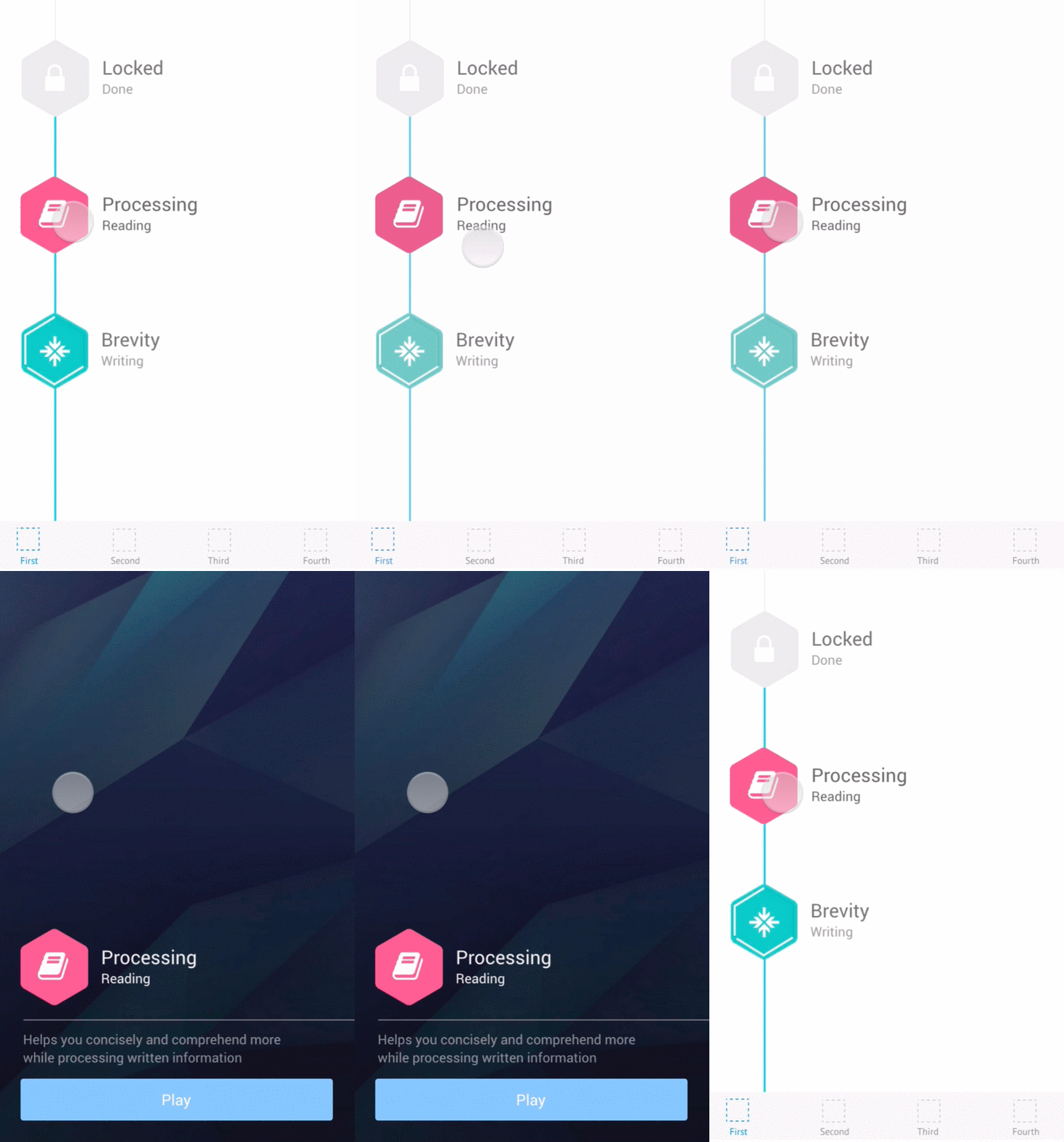
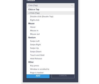
Check out the example (above) that we built with the collaborative wireframing & prototyping app UXPin. Using their step-by-step custom animations editor, we created a sequence of events so that clicking on one of the tiles activates a new state.
Watch your timing. Trigger the animation milliseconds after an action is taken. You'll want to to be within 0.1 seconds so that users don't feel like you're wasting their time.
Personality
As human beings, we automatically run something like a high-end pattern recognition engine in our heads.
The moment we see an object like a person jogging, we assign attributes to that person. Which attributes we assign, heavily depends on a large range of factors (priming, context etc.).
Let's focus on two core factors: look and motion. Now, if you transfer this to the design of a digital product, you can leverage the psychological effects of look and motion to assign a specific personality to your product:
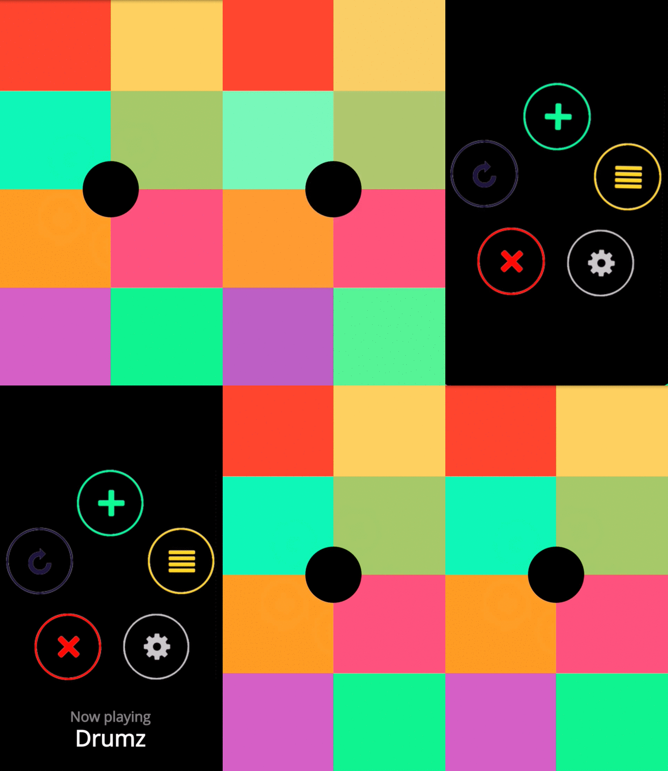
Fast transitions make your product's personality young and agile, like the Keezy app, which you can see in the above GIF of the animated prototype created with UXPin.
One caveat: if you use characters and objects in your animation, they should appear lively and interesting.
Putting it all into practice
Now that we've reviewed the foundations of motion and UI design. Let's look at some practical tips and tricks of how using motion.
Equally to a normal UX design process, there are different stages towards high-fidelity a design needs to go through. We have outlined three stages that we think are the most relevant for the design of motions:
01. Concept and sketch
At this stage, your animations are either pen and paper drawn or with any tool that is good for rapid animation.
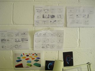
Outline keyframes of the animation you envision and deeply think about the purpose of the animation you plan to develop. Think intensively about any flaws in your UI and where the animation could improve the user experience.
When you are clear about which elements you want to animate and which goal you want to reach with the specific animation, then move to the next stage with your prototype.
Do's:
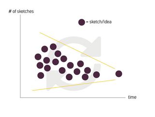
- Value quantity over quality of your designs
- Iterate often and iterate fast
- Enrich core animations of your product
- Provide clues to increase comprehensiveness of an interaction
- Sketch your animation like a movie storyboard
- Talk with more experienced designers about your animation, for example on crowledge.com.
Don'ts:
- Too much focus on details
- Wasting time by trying to achieve a high-fidelity product at this stage
- Unnecessary use of motion
- Get with your animation in the way of a user completing a task
02. Motion video
The results of the previous stage are likely to be static sketches or very rudimentary animations. And that's OK, you're working to get a feel at this point.
These concepts can be transformed into a high-fidelity visual experience showcasing your animation in detail to your stakeholders (eg, management, frontend developers).
With a motion video, you really need to get the details perfect and your animation self-explanatory so that it can become living documentation for developers. Alternatively, you can create an interactive prototype (I'll talk about that next), which end-users and developers can actually test. A video can only demonstrate linearly how one would use an interface, which usually differs from the actual user behavior.
Do's:
- Always stick to your design strategy of the previous stage. Don't fall in love with just animating anything.
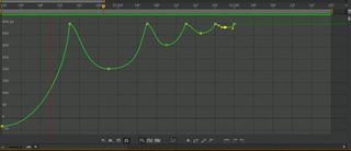
- Get familiar with curve editors to customize all your motions
- Iterate many times on even the tiniest detail because this is what makes an animation stellar
- Proactively work with your developers to check if an animation is possible on the target system or which changes it needs to work.
Don'ts:
- Use of template animations. They bore users because they don't surprise them.
- Disobey the foundations of motion design
03. Interactive prototype
As we outline in in the free ebook Interaction Design & Complex Animations, nothing beats the usefulness of an interactive prototype.
If you make everything interactive, you will get a clear picture about what works and where the flaws in your product hide. Sometimes, this leads to tedious re-work because the look of your animation differs from how it feels.
Luckily, there are tools, like UXPin that I use for fast iteration from concept to a fully interactive and animated prototype that you can validate with real users.
Since our team at Crowledge is still quite small, we use this approach to quickly move from rough sketches to an interactive prototype, whichwe then validated with our early supporters.
Sketching allows us to quickly transform ideas into something visual, so we have something to discuss. Sketches either get trashed or we prioritize the ones whose ideas resonate. As we whittle down ideas, the sketches that survive become a prototype.
Do's:
- Test your animations on all target devices (be sure to consider different input methods) over and over again
- Get feedback of real users and quickly iterate with this feedback
- Ask expert designers about their feedback
- Create yourself a library of all your animations, so that you could re-use parts of them in other products
- Discuss any animation if it is really needed and if it improves your product
Don'ts:
- Being too proud to accept that something doesn't work the way you thought it would
- Slowing down a process that could be faster without an animation
- Disregard any cross-browser incompatibilities that could ruin the feel of your animation
Conclusion
We know that the transition from dealing with static pixels to moving pixels is something that requires effort and experience.
But when motion design is done right, then digital products are no longer just a sequence of screens, they are now carefully choreographed experiences that shine out (e.g. in the app store).
If you'd like to experiment with different animations, go ahead and play around with UXPin. You can start a free trial, then use the step-by-step animations editor to create something simple like an ease-in animation. You could also follow along with this practical tutorial, which helped me prototype animations more efficiently.
Words: Christian Klaucke
Christian Klaucke is an interaction designer and founder of crowledge.com, an instant Q&A platform designed to make the lives of designers easier. He is also an avid user of the collaborative prototyping app UXPin.
Like this? Read these!
- 10 steps to engaging user experience
- How to build an app: try these great tutorials
- Free graphic design software available to you right now!

Thank you for reading 5 articles this month* Join now for unlimited access
Enjoy your first month for just £1 / $1 / €1
*Read 5 free articles per month without a subscription

Join now for unlimited access
Try first month for just £1 / $1 / €1
The Creative Bloq team is made up of a group of design fans, and has changed and evolved since Creative Bloq began back in 2012. The current website team consists of eight full-time members of staff: Editor Georgia Coggan, Deputy Editor Rosie Hilder, Ecommerce Editor Beren Neale, Senior News Editor Daniel Piper, Editor, Digital Art and 3D Ian Dean, Tech Reviews Editor Erlingur Einarsson and Ecommerce Writer Beth Nicholls and Staff Writer Natalie Fear, as well as a roster of freelancers from around the world. The 3D World and ImagineFX magazine teams also pitch in, ensuring that content from 3D World and ImagineFX is represented on Creative Bloq.
