5 ways to speed up your design with UI kits
Laura Busche of Creative Market explores the many ways UI kits can aid your design process.
If you're anything like me, you enjoy jumping in on the action. Website idea? New app? Learning how to start a blog? Game-changing startup? You want to make it happen. Today. But you worry whether spending too much time on the planning phase will hurt your idea's odds of making it in this fast-paced world.
Sketching is great to get initial ideas out the door. And they can certainly be useful in communicating your ideas quickly. Or you could use a create a library of elements in the prototyping tool of your choice so you can whip something up to show.
Or you could use one of the many UI kits out there. Think of UI kits like Lego pieces that you can snap easily together to create a quick mockup or prototype. In this article, we'll dive deeper into UI kits and how you can best use them in your next project.
The building blocks for a design
UI Kits provide a basic set of elements that will help you build a representation of the final product. Some of the most common items include screens, navigation, icons, grids, buttons, and charts.
These components become building blocks for a mid- to high-fidelity prototype, as explained in the free Guide to Prototyping. While this step may seem tedious, creating an early prototype of your user experience is actually a huge timesaver. Building prototypes with UI Kits allows you to collect feedback and detect major issues with the user experience flow early on.
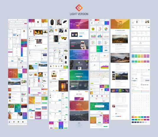
Grade UI Kit, for example, includes hundreds of icons, charts, screens and a tight grid to build your prototypes.
There are many advantages to building prototypes with kit elements :
- Rather than thinking about visual details, these pre-designed graphic kits force you to think about interactions and flow rather than recreating the same elements over and over again.
- Someone has already gone through the trouble of thinking about type layout, style and size so that you can focus on the actual copy and calls to action.
- Some collaborative prototyping tools like UXPin allow you to upload static compositions built with these UI kits and animate them into layered prototypes.
It's not enough to have an idea. You have to capture it in someway, whether it's a sketch or a rough prototype built with a UI kit. The benefits are clear. You can sell your early ideas with stakeholders and get quick validation before moving on to a more finalized design.
Using UI kits to create prototypes
Before you begin building a prototype with a UI kit, you'll want to consider a few things.
- Define the goals. Not just the user goals but the business goals as well. Consider: Or are you trying to get paying customers? Or are you trying to get users to upgrade? Outline what these are so you can frame your work effectively.
- Define the users. Who will likely to use your product or visit your page? Outline what each of these users is likely to want out of your product and what it is that you want them to accomplish. One easy way to do this is through the use of user personas, which allow you to address the major needs of your most important user groups.
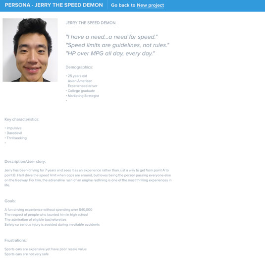
Once you've determine the goals and the users, you'll be able to spend more time thinking about how users actually interact with your product. This is where having a UI kit can come in handy. As we said before, having elements you can quickly slap onto a project frees up more thinking time to map user flows and experiences.
With that, let's delve closer into putting UI kits into practice.
01. Define your interface's basic set of features
Think about the elements you'll need. But frame this within the goals of the project and your users. Considering the user flow will give you a greater sense of what is it that you want your users to actually accomplish.
This is where creating a user persona comes in handy. This will allow you to clearly understand that particular persona's needs and motivations. If you need templates and other tips on creating personas, check out The Guide to UX Design Process & Documentation.
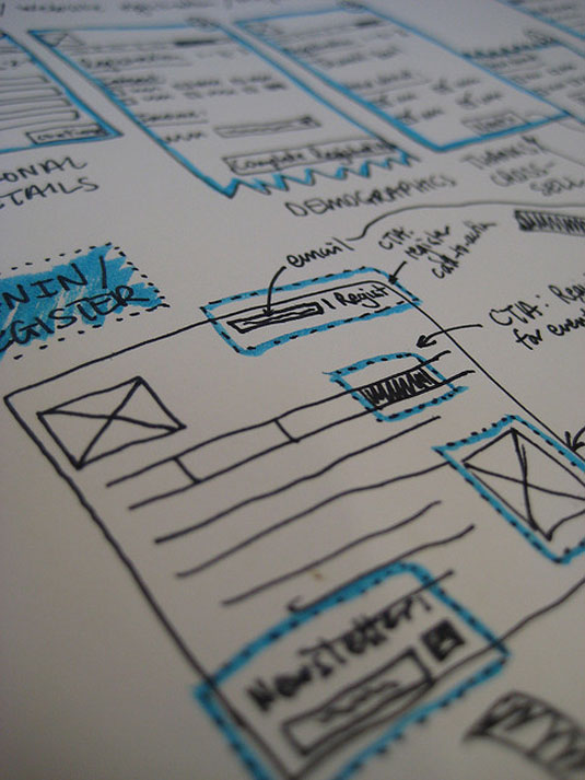
For example, you can rough out a flow, either in sketches or words, of having a user complete a simple checkout. You can consider:
- Will they need to login?
- Will they need a signup form if they don't have a login?
- How will they select an item?
- What are the steps once they select an item to actually purchase?
Write a list of every major feature that you'd like to display in this user interface. As a suggestion, avoid attempting to show every single feature and focus on those that truly differentiate the product and add the most value for users.
These features are also your most sensitive hypotheses to test: are users really interested in being able to do X or Y? That's where an early prototype helps save you time implementing a solution that doesn't amount to a hill of beans.
02. Decide which screens you want to show in your prototype
Now that you know which features need to be prominently displayed (and possibly tested), go ahead and think about a few screens that could represent these functions.
For example, if your app will contain some kind of dashboard, look out for UI kits that provide chart elements. In the example below, the Livo UI Kit offers several options for your data display needs:
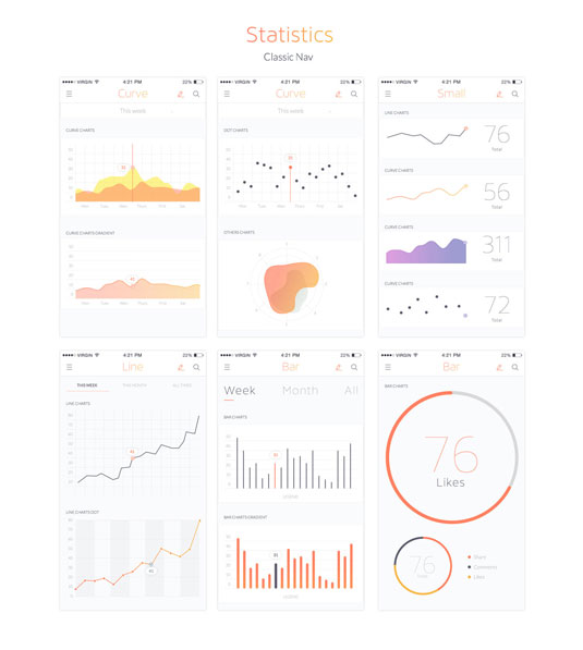
But don't spend time on screens that won't be in the flow you're testing out. You're looking to get validation on your ideas and shouldn't spend time prototyping things that might distract from that.
03. Select a UI kit that matches your product's visual identity
With a clear idea of the functions you'd like to display and the way in which these could be shown, you can find the UI kit that'll work for you.
Remember to look out for components that match your product's ideal look and feel, as well as kits that provide file formats that you can actually edit. Look out for these elements as you search for a great UI Kit:
- Does it allow for the amount of customization you need?
- Does it include the components you need? Think about navigation, buttons, modals, panels, breadcrumbs, tabs, alerts and tooltips.
- Does it provide versatile variations, as in different color schemes?
- Is it available in a format that you can open and edit?
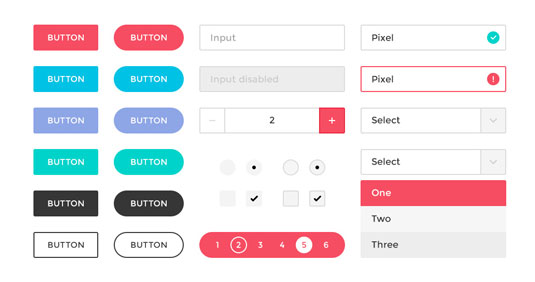
Popular formats for UI design include Adobe Photoshop and Sketch.
The match doesn't have to be perfect, but getting closer will make the prototype feel more usable.
04. Use Photoshop or Sketch to tweak colors, components and copy
Your UI Kit is ready to go and you can't wait to start customizing it. Open up the files in your preferred design software and edit away. Here are a few steps to go about doing that:
- Organize your work around screens to avoid confusion. A helpful tip here is to make each screen a separate layer. If you're using Photoshop and plan on animating the prototype with UXPin, the app can automatically import these layers as screens and you'll save precious time.
- Position the elements included in your UI kit as needed. Assemble each screen by dragging and adjusting components like buttons, navigation, images and text blocks.
- Switch around the kit's original color scheme if necessary. Some themes provide several "skins" to choose from. If your kit doesn't, you'll have to adapt the elements to your brand's color palette shape by shape.
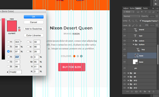
- Customize some high-level copy. Nobody is saying that you need to know exactly what goes in each text block at this point. Just add some hints about the basic language and tone you'd like to present in your user experience.
05. Add in some basic interactions using digital prototyping methods
Once you have finished building a basic user interface with these kits, there are three common digital prototyping methods you can use. These are described thoroughly in the Ultimate Guide to Prototyping.
- Presentation software (mostly for beginners): This involves using standard presentation tools like Keynote or Powerpoint to give viewers an idea of how the product works. You can even build screens as slides and display basic flows.
- Coded prototypes (intermediate to advanced): Go straight into HTML and CSS to bring this prototype to life. The advantage of doing this is you'll have a head start in development when it's time to build the actual product.
- Specialized prototyping apps (for all levels of expertise): Prototyping tools require little or no advanced knowledge and can help you build a wireframe with simple drag and drop features.
Prototype away
Once you get used to the workflow above, you'll never want to go back to hit-or-miss again.
Agile design requires lean solutions, of course, but it also requires informed decision-making. This is where prototypes step in to provide insight in a situation where user behavior seems unpredictable. Design problems are often fuzzy, and sound solutions require a good dose of experimentation. In building your early prototype with UI kits, you are opening the door to feedback that might save your product in the long run.
To get started, here's a few useful (and free) UI Kits:
Words: Laura Busche
Laura Busche is a content strategist at Creative Market and regularly blogs about branding and business. She is the author of O'Reilly Media's Lean Branding book.
Like this? Read these!
- Design your own UI kit
- Useful and inspiring flyer templates
- Free Photoshop brushes every creative must have

Thank you for reading 5 articles this month* Join now for unlimited access
Enjoy your first month for just £1 / $1 / €1
*Read 5 free articles per month without a subscription

Join now for unlimited access
Try first month for just £1 / $1 / €1
Get the Creative Bloq Newsletter
Daily design news, reviews, how-tos and more, as picked by the editors.

The Creative Bloq team is made up of a group of art and design enthusiasts, and has changed and evolved since Creative Bloq began back in 2012. The current website team consists of eight full-time members of staff: Editor Georgia Coggan, Deputy Editor Rosie Hilder, Ecommerce Editor Beren Neale, Senior News Editor Daniel Piper, Editor, Digital Art and 3D Ian Dean, Tech Reviews Editor Erlingur Einarsson, Ecommerce Writer Beth Nicholls and Staff Writer Natalie Fear, as well as a roster of freelancers from around the world. The ImagineFX magazine team also pitch in, ensuring that content from leading digital art publication ImagineFX is represented on Creative Bloq.
