5 ways to seduce your website visitors
Make people fall in love with your website by following these 5 expert tips from UXPin's Jerry Cao.
The arts of seduction and interaction design go hand-in-hand. Your goal, after all, is making the user fall in love with your website or application.
The same principles of courtship apply: trying too hard repulses the user, while not trying enough will make them pass you over.
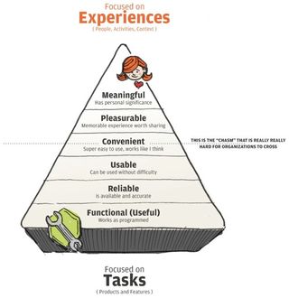
As UX consultant Stephen P. Anderson explains in his insightful book Seductive Interaction Design, an enticing interface requires a good degree of subtlety, tact, charm, and honest understanding of users.
In this piece, we'll explain how to take advantage of human psychology and emotional design to create an alluring charm to your interface.
01. Create an inspiring flow
An alluring interface is designed to put the user in a state of flow — a mindset in which they are so focused on interacting with your product, they forget the rest of the world. Mihaly Csikszentmihalyi, in his book Flow, explains that this is the optimal experience because the user focuses on their work, and the interface becomes only an invisible hand guiding them along.
The way to inspire flow is to constantly and rewardingly engage the user — "seducing them," in other words. Paul Trenchard-Seys, UX Designer, puts forth that an engaging experience is not only fun, but also easy and productive. To create such an experience, at least two factors are needed:
- Control — The user must feel in control the entire time. This is why seduction favors subtlety over aggressive approaches.
- Achievement — Obviously, the user needs a purpose for using your product, whether business or pleasure. Beyond the main goal, the sense of achievement can be bolstered by positive and well-placed feedback from the system.
While a simplistic viewpoint of the much more complex field of interaction design, creating this "flow" in your users is a nice, simple goal to chase throughout the rest of the design process.
Get the Creative Bloq Newsletter
Daily design news, reviews, how-tos and more, as picked by the editors.
02. Understand your users

Still other experts, like Stephen P. Anderson, go into more detail about how to get your users into a state of flow. To him, the first step is understanding as much as possible about people.
This list of observations about individuals as a whole leads the way to interaction designs that give people what they want. From this list, we can derive a list of elements that will make your website or app more attractive to the common person:
- Social Proof — Most people follow popular opinion, so if your product seems popular, its perceived value increases. If you don't have the numbers to parade openly, even a few considerate testimonials will help.
- Scarcity — Just like an exclusive club, scarcity adds the allure of something not everyone can have. Offering limited promotions or even a private, invitation-only beta version of the product can generate more excitement from non-users than the users themselves.
- Recognition over Recall — As we explained in Interaction Design Best Practices, the more the user must think, the less they'll enjoy the product. Design your interface with recognizable patterns so users don't need to relearn basic controls. For example, link text should be labelled the same as the headlines of the linked content.
- Sensory Integration — Stimulating more of your users' senses will engage them deeper. Aside from visuals, this can only apply to audio effects/music, or some creative use of gesturing in mobile devices. For example, the Wunderlist app plays a pleasant bell chime when you complete a task.
- Visual Superiority — While sensory integration is welcome, vision remains the dominant sense (as we explain in Volume 1). Design your interface along a solid visual hierarchy so that it looks as good as it functions.
Because so much of interaction design concerns human experiences, you must design for what the brain cares about (which is different than what the conscious mind cares about). To design for a brain that's evolved over a long period of time, you'll need to incorporate beauty, visual variety, and of course emotion.
While we're on the topic of the human element, let's explore emotion in interaction design. First we'll explain the difference between usability and enjoyment, and then we'll discuss some practical tips for designing emotional experiences.
03. Balance usability and enjoyment
Emotional stimuli make the difference between a product that's loved, rather than simply usable. Anders Toxboe, Designer for Bonnier Interactive, makes the case that, while usability will satisfy your users, the satisfaction will be short-lived. To be loved, an interface requires more than functionality.
The chart below from The Art & Science of Seductive Interactions shows a hypothetical product with features that are usable, but not enjoyable:
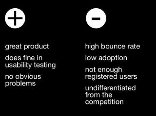
Despite having a product that works — perhaps one that's even ground-breaking or revolutionary — the chart shows that good usability can still lead to poor product adoption, and thus, failure.
Let's examine Abraham Maslow's Hierarchy of Needs to explain this situation. These were formulated from the psychologist's 1943 paper on the basic human needs, and the way we typically prioritize them:
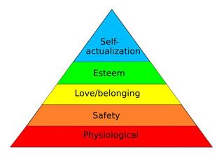
As you can understand, a homeless person who comes into some money will likely spend it on food or shelter instead of a psychologist appointment — physiological needs hold more weight than self-actualization needs. Likewise, this blog post from Treehouse applies Maslow's work to interaction design:
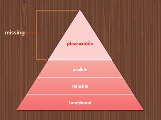
Evidently, usability goals are still core to interaction design. But once they are fulfilled, there remains a lot of room for improvement. As the pyramid points out, that peak is what other designers most often neglect.
For example, let's look at Wufoo. It applies shapes, colours, and typography in a way that makes the mundane task of form creation actually feel fun.

As cofounder Kevin Hale explained in 2012, they took the opposite direction of their competitors by designing the app to look like something out of a Fisher-Price product lineup. Wufoo's design is highly usable since the core actions are easily accessible, but its desirable presentation makes it stand far above its cookie-cutter database competitors.
Don't make the mistake of designing only for usability. Make sure you design experiences that also fulfill the user's emotional needs.
Next page: more ways to seduce your website visitors

Thank you for reading 5 articles this month* Join now for unlimited access
Enjoy your first month for just £1 / $1 / €1
*Read 5 free articles per month without a subscription

Join now for unlimited access
Try first month for just £1 / $1 / €1
The Creative Bloq team is made up of a group of design fans, and has changed and evolved since Creative Bloq began back in 2012. The current website team consists of eight full-time members of staff: Editor Georgia Coggan, Deputy Editor Rosie Hilder, Ecommerce Editor Beren Neale, Senior News Editor Daniel Piper, Editor, Digital Art and 3D Ian Dean, Tech Reviews Editor Erlingur Einarsson and Ecommerce Writer Beth Nicholls and Staff Writer Natalie Fear, as well as a roster of freelancers from around the world. The 3D World and ImagineFX magazine teams also pitch in, ensuring that content from 3D World and ImagineFX is represented on Creative Bloq.
