5 lessons in UX design
UXPin's Jerry Cao outlines five best practices when it comes to creating online interactions.
04. Don't overload human memory
In 1956, George Miller determined that short-term memory can usually retain data of between 5-9 items before forgetfulness sets in. What this means to IxD designers is that they must either limit their content to around 7 items, or look for alternate methods for memory-saving, such as chunking.
Limiting content fits into Hick's Law, which states that the more choices available, the longer the decision-making process. Menus will too many items fun the risk of causing decision paralysis (not to mention are visually unsettling).
But sometimes more than seven items are necessary. In such cases, strategies such as chunking can minimize the strain.

Chunking is grouping and organizing content in a more comprehensive manner, typically by putting similar items together. In the Etsy example above, there are actually 32 different pieces of content. However, by organizing them into 8 groups of 4 according to category, the site's able to showcase a large number of their products without burdening the user.
05. Proactively use white space
White space – or negative space – is often seen as empty space, tempting designers to fill it because, well, an artist wouldn't leave part of their canvas blank, would they? This is a dangerous line of thinking, though: the truth is that white space is an active element, and can add a lot to your design if you know how to use it.

Using white space proactively can add the following benefits:
- Improving comprehension – Spacing out your elements can make them more legible and allow your user to register everything in their heads. In fact, studies have shown that adequate white space can increase comprehension up to 20%.
- Clarifying relationships – As we hinted at above with chunking, grouping objects together suggests similarity. This extends beyond aiding memory and into showing different objects have the same functionality – but it only works with enough white space between groups.
- Attracting attention – The more white space around an element, the more the eye will be drawn to it.
If you don't believe us, just look at the Google homepage. All the white space funnels the user's attention to the main focus: the search bar. Furthermore, the spacing between the buttons and the bars lets the user quickly know their different options without having to think too hard.
Further reading
We hoped you learned something new from the above points, or that they at least gave you something to think about. The techniques, strategies, and best practices for interaction design are many and varied, and these are just some of the ones we found most useful.

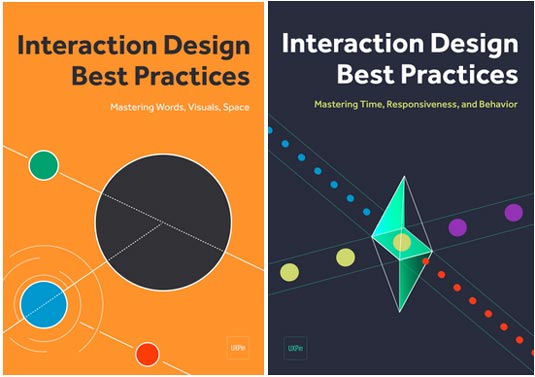
The Interaction Design Best Practices series covers:
- Persona creation
- Writing tips and guidelines
- Using visuals to guide user’s sight
- An examination of UI patterns
- Proper layout formats and how to use white space
- The spectrum of response time tolerances
- Using feedback to create dialogues
- Ways to reduce friction
This series and the rest of the design library are available for free.
Words: Jerry Cao
Jerry Cao is a content strategist at UXPin — the wireframing and prototyping app. To learn more about how to create visually digestible interfaces, download the free e-book Web UI Design for the Human Eye: Colors, Space, Contrast.
Like this? Read these!
- 10 steps to engaging user experience
- Brilliant Wordpress tutorial selection
- Free tattoo fonts for designers

Thank you for reading 5 articles this month* Join now for unlimited access
Enjoy your first month for just £1 / $1 / €1
*Read 5 free articles per month without a subscription

Join now for unlimited access
Try first month for just £1 / $1 / €1
Get the Creative Bloq Newsletter
Daily design news, reviews, how-tos and more, as picked by the editors.
The Creative Bloq team is made up of a group of design fans, and has changed and evolved since Creative Bloq began back in 2012. The current website team consists of eight full-time members of staff: Editor Georgia Coggan, Deputy Editor Rosie Hilder, Ecommerce Editor Beren Neale, Senior News Editor Daniel Piper, Editor, Digital Art and 3D Ian Dean, Tech Reviews Editor Erlingur Einarsson, Ecommerce Writer Beth Nicholls and Staff Writer Natalie Fear, as well as a roster of freelancers from around the world. The ImagineFX magazine team also pitch in, ensuring that content from leading digital art publication ImagineFX is represented on Creative Bloq.
