4 UI patterns to improve user interaction
Niall O'Loughlin of 99designs suggests practical ways to encourage people to interact with your website.
There is no one right way to design a website UI. There's no cure-all template for you to plug in your brand and hit "submit." Each site has its own goals, motives, strategies and artistic style.
This isn't an article outlining a definitive set of rules for designing the perfect website every time. This is an article that describes a few effective design patterns so you can choose and modify as needed.
01. Input controls
The very nature of input controls is to allow your user to interact more deeply with the site. But there's a paradox here: the users usually want more control, but every new control complicates the UI and clutters the screen. One of the best way to strike that perfect balance is to have controls on demand.

It's a win-win solution and the proof of its effectiveness is seen in how nearly all high-profile websites have adopted it. Controls can be hidden and revealed by hovering over the affected content (Pinterest) or hidden in collapsed drop-down menus via tabs (Google Docs).
If your site centers around a single input field, or if input is a necessary first step, setting an auto-focus on that input field would be a smart move. Auto-focus is when the cursor starts within the field automatically, most famously used by Google.
As soon as you enter Google, you can simply begin typing your query without having to click anywhere.
02. Navigation
One of the essential elements to UI design is a fully functional navigation platform. It is completely necessary for every site — it doesn't matter how great the rest of your site is if your users can't find anything.
Get the Creative Bloq Newsletter
Daily design news, reviews, how-tos and more, as picked by the editors.

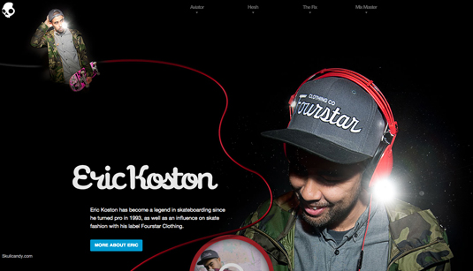
Skullcandy's Supreme Sound site, for example, utilizes the vertical navigation well with an unorthodox scrolling approach. The screen rotates as you follow the headphone cord down the page.
This can only work because the navigation menu to the right stays firm, anchoring and orienting the user as they explore.
03. Guided actions
While default settings can make people uncomfortable with their level of control, a much gentler way to guide their actions is the power of suggestion. Guided actions allow you to encourage deeper involvement, interaction and even feedback — as long as the action you're suggesting isn't cumbersome.
LinkedIn is one of the best examples when it comes to using guided action. Upon opening a page, the user will usually see prompts to actions, for example, adding information relating to courses, organisations or non profits you are involved in.

The same applies for endorsements. It's human nature to enjoy helping friends, so prompting this guided action works because it's something they want to do anyway, but may not have thought of it on their own.
The benefit to LinkedIn is that it encourages deeper involvement with their site, furthering both the users' investment and experience.
04. Default settings
Users rarely change the default settings, even if they have the option to. That means it's on you to get it right the first time.
While this seems like a lot of responsibility, there is an upside. You can choose the default settings for the actions you want the user to follow.
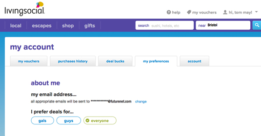
Take, for example, Living Social — the default audience for email deals is "everyone", which encourages users to forward deals to more people.

While it's tempting to take absolute control over your user's settings, it's important to the UX that you lend some freedom to your user. Creating a convoluted process to keep the user on default settings will only frustrate them and push them away.
Another factor to consider is input fields. Do not, however, use defaults for anything that requires user thought, like signing up for newsletters or accepting terms of use and so on.
Conclusion
UI design elements like input controls, navigation, default settings, and guided actions are all components of a successful UI; however, it's your choice on how you implement them. These elements are all versatile and can be used with flexibility.
The decisions you make in what kind of UI design elements will affect your site's personality as a whole, so take care in choosing which ones will appropriately represent you.
Words: Niall O'Loughlin
Niall O'Loughlin is marketing manager for 99designs, an online graphic design marketplace that enables customers to quickly source graphic design work.
Like this? Read these!
- 11 great UI designs
- How to build an app: try these great tutorials
- Our favourite web fonts – and they don't cost a penny

Thank you for reading 5 articles this month* Join now for unlimited access
Enjoy your first month for just £1 / $1 / €1
*Read 5 free articles per month without a subscription

Join now for unlimited access
Try first month for just £1 / $1 / €1

The Creative Bloq team is made up of a group of art and design enthusiasts, and has changed and evolved since Creative Bloq began back in 2012. The current website team consists of eight full-time members of staff: Editor Georgia Coggan, Deputy Editor Rosie Hilder, Ecommerce Editor Beren Neale, Senior News Editor Daniel Piper, Editor, Digital Art and 3D Ian Dean, Tech Reviews Editor Erlingur Einarsson, Ecommerce Writer Beth Nicholls and Staff Writer Natalie Fear, as well as a roster of freelancers from around the world. The ImagineFX magazine team also pitch in, ensuring that content from leading digital art publication ImagineFX is represented on Creative Bloq.
