4 essential elements of a minimalist website
Create a beautiful, functional website by keeping what's essential and removing everything else. Here's how.
More and more, we're seeing sites with less and less.
The artistic style of minimalism, rooted in the post-World War II movement, has found a re-emergence in modern web design. Embodying the concept of 'less is more', minimalist sites center around negative space, unadorned typography, and sparse elements.
But how does this apply to web UI design? How do designers navigate that thin line between "simplistic" and "boring"?
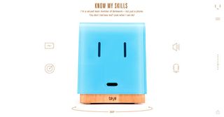
In this article, we'll take a look at the most important characteristics of minimalism in web design. We can break them down into 4 components:
- Reduced Content
- Negative Space
- Visual Harmony (Symmetry)
- Contrast
We'll explain the principles of each component, and then take a look at how the elements minimalism will likely evolve in the future.
01. Reduced content
If minimalism has one rule, it's this: keep only what is essential, and remove everything else.
The main mechanism driving minimalism is that, the less elements on a screen, the more potent the remaining ones becomes. That means if you have only four central elements, like the Huncwot site below…
Get the Creative Bloq Newsletter
Daily design news, reviews, how-tos and more, as picked by the editors.
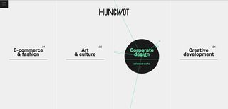
… each one of those will attract more attention than if you had a larger number, like the menu options from the Overstock site below.
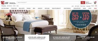
By that logic, if you had only a single element on the screen, you could be positive your message was communicated to the user.

Minimalism is not merely emptiness or scarcity. It is the intentional stripping away of everything that's not necessary to leave the focus on what is. As we describe in the free ebook Web Design Trends 2015 & 2016, minimalism transfers the attention away from the design itself, and onto the content, where it belongs.
02. Negative space
It should be no surprise that the most prevalent element of minimalism is no element at all. Negative space — also known as white space — is the most important feature of minimalism, and what give it its power.
As a general rule, the more negative space around an object, the more the eye will be drawn to it. For example, in the Leen Heyne example below, the monochrome logo and company tag compete with the gold and the sparkling gems of the jewelry. Both are surrounded by an expanse of negative space, making it a safe bet the user's eyes will go back-and-forth between the them.
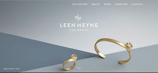
Additionally, negative space adds an air of elegance, making minimalism the prefered style of high-end fashion brands and other companies looking to appear exclusive.
03. Visual harmony (symmetry)
In order for a minimal design to be effective, it must have visual harmony (or an intentional lack-there-of). Because there are less elements to root the visual structure, it's important that minimalist sites have a strong grid and a carefully constructed alignment.
The easiest solution in minimalism is to center the content. But it's not the only one. Sometimes the text is aligned off-center for a more dynamic look, but the best way to stand out is to avoid the "center crutch" altogether.
This requires an understanding of the different forms of symmetry, and how to balance the large and small elements on a screen. We can categorize symmetry into four forms:
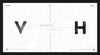
- Halved symmetry — The halves of the screen have compositions, mostly horizontally, but occasionally vertically.
- Approximate symmetry — While the composition may be the same, the visual weight is equal on both sides of the screen. For example, one large element balanced by several smaller elements.
In the tour page screenshot (above) from the UXPin website, you can see how the scroll-activated image slider is the dominant visual element. However, it's not overbearing since it's balanced on the left by a headline, block of body text, and coloured CTA.
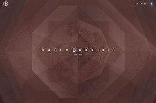
- Radial Symmetry — Starting at the center point, the elements exist symmetrically in a near-circular pattern.
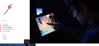
- Asymmetry — Organized chaos, so to speak. This risky and difficult-to-apply layout, will give your site a more "active" feel compared to others, which might just be what you're going for.
04. Contrast
Contrast becomes an even more powerful tool with other distractions stripped away.
As explained in Web Design for the Human Eye, contrast can exist in colour, size, shape, and location.
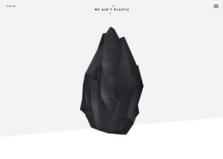
In the We Ain't Plastic example above, you see the staple of minimalism, the white (or white offshoot) background contrasted with black content, especially text.
The site goes a step further and contrasts the smaller text bits with a large, dominating image. Furthermore, notice the use of scale for the text: the brand name is larger than the "Hire Me" in the corner, though both seem small in relation to the image.
The future of minimalism
In the near future, we'll likely see a "less-minimal" minimalism. The style will enjoy more diversity and detail, while retaining its core of simplicity and scarce elements. On the horizon, pay attention to these changing elements.
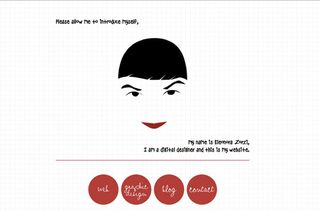
- Texture — Backgrounds might include more texture while retaining the ample negative space that shifts focus onto the main content.
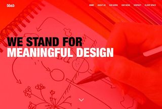
- Colours — More designers will move beyond the traditional black and white backgrounds and begin experimenting with more vibrant colours.
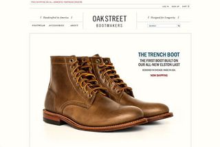
- Animation — Animated effects in general are on the rise, so minimalist sites risk falling behind if they don't implement them. However, these new effects will likewise follow the minimalist spirit: simple, smooth, with only what is essential.
Conclusion
Minimalism as a theory is an enduring and timeless concept.
The idea of stripping away the distractions will always resonate with designers, even if the techniques ebb and flow. If you can isolate this aspect of minimalism and apply it to your design, you'll never have to worry about falling behind.
To start designing visually clean websites without code, feel free to start prototyping in UXPin. Once you start a free trial, the collaborative design app comes loaded with 1,000+ custom elements and dozens of rich UI libraries.
Words: Jerry Cao
Jerry Cao is a content strategist at UXPin — the wireframing and prototyping app — where he develops in-app and online content for the wireframing and prototyping platform.
Like this? Read these!
- 20 steps to the perfect website layout
- How to build an app: try these great tutorials
- Free Photoshop brushes every creative must have

Thank you for reading 5 articles this month* Join now for unlimited access
Enjoy your first month for just £1 / $1 / €1
*Read 5 free articles per month without a subscription

Join now for unlimited access
Try first month for just £1 / $1 / €1
The Creative Bloq team is made up of a group of design fans, and has changed and evolved since Creative Bloq began back in 2012. The current website team consists of eight full-time members of staff: Editor Georgia Coggan, Deputy Editor Rosie Hilder, Ecommerce Editor Beren Neale, Senior News Editor Daniel Piper, Editor, Digital Art and 3D Ian Dean, Tech Reviews Editor Erlingur Einarsson, Ecommerce Writer Beth Nicholls and Staff Writer Natalie Fear, as well as a roster of freelancers from around the world. The ImagineFX magazine team also pitch in, ensuring that content from leading digital art publication ImagineFX is represented on Creative Bloq.
