Website mockups can be created in lots of different ways. It's true there is no 'best' approach, but depending on certain UI and UX designers' styles and preferences (and the design process), some will work better than others.
In this article, we'll look at the pros and cons of four of the most popular options: end-to-end UX tools, mockup tools, graphic design tools, as well as coded designs that start to blur the lines between website mockups and prototypes.
If you're after wireframing tools specifically, see this post on the best wireframe tools, or for a wider collection, check our out our mega-roundup of the best web design tools.

Don't make the mistake of thinking all website mockups are the same. Simple decisions about platforms, fidelity, and coding will all produce significantly different results. Know what you want and what your goals are before you even begin the design process – if you want a tool that supports all three phases, it's best to start out using it than to switch over halfway through. Likewise, if you need a stellar, fully realistic mockup, keep in mind that you'll be using a graphic design editor at some point.
01. End-to-end UX tools
At the highest tier are end-to-end tools that aim to satisfy the entire workflow: mockups, prototyping, documentation, developer handoffs, and design systems. UXPin has been catering to this need since the early 2010s, but a number of other brands, such as Adobe and InVision, are now also trying to create the ‘one tool to rule them all’.

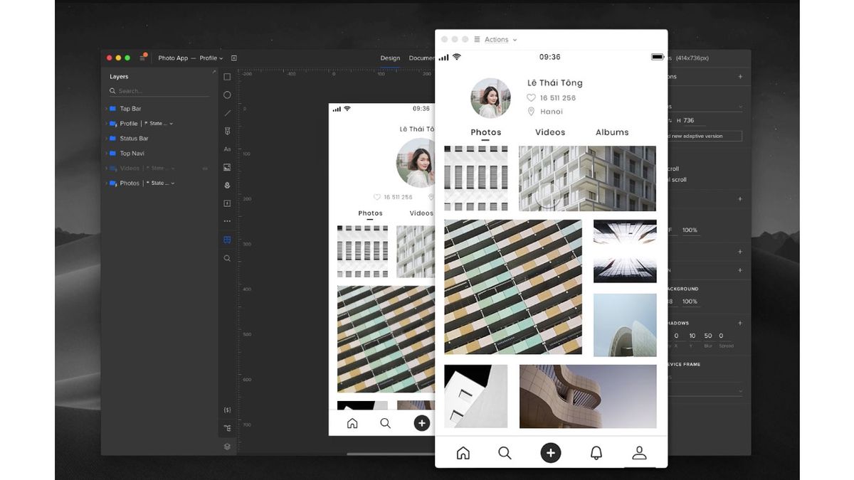
So how do these tools stack up just up for mockup creation? They can tackle them without any problem – and then some. With UXPin, for example, you can create mockups with multiple states and interactions. It even mimics some features of Photoshop and Sketch by including a Pen tool.
On the other hand, Studio by InVision, allows for some pretty nifty animation editing; while Adobe XD lets you open Photoshop and Sketch files inside your XD designs, and apply colours, symbols, linear gradients and character styles.
Get the Creative Bloq Newsletter
Daily design news, reviews, how-tos and more, as picked by the editors.
Most importantly, end-to-end tools are now offering design systems to ensure consistency of mockups across projects. Design systems give everyone a single source of truth for assets and design principles across tools. If you plan on creating a lot of mockups, this feature becomes almost mandatory.
When selecting an end-to-end tool for creating your website mockup, it’s worth considering the following aspects:
- Fidelity: How powerful is the tool for visual and interaction design?
- Consistency: What features ensure design consistency in your work?
- Accuracy: Do the elements you’re working with reflect the ‘source of truth’ in your organisation?
- Collaboration: Can you collaborate with stakeholders or other designers?
- Developer handoff: How does the tool generate specifications and assets for developers?
02. Dedicated mockup tools
Less robust solutions such as Principle, Framer, Moqups or Balsamiq can still provide you with everything you need to build your mockup – you’ll just lose the additional workflow and design consistency features. These tools are designed to make the creation process as easy as possible, so you can focus more on stylistic decisions and less on how to manipulate the program.
Dedicated mockup tools have clear advantages: Beginners benefit from their ease of use, while experts appreciate the designs specifically tailored to their advanced needs. On the more advanced end, tools like Framer and Principle specialise in animations and interactions for mockups.
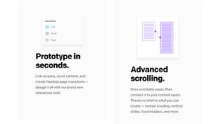
On the lower end, Moqups and Balsamiq provide more functionality than non-design tools that are sometimes used for wireframes and mockups (such as Keynote), but they are limited to only low-fidelity designs. They can, however, be quite useful if the goal is to create low-fidelity wireframes very quickly.
When it comes to mockup tools, you need to decide if a simple wireframing solution will just do, or if you need more advanced screen design. No matter what mockup tool you choose, just make sure you’re willing to accept the loss in collaborative workflow and less design consistency features offered by end-to-end tools.
03. Graphic design software
Some designers swear by software like Photoshop CC, Sketch or Illustrator CC, especially those particularly skilled or familiar with tools that offer control down to the pixel. Graphic design platforms work best if you're aiming for the highest level of realism and visual fidelity. And as we explain in our guide to rapid prototyping using Photoshop CC, it may be easier than you think.
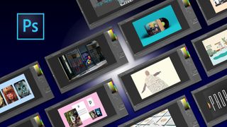
Working in graphic design software gives you access to an almost endless selection of highly defined colours, so if you're working within the restrictions of a rigid and preset colour scheme – for example, under particular branding rules – then these programs may be your best option. More than colour options, these programs offer far more visual tools, allowing you to tackle the minutiae of detail.
However, the drawback of using this type of software is that it can be difficult to translate when it's time to start coding the design. What worked in Photoshop may not always work in code (elements like fonts, shadows, gradient effects, and so on), which can translate to time wasted figuring out solutions for the prototyping phase.
For style-heavy pages it might help to hammer out the specific visual details during the mockup phase, in which case Photoshop or Sketch will give you the most options. Similarly, if you're dealing with a nit-picky or hard-to-please client, presenting them with a gorgeous and impressive mockup might win them over more easily.
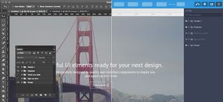
It's also worth mentioning that mockups created in Photoshop or Sketch can be dragged and dropped into the prototyping phase with UXPin. This lets you easily animate all layers (no flattening) with a few clicks, and ensures you don't need to start from scratch when it's time to prototype.
If visuals are not your only priority, you might be more efficient using a tool that allows you to do the wireframing, mockups, and prototyping all in one place. Graphic design software can be more trouble than it's worth for mockups unless you're looking for optimum visualisation – you'll definitely need to communicate regularly with your developer, since these tools aren't designed for collaboration.
04. Coded mockups
If you're mainly a designer and not comfortable with coding, then this obviously isn't an option. As discussed in The Guide to Mockups, coded mockups are not the default choice.
Most coding can be postponed until the prototyping stage (if you're creating an HTML/JavaScript prototype) or even later (if you use a prototyping tool). But despite the complexity and potential obstacles, there are many respectable designers who advocate introducing code into the mockup phase.
While improvements in tools and technology mean that more and more possibilities are opening up in layout design, not everything is easy (or even possible) to recreate in code. Starting in code lets you know right away what you can and cannot do. If you’re comfortable with code, it can also be argued that starting with this is less wasteful – the mockup is going to end up in HTML/CSS anyway.
But as we mentioned before, mockups with coding are not a popular strategy, for more reasons than the difficulty of coding. Starting to code too early may limit your creativity and readiness to experiment, as it's easy to worry about the feasibility of your ideas in code rather than how exciting they could look.
It's up to you when to introduce coding. Just make sure you know your design aims and keep the developers updated on how you're prioritising features.
Read more:

Thank you for reading 5 articles this month* Join now for unlimited access
Enjoy your first month for just £1 / $1 / €1
*Read 5 free articles per month without a subscription

Join now for unlimited access
Try first month for just £1 / $1 / €1
