10 pro tips for working with type in InDesign
We run through the valuable typographic tools in InDesign.
When it comes to typography, everyone has their own preferences, from typefaces to weight to alignment. InDesign has a number of great features to accommodate the different options available, making working with type an extremely simple and straightforward process.
In this tutorial, I'm going to walk through some of the features I've found most useful in my everyday work on Computer Arts magazine. Focusing mainly on the Character Formatting control panel, I'll show you how these options can be used on a day-to-day basis to help speed up your workflow.
01. Ligatures
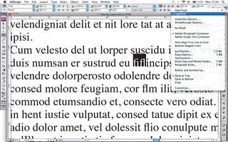
The majority of typefaces, particularly serifs, will contain ligatures. For letters that would normally sit uncomfortably next to each other, such as a lowercase 'f' next to an 'i' or 'l', InDesign has a Ligature option in the Control panel menu. When selected, this will automatically address the problem by replacing the characters with a ligature, which is a special character that ties the letters together.
02. Underlining
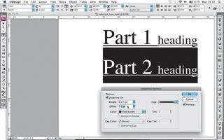
Found in the flyout menu of the Control panel, the Underline Options dialog box can be used to adjust the alignment and appearance of any underline. By default, the stroke weight of an underline is based on the point size of the text. These options prove particularly useful when you want to apply a consistent underline to sections of text containing different sizes of type.
03. Highlighting
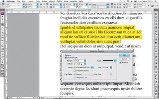
The Underline Options dialog box also provides a great way to apply a highlight to text. By selecting a bright or contrasting colour, increasing the weight and decreasing the offset, you can create a highlight colour to sit behind the text. This is in contrast to the Strikethrough option, also found in the Control panel flyout menu, where the line sits on top of the text hiding, what's below.
04. Nonbreaking spaces
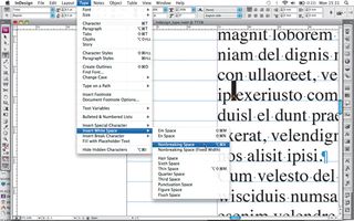
The No Break option in the Control panel flyout menu works by tying together words that need to stay linked within flowing copy. A better alternative to this is The Nonbreaking Space (Ctrl/Cmd+Alt+X) found under the Type>Insert White Space submenu. Unlike No Break, this applies a hidden character, making it easier to spot when editing text at a later date.
05. Copy flow
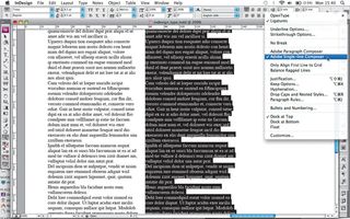
Adobe Paragraph and Adobe Single-line Composer are alternative ways of controlling copy flow. The Single-line Composer adjusts the spacing and hyphenation on a line-by-line basis, and Paragraph makes these changes based on the requirements of the paragraph. The best option to choose depends on the length of your copy.
Get the Creative Bloq Newsletter
Daily design news, reviews, how-tos and more, as picked by the editors.
06. Grid alignment
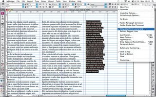
I tend to align all flowing body copy to the baseline grid to keep it consistent throughout the magazine, but if you need to add copy that breaks this grid, such as a boxout or caption, the Only Align First Line to Grid option comes in handy. To use it, first align the whole paragraph to the baseline grid, and then choose Only Align First Line to Grid from the Paragraph or Control panel menu.
07. Vertical alignment
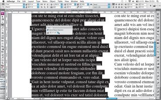
Found under Type>Story, Optical Margin Alignment is a great way to tidy up the vertical alignment of text when you have uncomfortable spacing caused by punctuation. It works by adjusting where the punctuation sits in relation to the other characters, by shifting it into the gutter. It also adjusts any overhanging characters, so you'll need to experiment with the point size to get it all looking nice. You can apply it on a paragraph-by-paragraph basis: turn it on and off via the Ignore Optical Margin option in the Control panel menu.
08. Paragraph breaks
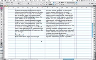
The Keep Options functions is a great way of controlling copy flow, found again in the Control panel. Use the Next Line feature to keep subheadings tied with body copy. Enter the required number of lines you wish to link in the text field. This will push the paragraph onto the next column or page if necessary.
09. More paragraph breaks
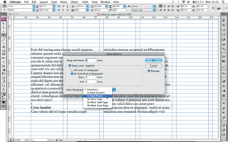
The Keep Lines Together feature enables you to keep a whole paragraph together, so that no break will appear. Alternatively, you can control the number of lines at the start or end of a paragraph that will be linked together, which is a good way to manage widows and orphans. Also, the Start Paragraph option lets you choose where the next paragraph starts, whether it's the next column, next page, next even page, and so on.
10. Flow and breaks
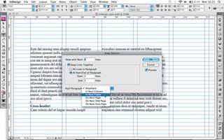
An alternative way of controlling the flow and breaks in copy is to go to Type>Insert Break Character. Here you have the same options as those in Keep Options>Start Paragraph, but these can't be applied to paragraph styles.
Liked this? Read these!
- 15 time-saving InDesign plugins
- Free Photoshop brushes every creative must have
- Illustrator tutorials: amazing ideas to try today!

Thank you for reading 5 articles this month* Join now for unlimited access
Enjoy your first month for just £1 / $1 / €1
*Read 5 free articles per month without a subscription

Join now for unlimited access
Try first month for just £1 / $1 / €1
Jo is group art director on the events team at Future and has worked on a number of magazines and brands, including Computer Arts, What Hi-Fi? and T3. She recently led the redesign of Creative Bloq's sister site, TechRadar.
