Why you should reinvent your typography
Reinvention is the key to exciting typography, as old forms take in new life in the hands of enthusiastic creatives.

What's been most exciting for me over the last five to 10 years is the fantastic explosion of expressive and exploratory typography and professional fonts everywhere. I'm completely inspired by the emergence of so many type designers of tremendous skill and talent, hailing from all over the world. I admire designers like Henrik Kubel, Peter Bil'ak and Kris Sowersby, to name just a few.
They find old forms and reinvent them, or craft seemingly impossible ligatures, or make bizarre stencils, or combine shapes previously unthinkable, and they stretch readability. They increase what is possible. In my 40-plus years of designing, I don't remember a period when typography has been better crafted, and more appreciated by non-designers. And it's never been more fun. Every project seems to demand the invention of its own font. It's so doable – even practical and cost-effective.
Typographic technology, art and craft are more in sync than they have ever been
Typographic technology, art and craft are more in sync than they have ever been. I marvel at the typographic dexterity and sophistication of my students. My class of seniors is completely international and diverse, but they seem to have all seized upon the creation of letterforms, in many languages and with different alphabets, to create an international way to see. We read the forms first, not the words; we understand what we see before we understand what it says. But it is literate. This is the language of our time.

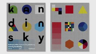
So I was astonished and delighted last year at a design conference by a presentation by Sascha Lobe on his design for the Bauhaus Archive. He began by talking about what we all believed we know from the Bauhaus: 'Less is more', 'Form follows function', etc. "Yes, that old lecture again," I thought.
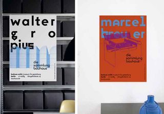
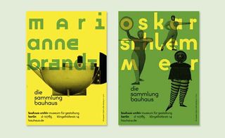
Then suddenly he began showing the absolutely crazy letterforms established by the Bauhaus designers. I must have seen them before – I know I had – but never quite this way. They hadn't abandoned their decorative past, they had recycled and reused it. And those guys didn't take their own advice. Form followed nothing! Less was pointless! They were playing around, having fun and reinventing form. Their work was idiosyncratic, complicated, even sometimes ornate, rich with impossible ligatures and bizarre spacing.

Sascha had culled the Bauhaus Archive for inspiration to solve a contemporary problem, and what he'd found through that lens was utterly contemporary. He took the crazy letterforms the designers had created and used them to build a new alphabet that married the old and new in a way that's emblematic of the Bauhaus in of our time. It's the best use of a combination of historical and contemporary typographic form I have ever seen. But it's what we are all doing, have been doing and will be doing.
We constantly look for trends and want to spot what we perceive as new, and what will be influential in the future. But there isn't really anything new. There are only individuals with passion finding interesting, challenging and often provocative ways to reinvent what will always continue.
This article was originally published in Computer Arts magazine issue 253. Buy it here.

Thank you for reading 5 articles this month* Join now for unlimited access
Enjoy your first month for just £1 / $1 / €1
*Read 5 free articles per month without a subscription

Join now for unlimited access
Try first month for just £1 / $1 / €1
Get the Creative Bloq Newsletter
Daily design news, reviews, how-tos and more, as picked by the editors.
