15 weird and wonderful uses for Helvetica
Think Helvetica's a boring typeface? Check out the inventive uses these creatives have put it to, and you may think again!
Helvetica, the typeface so iconic that they even made a movie about it, is often accused of being a boring and obvious choice. But it doesn't have to be that way. Here we present examples of typography-obsessed creatives who have taken the iconic sans-serif typeface and done something very different with it...
01. Helvetica - the perfume
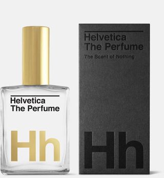
Oakland based creative collective Guts and Glory have created something rather special for Helvetica fans. Helvetica: The Perfume was inspired by the modernist font, with the collective calling the new product 'the ultimate modernist perfume'. There's even a 24k gold printing on the bottle to make it look more exclusive and luxurious.
The collective have stuck to the 'neutral' stance of the font and created a perfume with no smell whatsoever. At $62 a bottle, this is a product for die-hard Helvetica fans only.
02. Helvetica Hotel
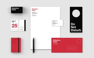
New York based designer Albert Son loves Helvetica so much that he decided to embark on a personal typography project. Here, he has created branding for an imagined Helvetica Hotel and it's really rather wonderful.
"Essential themes of the branding is based on the attributes of the typeface, which is neutral, clean, simple," Son explains. "As it's most beautiful when it's by itself, focus of the overall branding was on keeping everything simple and clean in terms of typography as well as use of colours".
03. Helvetica Beer
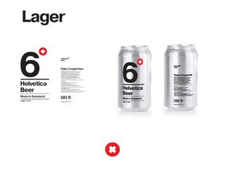
Students are renowned for like a beer or two. So we weren't surprised to learn that this cool new packaging design was a school project, designed by Sasha Kischenko at the British Higher School of Art and Design.
Tasked with creating a package design using typography only, Kischenko opted to develop a concept for beer from Switzerland's historical Helvetic republic - so the typeface was an obvious choice.
Get the Creative Bloq Newsletter
Daily design news, reviews, how-tos and more, as picked by the editors.
04. Helvetica Juice Bar
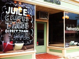
Friends and colleagues Juan Vergara and Edward Padilla have opened the Helvetica Juice Bar and Café in Lakewood, Cleveland - which offers authentic Latin American juices and cuisine - and the pair hope that the space will become a gathering place for the area’s graphic designers and creatives.
05. HelvetiCandy
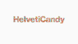
By carefully placing more than 200 pieces of candy (not including sprinkles), graphic designer Samuel Carter Mensah managed to totally recreate the sans serif typeface in sweet form. Mensah generously offers the lower-case alphabet of HelvetiCandy as a free font, asking simply for a tweet or Facebook share in return.
06. Mikser Festival 2012
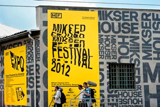
The designers of promotional material for the Mikser Festival 2012 used the concept of printing mistakes to create this very original take on the Helvetica typeface. Through a very systematic and mechanical process of editing they produced this 'photocopy that went wrong' idea concept, which was then implemented in a number of diverse ways to create a range of promotional products is beautifully done.
07. Human Font and Anatomy

This powerful typographical statement, created by Turkish designer Caglayan Aktug, symbolise the passion many designers feel towards the 'perfection' of the Helvetica typeface. On his Behance site, the image switches between the above and a distorted image of the man's face. Aktug's point is that to distort a typeface and reduce its legibility is as bad as distorting the image of a human being.
08. Typewriter Helvetica
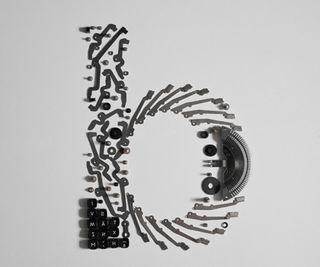
Here's another brilliant and original way in which Helvetica has been used in an unconventional way to create beautiful work. Johannes Klein-Reesink took her typewriter apart and arranged it back together in the style of Helvetica Neue Bold, creating a whole A-Z of incredible, inventive lettering.
09. Hellvetica Lights
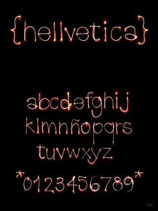
For a student project, Rachel Katstaller and Eduardo Love were asked to create type with material they had never used. We could use anything we wanted. Lovo had the idea of creating Helvetica with fire and renaming it 'Hellvetica'. This amazing creation was produced with a camera and a lighter, burned fingers and a lot of patience. Although it doesnt quite achieve the perfect arches of the original letter forms it's a fabulously inventive idea, beautifully executed.
10. Dress Helvetica
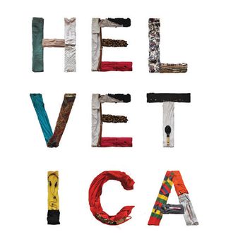
Giulia De Amicis is an Italian based designer who wanted to celebrate and bring a new light and perspective to Helvetica by using clothing, fabric and everyday objects to build a whole, usable typeface. The use of vibrant colours and diverse pattern and complexity work really well here, recreating the perfect structure of the original typeface.
11. Helveti-soup
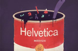
This awesome illustration produced by the talented French art director and graphic designer Paykhan slips in a sly reference to the typeface's Swiss origins.
12. Helvetica meets paper art
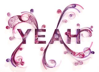
This project by German designer Stephanie Wiehle cleverly combines the complex and subtle beauty of paper art with the simplicity of Helvetica to create an enchanting narrative. Wiehle's design was made with paper in different colours fixed with ultra-strong glue.
13. Glyphs only
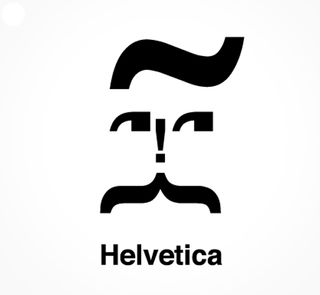
A typeface isn't just about the letters A-Z. For this small and humorous spin using the Helvetica typeface, Polish creative Aleksandra Szwalko looked at the elements of Helvetica typeface that are less obviously recognisable. She played around with just these glyphs to interpret the term 'Type Faces' in a literal way.
14. Helvetica Monsters
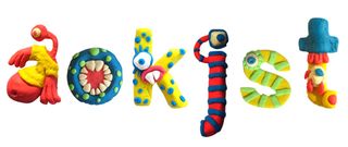
Delhi-based designer and illustrator Disha Roy wanted to demonstrate her love for Helvetica throughout mainstream design. She aimed to add personality to the letter forms in keeping with visual rules and atheistic of the typeface. The result was a uniquely beautiful and vibrant collection of letter forms.
15. Chocography

Dutch designer Rosa de Jong has created a tasty alphabet that's perfect for the typographically inclined chocolate lover. The subtle and delicate attention to detail here pays tribute to the much-loved Helvetica typeface.
This is an updated and extended version of an article which previously appeared on Creative Bloq

Thank you for reading 5 articles this month* Join now for unlimited access
Enjoy your first month for just £1 / $1 / €1
*Read 5 free articles per month without a subscription

Join now for unlimited access
Try first month for just £1 / $1 / €1
Sammy Maine was a founding member of the Creative Bloq team way back in the early 2010s, working as a Commissioning Editor. Her interests cover graphic design in music and film, illustration and animation. Since departing, Sammy has written for The Guardian, VICE, The Independent & Metro, and currently co-edits the quarterly music journal Gold Flake Paint.
