21 of the best font families to supercharge your typography
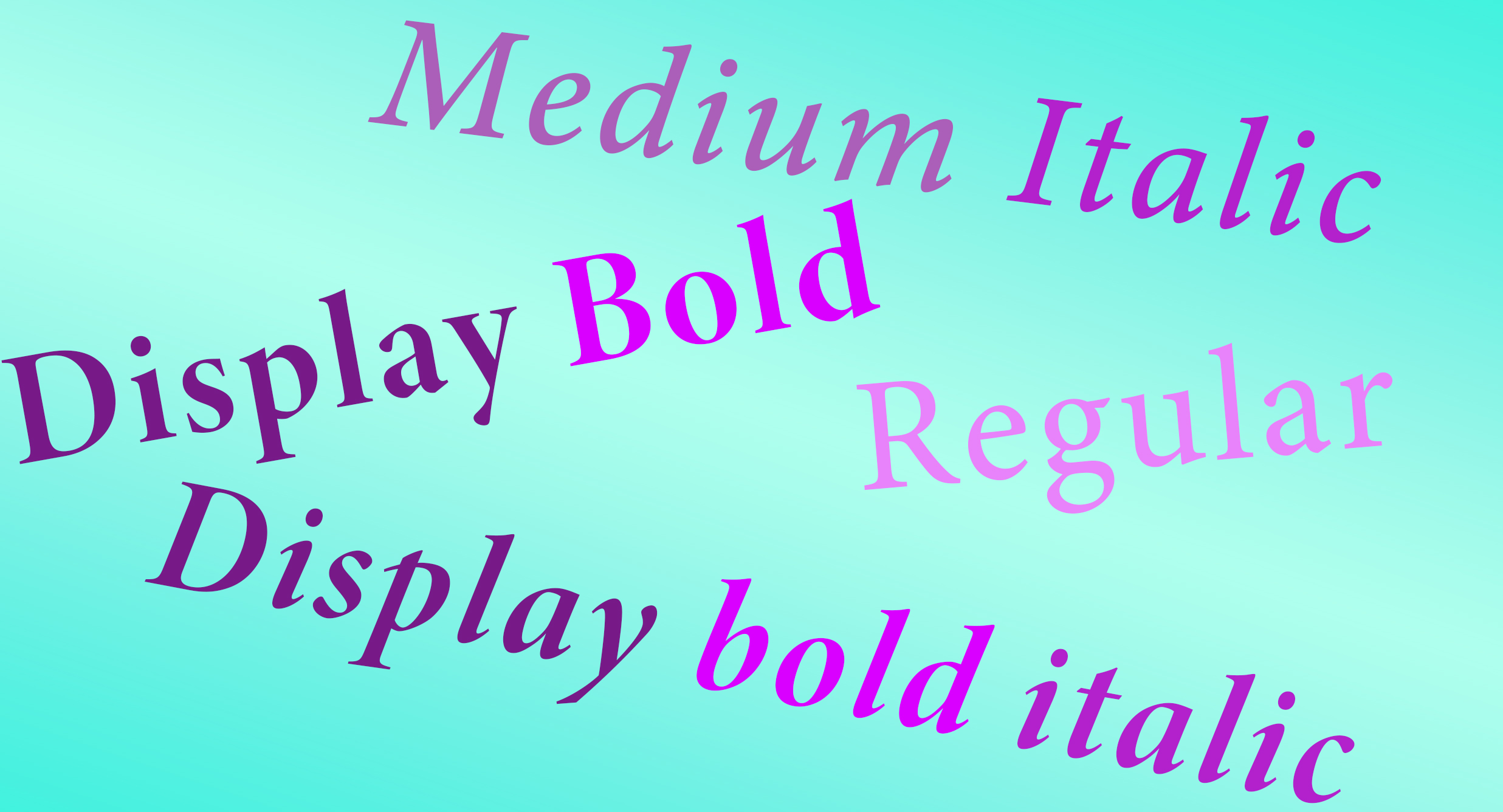
The best font families and font superfamilies are versatile resources for designers. A wide range of fonts in different styles can help ensure consistency while allowing adaptation to different applications without becoming repetitive, i
Even the most skilled and experience designers can often find it difficult to choose just the right typography for a project. Do you go for something unique to give a piece character, or is it better to opt for something neutral that doesn’t overwhelm the rest of the design? What other uses could crop up that haven't been envisioned in the current brief?
A large typeface or font family can help by covering different styles, weights and widths. Such extended but organised type families (or 'superfamilies' if they contains different classifications, like a serif plus a sans serif) is a relatively new concept, emerging in the last century or so, but there are now plenty to choose from.
Below, we've rounded up 20 of the best font families, or type families, that we think can help ensure versatility for all manner of design projects. See our pick of the best free fonts and the best font pairings for more options. We also have a roundup of the best typography of the 2020s.
The best font families for versatility
01. FF Meta
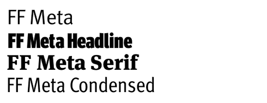
Originally developed by Erik Spiekermann for the Deutsche Bundespost (West German Post Office), Meta is a font superfamily since it has headline and both serif and sans serif versions as well as a range of weights. It was released commercially in 1991 on the FontFont label and was intended to be the "antithesis of Helvetica", it comes in serif, sans serif and headline versions, and hairline, thin, light, normal, book, medium, bold and black weights.
02. Knockout
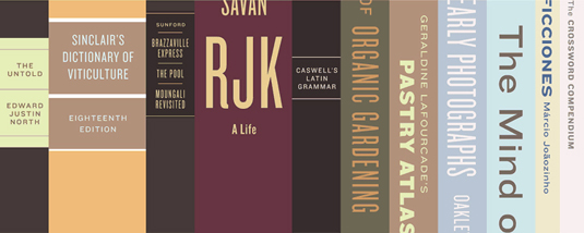
Renowned New York foundry Hoefler & Frere-Jones likes its metaphors. Knockout is available in nine boxing-themed widths, from flyweight to sumo - and its four weights are themed too, ranging from junior to ultimate. If the full range of styles is overwhelming, they're split into seven 'series' packs to fulfil different creative needs.
03. ITC Franklin Gothic

Another wonderfully versatile type family, ITC Franklin Gothic supplements the standard book, medium, semi and heavy weights with both condensed and compressed weights too. The typeface boasts plenty of impact when used large for display purposes, and has been used extensively both in advertising and for newspaper headlines.
Sign up to Creative Bloq's daily newsletter, which brings you the latest news and inspiration from the worlds of art, design and technology.
04. Minion
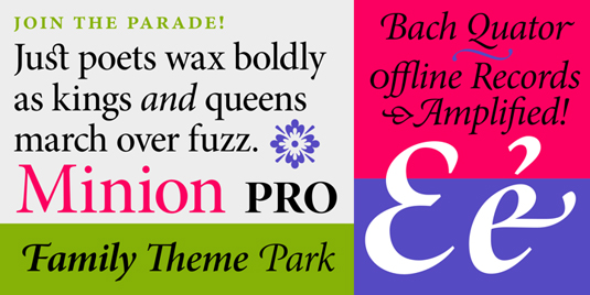
Despite being designed in 1990, Adobe's elegant serif face Minion was influenced by Renaissance era typography. It takes its name from the traditional naming system for type sizes: ‘minion’ is a measure in-between ‘nonparell’ and ‘brevier’. Other multi-weight varieties include Minion Expert and Minion Pro.
05. Inter
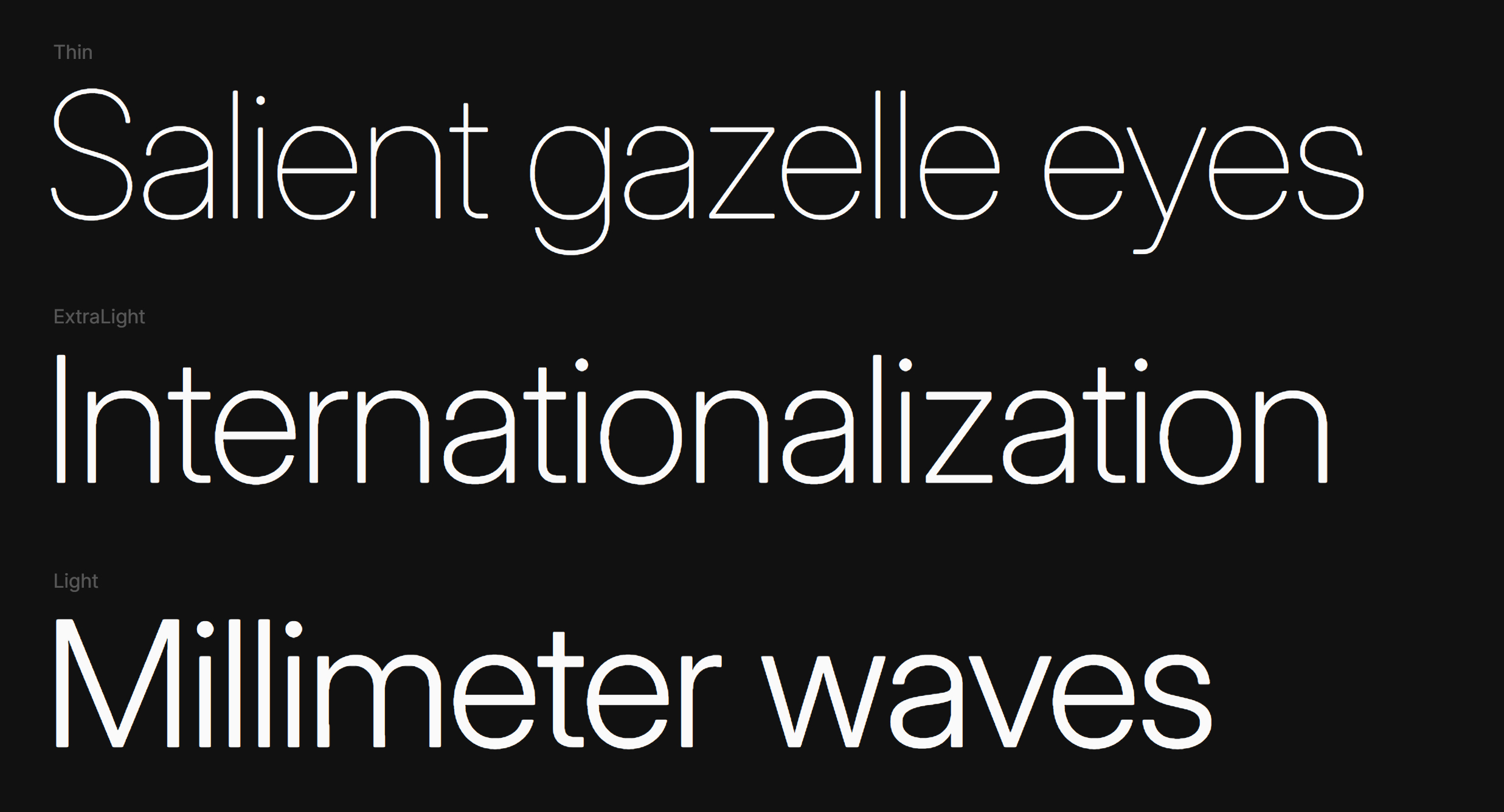
Inter might seem a bit overused in 2024, but as a versatile free font family it still does its job extremely well. It's a highly functional, neutral variable font that doesn't call attention to itself. It's not going to stand out if you're looking to build distinction for a brand with a visually unique font, but if the goal is timeless, easily legibility, it's a winner. As a variable font it provides endless adjustability, allowing weight, width, and other characteristics to be tweaked as needed.
06. Mrs Eaves / Mr Eaves
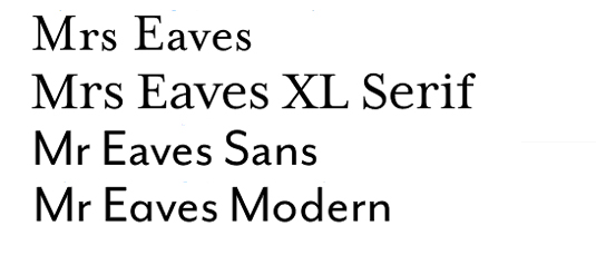
Okay, so these are technically two separate typefaces - but as their names imply, it's a marriage made in heaven. Designed by Zuzana Licko for Emigre in 1996, delectable serif Mrs Eaves is named after John Baskerville's wife, while its sans serif partner followed thanks to popular demand in 2009. Both also come in an XL display variety.
07. Soho
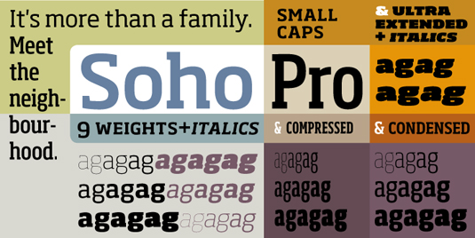
Designed by Sebastian Lester for Monotype in 2007, Soho is a relatively rare beast: a hugely versatile slab serif font family. Its enviable range of weights - including thin, extra light, light, regular, medium, bold, extra bold, heavy and ultra - are supplemented further with condensed, compressed and extended varieties.
08. Thesis
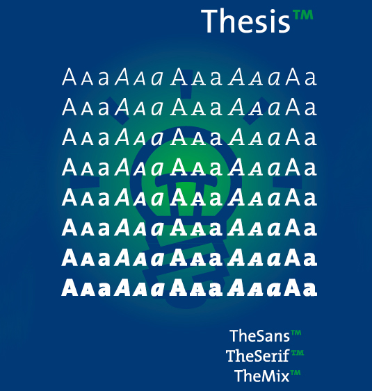
Lucas de Groot of LucasFonts developed this typeface between 1994 and 1999. Within the Thesis superfamily are TheSans, TheSans Mono, TheSans Typewriter, TheSans Hair, TheSerif, TheMix, TheMix Mono and TheAntigua, each in various weights. Each comes in three collections, ranging from Classic - seven varieties in eight different weights - to the more pared-back Basic and Office versions.
09. FF Scala
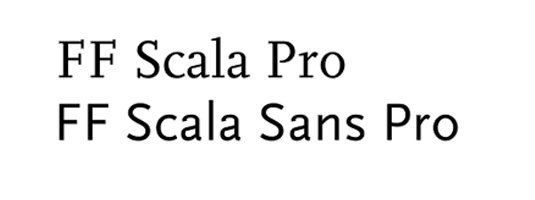
Another FontFont superfamily, this time by Martin Majoor, FF Scala was originally developed for use by a Dutch music venue and later released commercially. The serif version came out in 1990, followed by the sans serif in 1992 - both feature true small capitals, a broad range of ligatures, and both lining and non-lining figures.
10. Gotham
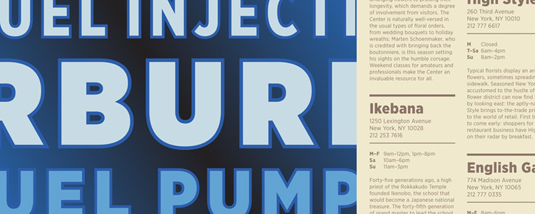
One more from the masters of versatility, Hoefler & Frere-Jones: Gotham is a practical workhorse typeface that's influenced by and celebrates the urban typography that surrounds us, from neon signage to hand-painted lettering on trucks. It comes in eight weights, as well as narrow, extra narrow and condensed varieties, all with complementary italics.
11. ITC Century
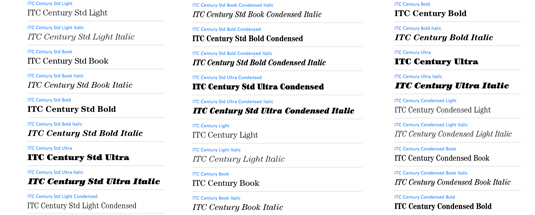
This is Tony Stan's 1970s interpretation of a typeface originally designed for The Century magazine at the end of the 19th century as a more practical, scalable alternative to the popular Bodoni-style faces popular during that period. It comes in four weights - light, book, bold and ultra - plus a condensed version.
12. Myriad
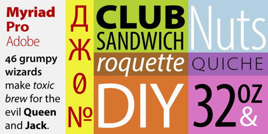
Designed by Robert Slimbach and Carol Twombly for Adobe, Myriad is perhaps most famous for its role as Apple's corporate font. The Pro version has wider language support, featuring five weights each of four widths - including condensed, semi-condensed and semi-extended - all with complementary italics of course.
13. Base 9 and 12
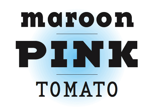
Another Zuzana Licko creation for Emigre, Base 9 and 12 is a superfamily with both serif and sans varieties, as well as a monospace version. It's designed to harmonise the relationship between screen fonts and printer fonts, designed for use at the two most popular sizes - 9-point and 12-point - and multiples thereof.
14. Rotis
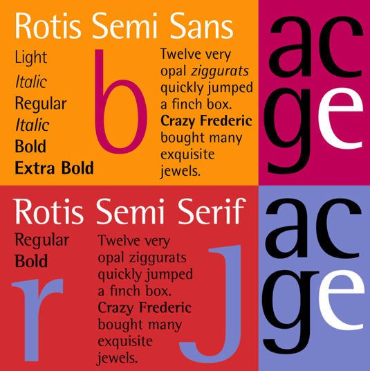
Named after the place he lived, Otl Aicher's pioneering hybrid typeface superfamily was completed in 1988 - three years before his tragic death in a motorbike accident. Rotis was unique at the time for including semi-serif and semi-sans varieties alongside the traditional serif and sans versions, making it particularly versatile.
15. Agenda
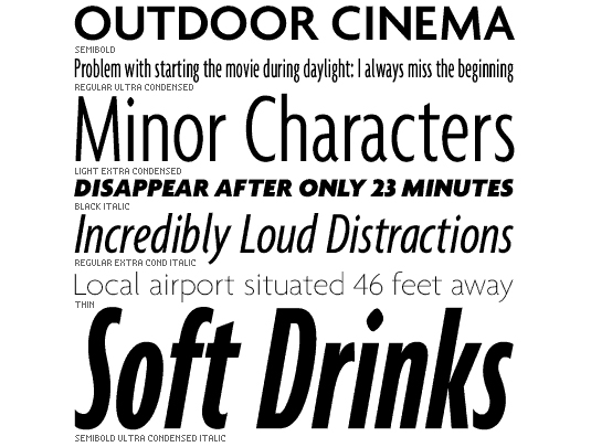
Coming in an impressive 54 font styles, Greg Thompson's Agenda type family was designed for Font Bureau in 1993 as a stylish alternative to the ubiquitous Swiss sans serif. It comes in thin, light, regular, medium, semi-bold, bold and black, with condensed, extra-condensed and ultra-condensed varieties.
16. Fedra

Developed by Typotheque's Peter Bil'ak, Fedra is a superfamily that boasts two different serif varieties alongside the original sans, plus a mono-spaced version too. It was first commissioned in 2000 for an insurance company, followed in 2004 by serif A - which matches the proportions of the original - and serif B, which is proportioned differently.
17. FF Quadraat
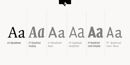
The third FontFont representative on the list, designed by Fred Smeijers, is another superfamily. It includes display, headline, sans, sans display and sans mono versions under the same Quadraat umbrella - all in six weights, from regular through to bold. It's particularly well suited to editorial and publishing applications.
18. Chronicle
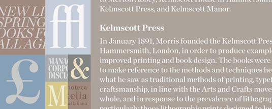
This Hoefler & Frere-Jones' newspaper typeface is a sterling example of the Scotch Transitional serif, so named after 18th century Scottish type founders Alexander Wilson and William Miller. Chronicle Text comes in four 'grades' to allow for different paper stocks, while the display is more expansive - three widths, six weights and a 'deck' version for sizes in between display and text.
19. ITC Officina
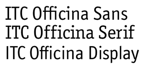
There's an impressive range of fonts in this superfamily that Erik Spiekermann designed in the '90s for ITC. Based on the premise that photocopiers, fax machines and poor-quality printers can deteriorate type, Officina has open counters and strong slab serifs, and is available in five weights, from book up to black.
20. Antenna
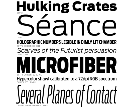
There's a pleasing sense of symmetry to Cyrus Highsmith's creation for Font Bureau, with strong emphasis placed on the repeat and variation of counter shapes within the spacing between letters. The sans serif comes with seven weights in four widths, including compressed, condensed and extra condensed.
21. Lucida

Closing our list of versatile font families is Lucida. Charles Bigelow and Kris Holmes designed this hugely varied typeface superfamily in 1985. Uniquely for this list, as well as serif (Lucida Fax and Lucida Bright) and sans serif (Lucida Sans, Lucida Sans Unicode, Lucida Grande and Lucida Sans Typewriter), there are also several scripts - including blackletter, calligraphy and handwriting variants.
What are font families?
A font family is a group of fonts that make up a typeface (see our piece on font vs typeface). The different fonts in the family have different weights and styles.
To take a very well-known font as an example, Arial is a typeface or font family comprising various individual fonts, such as Arial Italic, Arial Bold, Arial Bold Italic. There are also sub-families such as Arial Black and Arial Narrow, which each comprise more individual fonts (Arial Black Italic, Arial Narrow Bold, etc).
Most font families have a Regular, Italic, Bold and Bold Italic member, but some large font families have much wider ranges of weights and styles, from very light to very heavy. Variable fonts make font families less relevant to an extent since the font's weight and style can adapt.
What are font superfamilies?
A font superfamily refers to when a grouping of fonts with different classifications, for example a serif and a sans serif or monospaced font. They will normally have been designed specifically to look good together. They're relatively rare since most typefaces will only have a serif, slab serif, sans serif of monospaced form.
Notable examples include the Merriweather font superfamily (Merriweather and Merriweather Sans), FF Meta (FF Meta sans, FF Meta Serif and FF Meta Headline) and the big font superfamily Lucida (Lucida Sans, Lucida Serif, Lucida Typewriter Sans, Lucida Typewriter Serif and Lucida Math). Some brands have used bespoke font superfamilies, such as the BBC's Reith.
What is the biggest font family?
I can't say categorically since it's very possible that there are bespoke typefaces out there that bear it, but I believe that one of the biggest font families is the Right font family.
This massive font superfamily comprises more than 470 fonts in sans and serif genres with different weights, widths, contrasts and italic angles. There are even mini variable fonts – files containing several styles together to allow smooth transitions between styles for animation. Licences are available from Pangram Pangram.
For more type options, see our pick of the best free graffiti fonts and the tree tattoo fonts. We also have an explainer, what is typography?

Joe is a regular freelance journalist and editor at Creative Bloq. He writes news, features and buying guides and keeps track of the best equipment and software for creatives, from video editing programs to monitors and accessories. A veteran news writer and photographer, he now works as a project manager at the London and Buenos Aires-based design, production and branding agency Hermana Creatives. There he manages a team of designers, photographers and video editors who specialise in producing visual content and design assets for the hospitality sector. He also dances Argentine tango.

