TYPO Berlin: highlights from day two
Our exclusive report from the second day of the international typography event.
If the opening day of TYPO Berlin was defined by surreal Scandinavians, the second day brought an even more rich and diverse line-up from Germany, The Netherlands, the USA and beyond to the Haus der Kulturen der Welt to continue the theme of beating your own path, and flying in the face of what the establishment expects.
It all kicked off with a thought-provoking video interview with Gerrit Noordzij in his self-confessedly rusty German, in which the opinionated Dutch type designer - who couldn't attend in person due to illness - walked through the history of letterforms using his trusty chalkboard, emphasising the links with handwritten characters and how they have developed.

"He encourages every student to be professionally arrogant - you cannot copy him," was the assessment of Bold Monday's Paul van der Laan, who studied under Noordzij, during a brief on-stage discussion afterwards - which also included fellow former apprentice Erik van Blokland.
Both agreed that while their shared mentor was often hard to understand (and not just when speaking rusty German), his provocative teaching method forced his students to do things for themselves. All of which sets up our three highlights from the rest of the day rather nicely…
Techno nation
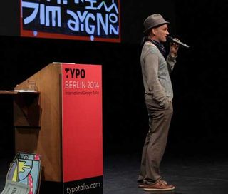
Once described by Dazed & Confused as "Picasso on acid", Jim Avignon prides himself as being one of the fastest painters in the world - and has been flying in the face of authority throughout his career. "As an artist, I want to work in much the same way as a punk musician," he declared. "The opposite to the establishment."
One of his past exhibitions, for instance, equipped visitors with a pair of scissors with a view to all of them snipping off a piece of artwork to take home at midnight.
Of course, it didn't exactly go to plan and people started tearing the exhibition to shreds far too early. "It was mayhem," he shrugged.
Get the Creative Bloq Newsletter
Daily design news, reviews, how-tos and more, as picked by the editors.
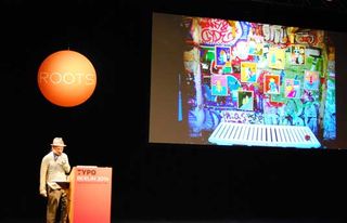
During the early 1990s, Avignon became what he calls the "painting face" of Berlin's techno movement.
Rough-and-ready clubs were opening up everywhere in the city in the years after the Wall came down, often with no internal decoration to speak of and the entrance little more than a hole.
"They were happy if you could paint it all in four hours," admitted the artist.
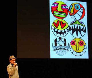
Following a prolonged period of commercial success, however - including an ever-increasingly range of merchandise, from socks to cigarette packaging - Avignon began to realise that he'd sold out.
"I had become a rich man, but had betrayed my ideals and my mind was full of how to get rid of this money," he confessed. It had all gone too far, bringing cash and exposure at the expense of his professional integrity, which ultimately he battled to reclaim.
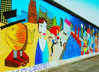
One of his proudest recent pieces was a mural that contributed to the work of communal art that is Berlin's East Side Gallery, painted on one of the remaining sections of the Wall.
This led to threats of imprisonment for desecrating a public monument - a surefire sign that Avignon was on the other side of the establishment once again.
The personal touch
Rescheduled from yesterday due to earlier technical issues, Julia Hoffmann brought a refreshingly craft-focused approach to the day from her perspective as global creative director for Etsy, based out of Berlin.
At the core of her talk was the tension between global and local, and particularly how to tailor design and communication to individual tastes and cultures.
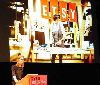
After moving to New York, Hoffmann spent some time working with ad agencies: "In that world, attention to detail is often completely secondary," she observed.
"When you're communicating on a national level for global brands, you need to consider the broader picture."

During a stint at the in-house design team at MoMA, a simple project to tap into the hugely diverse individual personalities of the museum's millions of visitors from all over the world was more successful than Hoffmann ever thoughts possible.
By simply providing a blank canvas with the prompt 'I went to MoMa and…' they gathered a huge range of responses that were used in MoMA promotional materials across the board.
While at MoMA the line between 'art' and 'design' - the content of the exhibitions, and the tools used to promote them - was clearly defined, at Etsy the two are proudly blurred, with promo campaigns every bit as creative and tactile as the crafts that are sold on the site.
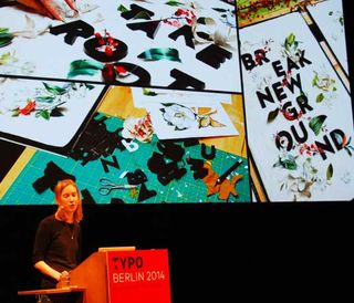
One such example is the Valentine's Day tongue-twister campaign, that stressed the skilled, artisan nature of the sellers and the desirability of their wares through lines such as: 'I can't slip stitch, but if I could slip stitch I would have slip stitched this for you.'
Because, as Hoffmann pointed out, once you've received a beautifully hand-wrapped, decorated package from an Etsy seller, it's hard to go back to the cold, impersonal cardboard packing you receive from the likes of Amazon. "Etsy is more than a website: it's a community," she insisted. "It's powered by real people; real human interactions. And it makes the global world a little bit more local by connecting you to those designers."
Off the grid
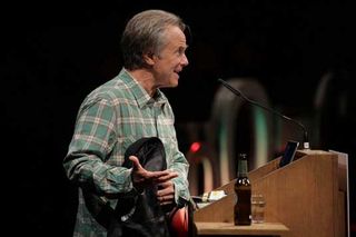
Bringing day two to a close was the world's foremost surfer-designer, David Carson - with his own fair share of technical gremlins that he mischievously blamed on "German engineering", in response to which the MC promptly pointed out that the Mac he was using hailed from his own native California.
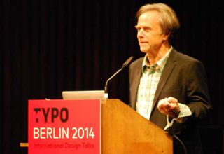
Carson's maverick approach to typesetting famously made him the poster-boy of 1990s graphic design, and his attitude has changed little since.
"Legibility on its own isn't enough," he pointed out, showing a comical example of a perfectly readable road sign that warned in large, ultra-bold type that its edges were sharp and you shouldn't touch them, while the rather more pressing message "bridge out ahead" was set vanishingly small at the bottom.
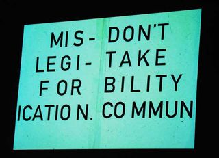
His disregard for the formal 'rules' of design are well documented, and grids are particularly frowned upon. "I don't have any sort of system," he declared.
"The answer is usually there in whatever it is you're designing for." It's a personal approach that flies completely in the face of yesterday's talk by MuirMcNeil, where the British duo argued in favour of designing a system that designs a thing, rather than the thing itself – investing in the "root rather than the branch", as they put it.
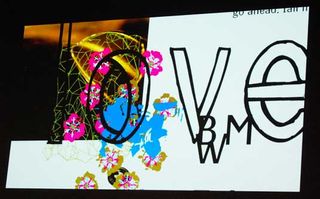
"I can't work with the guidelines on," Carson revealed, before urging: "Don't let the computer make the decisions. You should be making them."
This applies metaphorically as well as literally, with his subversive streak showing in everything from his approach to magazine contents pages ("I never put page numbers on, because I don't think people use them") to a cover design for the Helvetica documentary, defiantly set in Franklin Gothic.
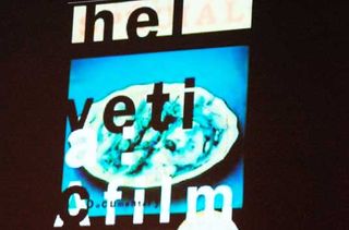
"I'll leave you with two ideas," he concluded, bringing up an image relating to each. "Never snap to guides, and keep paddling."

Check Creative Bloq for more highlights tomorrow...

Thank you for reading 5 articles this month* Join now for unlimited access
Enjoy your first month for just £1 / $1 / €1
*Read 5 free articles per month without a subscription

Join now for unlimited access
Try first month for just £1 / $1 / €1

Nick has worked with world-class agencies including Wolff Olins, Taxi Studio and Vault49 on brand storytelling, tone of voice and verbal strategy for global brands such as Virgin, TikTok, and Bite Back 2030. Nick launched the Brand Impact Awards in 2013 while editor of Computer Arts, and remains chair of judges. He's written for Creative Bloq on design and branding matters since the site's launch.