10 typography tricks every designer should know
Banish kerning calamities and learn to love leading with our expert tips and tricks for perfect typography.
Before you begin getting into the intricacies of setting type in the likes of InDesign CC, it's important to know the basics of typography. If you need a refresher on type terms then check out our key terms every graphic designer should know.
For this typography tutorial, though, the most important thing you need to know is the difference between kerning and tracking. Kerning is the spacing between specific pairs of letters, whereas tracking works across a range of characters, or even entire paragraphs or documents.
Kerning is a fine art – and one you can quickly get good at using InDesign's tools and some tricks in InDesign, Illustrator CC and Photoshop CC. In InDesign or Illustrator, you can adjust kerning by selecting the Type tool and clicking on the gap between two characters, before holding down alt/opt and using the left and right arrows to adjust the space between them. By default the increment applied with each press of the arrow is 20 thousandths of an em, but you can adjust this preference for tighter control.
Once you've got the hang of that, read on to discover how you can take your typography skills to the next level...
01. Kern upside down
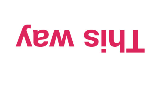
Why would you want to kern character pairs upside down? Because this enables you to see your letterforms and the space between them without actually reading the words – bringing meaning to them. If you're doing something fancy with the kerning based on the meaning, this won't work, of course, but otherwise it's a well-used and tested technique and one you should try if you're struggling with kerning character pairs.
02. Blur it
Another tested technique is to blur the type, perhaps by taking a screenshot and blurring it in Photoshop ... or more likely just squinting a little bit. Like Brian Hoff says: "I like to blur my eyesight a bit by squinting or crossing my eyes. This enables me to focus on the contrast and white space of the letterforms without becoming distracted by the characters themselves." It's a great technique, and you can find plenty expert kerning tricks in this brilliant article from Brian Hoff.
03. Kern with balloons
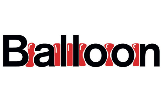
Another, perhaps more abstract kerning tip is to imagine that between each letter there are balloons of equal size and volume, forcing the letters apart. As designer Tom Sewell says: "Aim to space the letters so that the balloons fit exactly between them without being squeezed out above and below". It's an interesting technique, and one that can prove very handy.
04. Use 'o' to space words
Another tip is to always consider the spaces before and after the word you’re working on and ensure they are spaced correctly visually. A good rule of thumb is to imagine that the character 'o' sits between each word (thanks again to Sewell for that one).
05. Rough out headlines
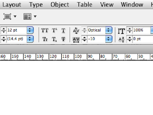
Kerning and tracking is most obvious in headlines, so it's essential to get it right. And sans-serif fonts can accentuate your mistakes.
When working with sans-serif headlines, make sure you get a rough tracking before you kern. If you have to put -10 kerning between almost every character combination, you should be using tracking at -10 before you do your individual character spacing.
This goes for numbers too. The numeral 1 with anything before or after it (213, for example, or even a space) will always benefit from a tighter kern. More than one 1 (for example, combinations such as 11) needs really tight kerning.
06. Forget about small caps
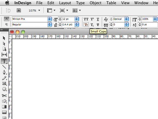
John D Berry knows his stuff – after all, he's written several books on type and typography. His top tip? Unless you know the difference between true small caps and fake ones, it's best to just forget that your design app's Small Caps command exists.
Never just shrink full-size caps down and call them small caps: they aren't. If you're willing to go to the trouble of using real small caps, be sure to letter-space them properly – that is, a little looser than lowercase.
07. Keep the font count low
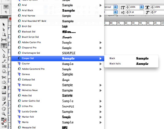
It's important to think of your type as a whole in your project. When you use more than three fonts in your project – say a slab, a serif and a display – it can sometimes become difficult to read and understand; the project can lack order.
Usually, one font has different weights and you can create a stunning and simple design solution using these in the correct way. The result will be cleaner and sharper. So think about whether you need many fonts or a better job can be done using different weights of just one. Thanks to Hey Studio for that one.
For more on the fonts that do go together nicely, see our post on perfect font pairings.
08. Rental revolution
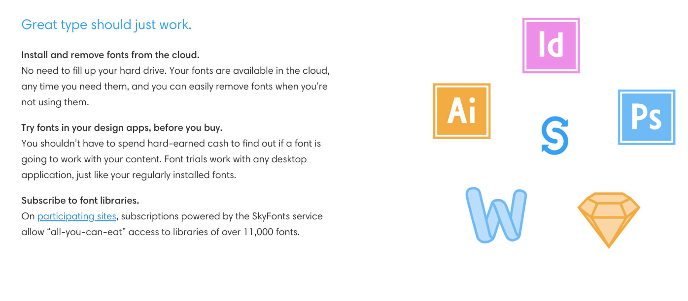
The problem with font shopping is that often you're not able to try fonts to their full capacity before you pull the trigger and purchase. Skyfonts from Monotype rectifies this by enabling you to try any font from its library for five minutes, for free.
Sure, many foundries enable you to test out characters on their site, but it's not the same as trying them out in your preferred layout/design app. After all, the feeling of a particular font can be hard to establish until you start combining words.
09. Don't push it (unless you really have to)
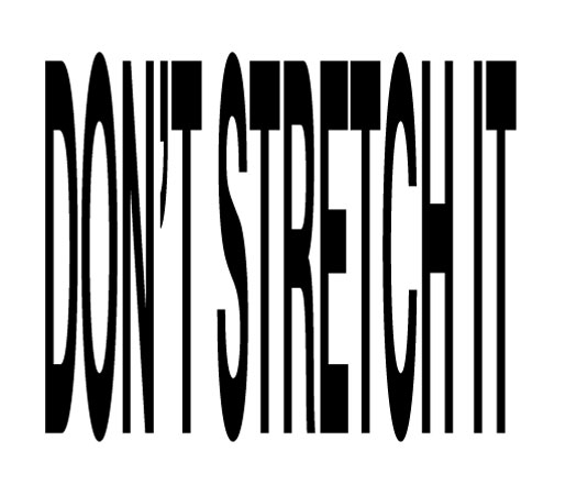
Unless you're after a specific effect (or working on an illustrated piece) don't stretch, skew or otherwise alter fonts by messing with its dimensions after turning to outlines.
You wouldn't stretch a photo or refined vector piece and you can often end up with an ugly, amateurish result. If you're going to edit a font, make sure it's with good reason. You don't want to ruin hours of the type designer's work.
10. Think of type as a voice
Here's an interesting tip we picked up from Hoon Kim of Why Not Smile: "To deal with type is much the same as to control one's voice: [think of] selecting typefaces as voice quality; having a relationship with type in size, amount and degrees as vocal tone; and setting layouts of type as voices in space and time. Typographic design is visible as well as audible. If you have a great scenario, now it is time to cast good actors."
Related articles:

Thank you for reading 5 articles this month* Join now for unlimited access
Enjoy your first month for just £1 / $1 / €1
*Read 5 free articles per month without a subscription

Join now for unlimited access
Try first month for just £1 / $1 / €1
Get the Creative Bloq Newsletter
Daily design news, reviews, how-tos and more, as picked by the editors.

Rob is editorial, graphic design and publishing lead at Transport for London. He previously worked at Future Publishing over the course of several years, where he launched digital art magazine, ImagineFX; and edited graphic design magazine Computer Arts, as well as the Computer Arts Projects series, and was also editor of technology magazine, T3.
