How to choose the right typeface
Top tips for picking the perfect fonts for your next project.
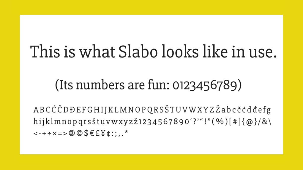
There are thousands of fonts available for creatives to choose from. However, when it comes to picking a typeface, you can't rely on gut alone. Making the right choice depends on function, context and a whole host of other factors.
How do you ensure you're going about it the right way? Follow these tips for how to pick the right font for your project. If you need a refresher on typography as a discipline, then check out our typography tutorials. To make sure you're using the right terminology, see our type glossary or our guide to font vs typeface.
01. Think about personality

Before starting a project, think about values and words that describe the feeling of what you want to create. For example, is the design going to be friendly, intelligent or confident? You might want to put together a mood board. Limit yourself to three to five traits, then you can start to get a sense of the direction your font needs to go in. A friendly font might be one that’s rounded and really legible. A confident one might be angular – perhaps full caps.
02. Consider visual and tonal direction

Visual is very much the font and how it looks, while tonal is the arrangement of words to form a message. Both of these elements need to harmonise and be sympathetic to each other. Use the values you decided earlier to understand what a font truly says and how a message looks when you compare it to what is written. The right font can amplify words in this way so the visual characteristics of a font are important to make the relationship work.
Some of the characteristics to look out for are weights, roundness, length and how the font flows from letter to letter. You might be torn between serif, sans-serif (see our sans vs sans-serif piece for the differences) script fonts or even hand-drawn styles. Each font will help evoke a feeling or message.
03. Think function
Always think about function as well as form. There's no point finding a typeface that ticks the creative boxes, testing it and wowing your client with it, only to discover that it won't actually work for the project because it lacks key technical features. Consider these from the start.
04. Consider performance
It’s always worth making sure that your chosen font is web safe and can be rendered perfectly in a browser. If you're using a good font library or a web-safe font file (OTF or WOFF), your font should be web safe.
The second element to consider here is performance. Using a library such as Google Fonts or Adobe Typekit ensures that everything is taken care of and you can expect good performance. With web fonts, always make sure that you’re only loading the character set you need too – there’s no point using all the available weights if you don’t need them.
05. Notice typography around you
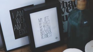
As a designer, type should be in your consciousness, not something you only think about when you need to use it. Try following some foundries like Dalton Maag, Monotype, Hoefler & Co, Font Bureau and Commercial Type on social networking sites, follow trending typography hashtags, read typography blogs or simply keep your eyes peeled for good and bad examples of type you see out in the world. The more you notice, the more you'll know.
06. Test rigorously
Always test your type in ways that are relevant to the project. You don't know if a typeface will work until you've seen it at the right size and tested whether the spacing works. You need a realistic idea of how it's going to look – which you often won't get from fake Latin.
07. Pair up properly
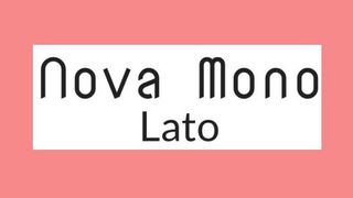
If you're trying to pair two typefaces, start by defining what you want to achieve: are you aiming for harmony or contrast? Are you looking for complementary typefaces with corresponding curves, for example? Be careful not to let things get too uniform. For some ideas, explore our list of perfect font pairings.

Thank you for reading 5 articles this month* Join now for unlimited access
Enjoy your first month for just £1 / $1 / €1
*Read 5 free articles per month without a subscription

Join now for unlimited access
Try first month for just £1 / $1 / €1
Get the Creative Bloq Newsletter
Daily design news, reviews, how-tos and more, as picked by the editors.
Carl is a creative who has been in the web industry for more than 14 years. Blessed with a passion for UX/UI design, Carl has been awarded Creative of the Year for his contribution to the industry. His diverse portfolio of past clients includes Facebook, Twitter, Unity Technologies, Ordnance Survey, and beauty brand Lush. He has written features for Web Designer magazine, and currently heads up the Salo Creative agency, which he also founded.
