Should designers care about typographic mistakes?
Typography has had a rich evolution to reach this point, so please honour it.

The written word has come a long way since its beginnings, when words were all crammed together wily-nilly.
ITWASNTALLTHATLONGAGOHISTORICALLYSPEAKINGTHATANY
WRITTENTEXTLOOKEDBASICALLYLIKETHIS.
(That was “It wasn’t all that long ago, historically speaking, that any written text looked basically like this,” incidentally.)
Early punctuation arose as a system of cues to a reader, since early written text was never read silently, but read aloud. This proto-punctuation began by hinting to the reader when he should take a breath, for example.
FOR·A·WHILE·WE·EXPERIMENTED·WITH·THIS·WHICH·WHILE·
A·LITTLE·EASIER·TO·PARSE·IS·REGARDLESS·MUCH·TRICKIER·
TO·READ·THAN·A·MODERN·SENTENCE·WOULDNT·YOU·SAY
It wasn’t long, though, before we had developed a rich, expressive and widely adopted system of glyphs that were used to make meanings clear and to make printed text look beautiful and elegant (although not all of us use them properly – read 10 typographic mistakes everyone makes for more).
Discarding conventions
These are not always mistakes, however. In recent years, as a society we’ve started both deliberately and inadvertently rationalising the list of glyphs we use, abandoning hard-won, useful and beautiful characters.
Get the Creative Bloq Newsletter
Daily design news, reviews, how-tos and more, as picked by the editors.
We haven’t quite regressed back TOTHISSORTOFTHING but for lots of reasons we’re discarding many of the conventions of typography that previous generations would have insisted were the only right and proper way of doing things.
What are these changes, and what do they mean for designers and to the rest of society? Let’s explore.

Up-front, we should say that we’re not being prescriptive or didactic here; fashions, needs and limitations change in typography just as in grammar, and anyone who tries to hold back that tide of change is not just doomed but misguided.
Communication is a live, writhing thing, and you will note, for example, that we’re using these new-fangled paragraph thingies here rather than setting the whole thing as a solid wall of text which is broken up only with ¶ (pilcrow) characters.
But still, some people would rail against what they’d see as typographical mistakes and dumbing down.
Let’s take the first example from our 10 typographic mistakes everyone makes piece – typographic or ‘smart’ quote marks. "These" are dumb (or neutral) quotes, while “these” are smart quotes. In the first example, both double-quotes are identical, while in the second you have 66 and 99-style pairs (although you might need to bump up the point size before you can see the difference).
Typographically speaking, those dumb quotes have no role at all, and should never be used. They come from the days when typewriters were introduced, when adding separate keys for “, ”, ‘ and ’ would have added complexity and additional points of failure.
The desktop publishing revolution
And for a long time, it didn’t matter, because much of what would be produced on a typewriter would then be sent to a typesetter and set properly with curly quotes. But then computers came along, and to ease the transition their keyboards copied the layout that typewriters had been using. Even then, having only dumb quotes didn’t matter, for the same reason.
Then, though, came the desktop publishing revolution, and then the internet, and the stuff that was being written on computers was being published directly, without the intervention of someone whose job it was to make sure text adhered to established standards and customs.
And the computer itself wasn’t the answer. Sure, some apps – and even OS X – can convert dumb quotes to smart, but they can make mistakes.
The only sure-fire way to get your smart quotes right is to type them manually – or at least to watch what your computer is writing, and correct it if necessary. But for most of us these days, that’s too much work for too little reward, since the meaning of a sentence won’t be impaired by some sub-standard typography.
'Bad' typography on the web
Indeed, there are often many good reasons to use ‘bad’ typography like this. One is that there might be technical limitations imposed by, for example, a content management system, or the platform to which it will spit content out.
Websites like this one are the readiest example of this. And what’s more, because websites will be viewed by people using a range of browsers on a raft of operating systems on a plethora of devices, by using the lowest common denominator, typographically, you’re giving yourself the best chance possible that characters will display.
Sure, "these quote marks" might be ‘wrong’, but if you can’t guarantee they’ll display properly, some would argue it’s better than than ⍰these quote marks⍰ or something like them if your reader’s browser can’t handle “these quote marks”.
What’s more, as more and more content gets repurposed across multiple systems – sometimes being copy/pasted, sometimes referencing a canonical file – then there’s a temptation to use whatever basic character set is common to all, even if the majority of the platforms can use richer typography.
Typography across borders
A similar thing happens when we’re sharing documents internationally, where different text encoding standards might prevail.

There are robust systems to combat this, however, at least at a technical level. The old ASCII system – which encoded 0–9, A–Z, a–z, some basic punctuation and control codes – has long since been superseded.
For a time we had lots of per-platform text-encoding solutions, but as a world we’re beginning finally to settle on an agnostic standard, Unicode, usually specifically UTF-8.
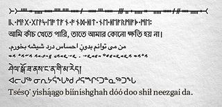
Unicode supports over 136,000 characters (with plenty of headroom for more) covering 100 scripts – versus 128 characters for ASCII – as well as right-to-left scripts, combining ligatures and a huge range of other typographic niceties, so so long as documents online and off correctly identify themselves as being UTF-8, say, there’s no excuse for dumbed down typography… at least technically.
Choosing simplicity
Regardless, people might choose to use a simplified system of typography.
Smart quotes, for example, will of course break HTML (another score for Markdown, which doesn’t use quotes in its syntax).
It’s also not unheard of for coders to denigrate richer typography even in content (as distinct from the back-end that powers it) and for them to brow-beat writers and editors into adopting simplified typography. That's either because they don’t understand or value typography, or because they’re not motivated to support rich character sets such as UTF-8, despite it being part of the HTML spec since 1997’s 4.0 declaration.
Ultimately, though, the gradual abandonment of some of the established typographic conventions isn’t down to technological constraints. It’s because many people aren’t even aware they’re doing things ‘incorrectly’.
After all, Unicode, a global perspective, the increasing pressure on foundries to make fonts with rich character sets, and capable tools mean that we can do proper typography with relative ease these days.
But if you don’t know that you should write £29·99 instead of £29.99, that 90º is wrong but 90° is right, or that there’s a proper character for inches – 12″ rather than 12" – then even though modern systems make it possible to enter them, you won’t.
There are fewer old hands around to educate, and with a move away from print to the brisk, throwaway nature of much of the internet, not only are typographic traditions being abandoned but fewer and fewer people even realise it.
So what? you might ask. Like with grammar, even if it’s wrong, your meaning is usually clear; nobody will think ‘90º’ doesn’t mean ‘ninety degrees’ just because it uses the wrong symbol, just as “I ain’t done nothing” can be clearly understood even though it technically means the opposite of what it says it does.
Future proofing
Maybe so. But quite apart from the satisfaction that comes from doing things right, there is a cost in the future, too.
Good typography, like good grammar, isn’t a frivolous decoration, there to constrain your meaning. It’s there to make your meaning unambiguous.
Take, for example: 3 1/2". It’s supposed to say three and a half inches, and since we humans are good at decoding the world we can read it as such, but you could also read the numbers as ‘three, space, one or two’. And that mongrel of a double-quote glyph could signify any manner of things.
Write 3½″, however, and not only is it easier to read now, but it will be easier to read in the future, by computers, which lack our intuition and fuzzy logic, as well as by humans.
Honouring typographic conventions like this is thus a kind of metadata, and “metadata is a love note to the future”.
ITSVERYHARDTHESEDAYSTOREADTEXTWHICHISSETLIKETHIS. But mix robust standards such as UTF-8 with established, hard-working typographic conventions today, and as well as looking beautiful and honouring the traditions of typography, you’ll ensure text is readable long into the future.
Related articles:

Thank you for reading 5 articles this month* Join now for unlimited access
Enjoy your first month for just £1 / $1 / €1
*Read 5 free articles per month without a subscription

Join now for unlimited access
Try first month for just £1 / $1 / €1
Christopher has written and edited a range of publications, including Apple-specialist titles MacFormat, Mac|Life and iPad User. His work has also featured in the BBC, Computer Arts, Digital Camera Magazine, PhotoRadar, Practical Photoshop, Macworld and TechRadar. He is currently head of podcasts at DC Thomson and has spoken at various design and tech events.


