The top 10 open source web fonts
Micah Rich, co-founder of The League of Moveable Type, rounds up the best open source fonts for web design and explains how you can contribute. He looks at the precursors to the @font-face revolution, Google Web Fonts and fonts from the League.
The revolution is underway. This time two years ago, finding fonts that were allowed to be used online was difficult to say the least, but the mere utterance of the word "open source" was nearly a felony to type designers everywhere.
Today we have individuals standing up, creative typographers conquering new ground, foundries dedicated to the movement, and not only acceptance, but widespread usage from big-name companies to amateurs just messing around.
I'm here to give you a tour of not only the best open source fonts available, but how you can get started contributing, and what my vision is for where it's going.
Also read:
- Our favourite web fonts - and they don't cost a penny
- Download the best free fonts
The grandfathers of the movement
There are, of course, tens (or possibly dozens) of open source fonts that were a precursor to the @font-face revolution. However, I've found that a lot of them, while being exceptionally full-featured and complete, are less than interesting for everyday design work or for using as inspiration for the type-design beginner. They may be fantastic fonts, and educational, but are in a way more like a textbook than hands-on training. However, there are two families in particular - The Fell Types and Open Baskerville - that I do enjoy using, and put to work on a regular basis. So first we’ll look at those, and leave the rest to be discussed in other blog posts elsewhere.
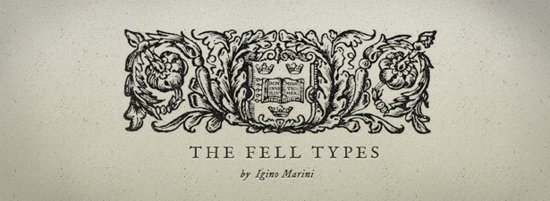
01. The Fell Types
The Fell Types have been expertly crafted by Igino Marini, one of the first I'm aware of to utilise the Open Font License. Reviving these classic 17th century faces from original manuscripts, and then expanding for all manner of letters and languages that weren't originally imagined, he created not only a classic and complete set of fonts, but a noble model for which many have followed.
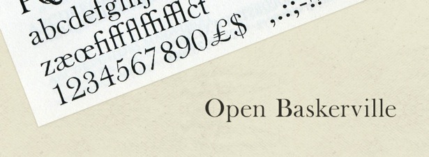
02. Open Baskerville
Originally started by Simon Pascal Klein, based on some work James Puckett did reviving the original drawings of Baskerville, the Open Baskerville font was an inspiration for the foundation of The League.
Get the Creative Bloq Newsletter
Daily design news, reviews, how-tos and more, as picked by the editors.
More importantly, Open Baskerville is a great model of collaborative font-making. Contributions have been added by James, Simon, Rob Mientjes, and Eric Schrijver. They manage everything using Git on Github, which, as you'll read later, is exactly my vision of the future.
Google Web Fonts
A relative newcomer to the scene, Google launched Google Web Fonts roughly a year ago, and it was completely unexpected. There are fantastic benefits to the service - fast embedding, easy interface, no price tag - but it's sometimes difficult to find exactly what you're looking for. Also, it often seems that Google's goal is more towards free fonts than towards open source and collaboration. Despite this, Google has hired a few great freelance type designers (including a few League Contributors) to work on new fonts for its system, which is exciting and a wonderful way to support those who care so much about typography and their craft.
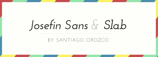
03. Josefin Sans & Slab
Made by Santiago Orozco, part of what's so wonderful about Josefin Sans and Slab is its quality (it's very well-drawn), but part of its appeal is its completeness. Few open source families have as many weights and styles as this. This means that it's a great font for the designer that needs flexibility and variety, but also that it's a great learning resource to understand how to build all different kinds of fonts.
Often, the best way for a budding typographer to learn to build things is to mimic those who've come before. That's one of the great things about the Open Font License, too - you're allowed to extend and build off OFL fonts that others have made.
04. Open Sans
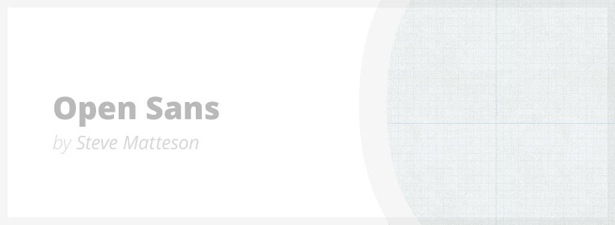
One of the most professional open source fonts in Google's directory, Open Sans is often my response to those who doubt the quality of open source fonts. The fact that Steve Matteson is the type director for Ascender certainly lends credibility, but also goes to show that open source is not just for amateurs.
There's a big variety in weights and styles and Open Sans has nearly replaced my desire to use Hoefler & Frere-Jones' Whitney.
05. Gravitas
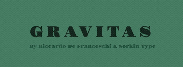
Totally unappreciated from what I can tell, Gravitas One from Riccardo De Franceschi and Sorkin Type is an awesome and fun addition to the world of open source fonts. It's excellently drawn, a great historic reference, and currently one weight - which makes it a great candidate to play with.
For open source, having a less-than-full feature set is an opportunity to jump in and do some good work. You don't need permission to play, it's included in the licence. When you've got some awesome additions, contact Riccardo or Eben Sorkin and show them! I personally would love to see how multiple weights would look, and I'm positive an italic version would be slick.
06. Jura
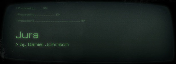
Jura, by Daniel Johnson, is one of those unique faces that you just find yourself itching to use. It's futuristic and very readable, comes in a handful of weights and is well drawn. It's based on a classic old typeface called Eurostile, and is a great inspiration for realising that "already been done" is a silly phrase. It adds a lot of unique personality by adding a bunch of clever and subtle character changes.
The League of Moveable Type
One of the interesting things we've been doing with The League (which will soon be translated to the website) is that we're moving everything to Github. If you're not familiar, Github is a site that acts as a central place to keep your work, using a version control system called Git.
The beauty of it is that there's a history of changes to all our fonts, they're dead-easy to update, and - the most exciting part - anyone can make a fork (read: copy) of one of our fonts and do whatever they want with it. You can make an italic version, or add a character, and send us a request to merge it into the main version. Or you can make your own fork and use it as a base to build a completely different font.
We're going to start pushing for people to adopt a workflow like this; we think it could become a standard that will help typographers immensely. So for each of these fonts, I'll be including a link to its Github page, so you can go check it out and start playing with it.
07. League Gothic
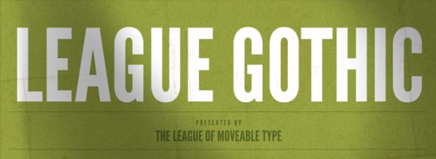
We're super-proud of League Gothic, and it's become really popular. Caroline Hadilaksono and I collaborated to revive the original Alternate Gothic #1. This is a great example of an open source font, because (though we're still working to integrate the changes), a man named Dannci took it and added a bunch of characters, completely on his own, to extend the font. Someone else took it upon themselves to make an italic version.
And there's still plenty more work we'd love to do with it. There are three weights of the original Alternate Gothic. We'd love help in making a whole family, and it would be a fun project to start out with if you've never tried making a font before.
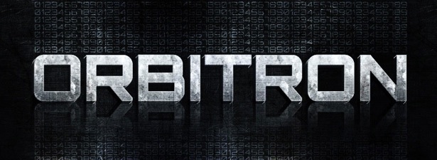
08. Orbitron
Orbitron, by Matt McInerney, is a great, full-featured, multi-weight font. It's fantastically drawn, a great example of stylistic alternates, and even has an awesome collection of small-caps and ligatures. It's a surprisingly under-utilised resource, both for a type designer's example and for your day job as a designer.
09. Chunk
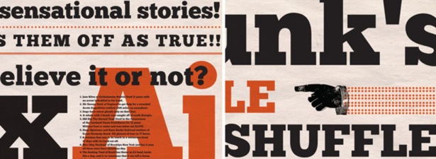
At this point, Chunk is one of the classics. Meredith Mandel is actually a former classmate of mine, and she worked on this font when we were in college together. It has one weight - ultra bold - but I've seen this slab serif used in an amazing variety of ways since it's become popular. People have expanded this character set as well, which we're hoping to integrate into the main font soon.
This is exactly why we're pushing for type designers to adopt open formats and Git as a version control: it's difficult to work collaboratively when everyone's using different systems. The fine gentleman who expanded the character set did a fantastic job, and delivered it to me as a final font file. With Git, I'd be able to see exactly what was changed, and offer it as an update, rather than a replacement, and be able to show his name as a contributor, since his work will have been recorded in the versioning.
10. Ostrich Sans
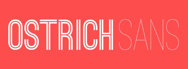
My final choice for our list is our most recent addition to The League's catalogue - Tyler Finck's Ostrich Sans. He'd been working on this one for a while, in secret as far as I knew, but shared with the world six different styles and weights. They're all drastically different, but somehow they all fit together as a family, and they're a great example of the creativity and imagination that's possible today in type design.
The League and the future
We're just picking up steam. The League's goal is not only to offer a great collection of hand-picked open source fonts, but to help those who are interested dip their feet into the warm waters of type design. We're hoping to offer tools, guides, and a collaborative eco-system so that those who are just starting out have a place to do so, and those who are experts have a place to advance.
For more information, head over to theleagueofmoveabletype.com, check out Google's fonts at www.google.com/webfonts, and if you're interested - start playing.
Micah Rich is a co-founder of The League of Moveable Type, a small design firm called A Good Company, and keeps busy as a design and programmer with various online services & products he's created. He's currently living in Los Angeles, CA, though he calls Syracuse, NY his home. You're welcome to say hello to him on Twitter, @micahbrich.
Liked this? Read these!
- Where to download free fonts
- Free graffiti font selection
- The best free web fonts for designers

Thank you for reading 5 articles this month* Join now for unlimited access
Enjoy your first month for just £1 / $1 / €1
*Read 5 free articles per month without a subscription

Join now for unlimited access
Try first month for just £1 / $1 / €1

The Creative Bloq team is made up of a group of art and design enthusiasts, and has changed and evolved since Creative Bloq began back in 2012. The current website team consists of eight full-time members of staff: Editor Georgia Coggan, Deputy Editor Rosie Hilder, Ecommerce Editor Beren Neale, Senior News Editor Daniel Piper, Editor, Digital Art and 3D Ian Dean, Tech Reviews Editor Erlingur Einarsson, Ecommerce Writer Beth Nicholls and Staff Writer Natalie Fear, as well as a roster of freelancers from around the world. The ImagineFX magazine team also pitch in, ensuring that content from leading digital art publication ImagineFX is represented on Creative Bloq.
